The Subtle Changes make all the difference……
As you may or may not know I’ve been using the N95-8GB for a couple of days now from WOM and, although its only been a couple of days, I’ve fallen in love with it. I think, apart from the N96, it would be THE only phone that I would ever seriously consider using instead of the N82. I got to thinking, what is it that makes its such a nicer handset then the N95?
Ok, there are obvious things like the bigger screen, the shiny black finish etc, but, it was more then that. The first thing I noticed was it felt more sturdy then my old N95. I was unfortunate enough to have one of the first N95s with the wobbly  slider, so obviously that makes a huge difference. I also noticed that it felt more square and solid in your hand, simply because they made the slider wider by about 1mm either side.Â
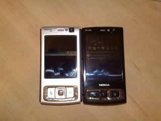
As you can see from the picture (its something ive never even noticed or thought about before) but the slider on the front of the N95 is actually slightly smaller then the back, where as on the 8GB, the slider takes up the whole of the front of the device.

Notice that on the N95 you can see the back of the device from just looking directly at the front, with the sides of the slider being the main body of the device, if you can see what I mean. After noticing this, it actually shows that the N95 feels more solid in your hands, and, you can get a better grip on it.
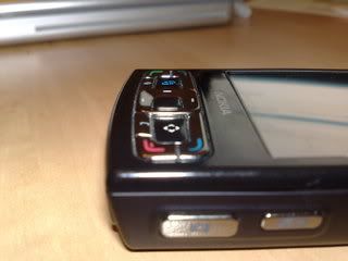
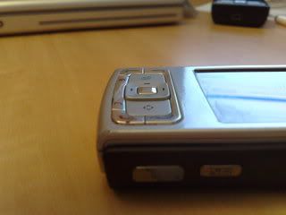
Another thing is the keys. Now we all notice that the key area on the 8GB is alot smaller then the N95 to accommodate the screen size, however there was something different I couldn’t put my finger on (no pun intended!) After all, its not really something a lot of people take huge notice of. When I actually looked at them, I noticed that the D-pad was slightly more cured and sticking out on the 8GB, where as on the original N95, although still slightly curved, its more flat. As well as that, the D-pad on the 8GB is a shiny finish as opposed to the Matte finish on the N95.


The Menu button and the interactive menu button on the 8GB are also more rounded then on the original N95, are for some reason, I prefer that. Its probably due to the smaller keys, but its nice.
AS well as these changes, there is also other small changes that have occurred, such as the movement of the main nokia logo, which is now in the centre of the phone, which I think makes it look better.
Although these changes are all positive, there are a few things, again, subtle things, which I would have quite like to see. For Example, I would have liked to see the headphone jack on the top of the phone as opposed to on the side. It makes it very awkward to chuck the phone in your pocket when your walking along, as it has to constantly be at an angle and adds another 3-4 cm onto the width of the phone when headphones are plugged in. There is also the obvious one of the card slot, but I wont go into that again! Having said that, the N96 seems to have fixed those issues, with the card slot and the headphone jack, which is now on the top! Ive said it before and ill say it again. The 8GB has shown me that its not just an “Updated” N95, but its a whole new phone in itself. It brings a touch of class to the N95, and its what the N95 should have been. I will be disappointed when I will have to part with it.
Chaslam


Connect
Connect with us on the following social media platforms.