Do you like… pink? Nokia X3 Touch and Type hands-on impressions
So, with the Nokia World 2010 ending in a flash, I can finally start digesting the enormous stream of mobile information that was coming from more directions I could manage to catch. It’s was a monster. There was only but a few things that kept us running with a constant supply of adrenaline, and more specifically, one – the all new devices from Nokia. By now, you probably know what the new portfolio is like, and what can we expect from Nokia in the next couple of months. There’s definitely lot to talk about, and choose in which phone to invest our money in, but one thing’s for sure, there’s just about everything to everyone. But let’s stop here, and have a closer look at one of the phones that appeared at the event.

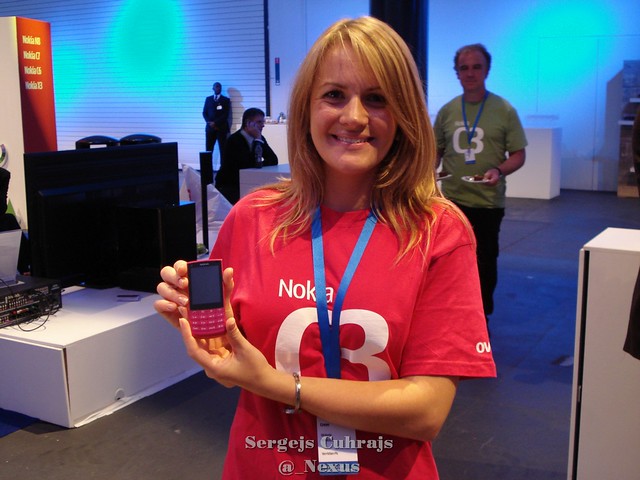
Meet the Nokia X3. Or, if you like it better that way, X3-02 Touch and Type. Sounds confusing? Most certainly, as there’s already a Nokia X3 but with a slider form factor, released in late 2009. Especially confusing is the fact that ‘X3’ is clearly visible on front of the device. Suddenly, using the righteous X3-02 isn’t so attractive anymore, now is it? But let’s leave this for later discussions, and instead have a quick virtual tour around the device in question.


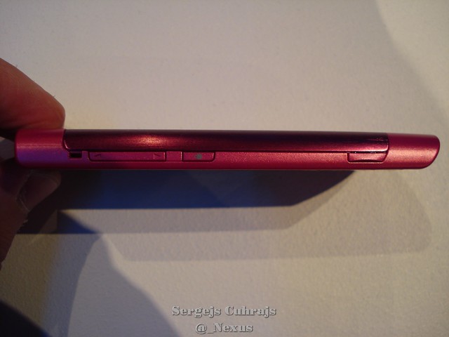
The very distinct ‘V’ shape of the chassis of the X3 is also less noticeable in real life than in the official photos I had seen out there. And perhaps I’ve grown tried of the masculine, all-black N900, but the pink doesn’t look so bad on the X3…Â Add the slim form factor and incredible lightness of the device (77.4 g), and you have a good contender for a female type of phone. Needles to say, the device sits perfectly in hand, plus the metal battery cover adds to the overall quality feel of the phone. Of course, there’s a lot more going on than just the looks – X3 is also one of the first so called ‘touch-and-type’ Nokia phones, that run on the S40 series platform. While using the alphanumeric keypad isn’t news for S40 phones, the inclusion of a fully capable touchscreen is. The sensitivity of the touchscreen is impressive despite the fact it’s resistive, with the UI being clean and simple, and large enough to avoid any problems fingering the rather small, 2.4″Â screen area with the standard 240 x 320 pixel QVGA resolution.

I quite like where Nokia is going with the X3, combining the old and familiar with the relatively new. For the users who feel like they are not ready yet to take a dive to touchscreen only controls, here’s a way to have a go with a touch sensitive screen without leaving the comfort of physical alphanumeric keypad. There’re no navi keys to be found here, but once the user realizes the sheer beauty of navigating through menus just by touching the screen, going back to the old ways could prove to be difficult. The keypad itself doesn’t leave many surprises, but one thing should be noted is that there’re four keys per row instead of the standard three, with the first row dedicated to call keys and two shortcuts keys. Each key also has a slight slope at the bottom part for better distinction between the rows.


The connectivity options would be pretty much standard issue for smartphones, but for an affordable S40 phone like X3 the specs are actually quite good: 3G, HSDPA, Wi-fi, bluetooth (2.1) and microUSB port. There’s a 2 mm charger port, but according the Nokia official site, USB charging is also possible. The internal memory is rather small (50 MB), and knowing the price group of the phone, there’s a very slim chance that a micro SD card will come in the retail package. Understandable for such a slim body, the Nokia X3 is equipped with a very basic 5 Mpix ‘full focus’ camera. Why even bother, you may ask? Just ’cause…
So there you have it, the Nokia X3- a simple to use, compact and lightweight non-smartphone, offering the best of both worlds of touch and type.

You can have a look at the rest of the Nokia X3-02 pics in my flickr album here.
Category: Nokia


Connect
Connect with us on the following social media platforms.