The Nokia E7 is no small business. Find out why…

Since it’s announcement during the recent Nokia World event, the E7 has gotten quite a lot of attention. And for a good reason. It was passionately dubbed by Annsi Vanjoki as the direct continuation of the Nokia’s ‘communicator’ legacy, and thus, has quite some shoes to fill. But before we move head first into the device itself, let’ relive the very first moments of Nokia E7 at Nokia World in the following video, starting at the 11:16 mark:
[youtube=http://www.youtube.com/watch?v=_Kwp_gcLhXo]
Short demo of Nokia E7
[youtube=http://www.youtube.com/watch?v=Dg1y4jkHr84]
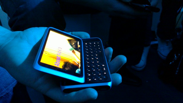
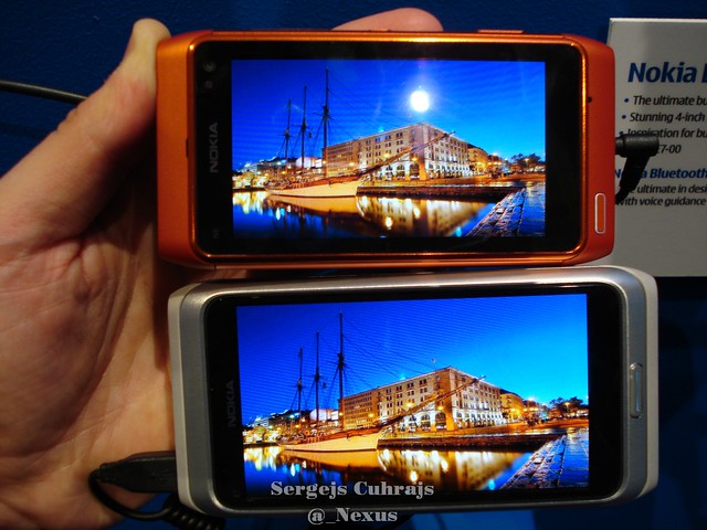
The pictures doesn’t do the E7 justice. Yes, ‘it’s BIIIG’. The E7 is no small business. But at the same time, it doesn’t feel like a brick. It’s seamless and sleek design is truly remarkable, especially if we compare it to it’s spiritual predecessor, the E90. In closed state the E7 looks and feels like a slightly bigger version of the Nokia N8. With a slightly wider body and a similar thickness to the N8, the device also feels incredibly solid. You won’t find advanced camera optics of the N8 here – instead, the bulky camera module on the back has been removed to keep the device as slim as possible.


There’s also a more functional reason for this, namely so that the E7 can sit firmly on flat surfaces while working with the qwerty keyboard. What I’m not impressed with is the camera cover, which is at exact same level as the backside of the phone. I guess the engineers very really pushing the limits as to how slim the E7 can be, otherwise I can’t see the reason why the camera lens couldn’t be put in a slight recess of sorts for better protection.
The slider itself resembles the N97 in the way it looks and tilts the screen at a specific angle, yet it doesn’t quite work in the same fashion. I was pointed out by the people who also had some hands-on time with the device that you actually have to push it a bit from the top, rather than pushing the upper part dead-on from it’s sides. So it might require a bit of practice until it becomes natural, but overall, it’s not an issue. When the slider is finally engaged, the rest of the movement is as smooth and matter-of-fact as you’d expect from it, locking the screen into open position at the very end and giving the E7 the certain ‘oomph’ factor the N8 strangely lacks in my opinion.
But that’s, obviously, is a completely different story. Nokia has done a great job at separating it’s new devices from each other, and it’s hard to choose a device without some sort of compromise in a certain direction. For the N8, it’s the lack of the Amoled CBD (Clear Black Display) and physical keys, for E7, it’s the absence of the superior camera hardware and a microSD card slot. Yet it almost feels like a perfect combo, these two devices – one for work and the other for leisure -Â but other Nokia phones, like C6-01 or C7, can also be easily added to the mix.

During the little time I had (it’s never enough..) to play with the E7 in Nokia World experience lounge, the physical qwerty keys felt definitely closer to the Nokia N97 mini keys rather than N900’s. For starters, the E7 offers a generous work space for the qwerty keyboard. That, in turn, makes it so much more easier to work with emails, office documents and whatnot – definitely better than, again, the cramped keys on the N900. When compared to the N900, the keys are also slightly larger and with a tad shorter travel, but by no means I can say that the E7 keys have poor feedback.

Speaking of feedback, I was also quite happy to see the redesigned and much improved menu key on the E7. In comparison to the N8, it has been moved from the corner to the middle area under the screen, and it has also been slightly raised rather than totally flush with the rest of the phone like on the N8. And the difference is quite noticeable: you thumb doesn’t aimlessly wander under the screen until it feels the slightly softer area that is the menu key. The raised boarders of the menu key on the E7 means that the time to adjust your finger to properly work the key is reduced to minimum. A dream!

The rest of the phone speaks volumes by itself: anodized aluminum body, up front – hardened glass , HDMI port - just like the Nokia N8. These two devices go hand in hand in many ways, yet they successfully manage to offer their own, unique experiences to it’s user. Aside the usual corporate features that are essential for business users, during the Nokia World Q&A session with E7 product managers we were also promised some additional software tweaks in Symbian^3 operating system, so the phone would in theory run snappier than the N8. From my experience, even with the pre-production firmware the device ran pretty much lag free, and the screen responded promptly to my finger inputs. In a nutshell, the E7 runs on the same processor and has about the same RAM as the other recent additions to the Nokia Symbian^3 phone family. The graphical accelerator, however, was promised to handle the much bigger 4 inch screen of the E7 without sacrificing performance. It would be very interesting to see how the E7 fares against other Symbian^3 phones in field conditions, but by the end of the day, not everything solely depends on how much Mhz’s and Mb’s the phone has ticking under it’s hood. Symbian OS is proven to be less demanding to system resources, and less power consuming as well. Let’s keep that in mind, when and if comparing it to other operating system phones out there in the market.

Link to the full Nokia E7 gallery
Finally, we move onto the already mentioned Q&A session we had during Nokia World day 2. What are the differences from the Nokia N8 camera? What business applications the E7 is going to have? These, and some other relevant questions were raised, and for the most part, answered in the following video, thanks again to @dani2xll for providing it! Incidentally, yours truly, can also be seen in the video, sitting to the left from the product managers 😉
Nokia E7 Q&A
[youtube=http://www.youtube.com/watch?v=gZCfuUW97fg]
So that about sums it up what I feel about the Nokia E7 at the moment. For me, the E7 was the absolute winner of the whole Nokia World show. For others, it’s greatest strengths might be less important, and they might look at the likes of Nokia N8 or C7, for example. Many questions have been lifted during Nokia World regarding the E7, where rumors and blurry spy photos turned into an ace looking successor of the Nokia’s communicator line. The E7 has an edge over the competition with a truly attractive design, built materials, and thought-out qwerty keyboard. And did somebody forgot about the desert – the HDMI and USB OTG functionality?
Yet the biggest question remains, that actually sounds more like a request at this point… when is it finally coming out?
Category: 5th Edition, Eseries, Nokia, S60


Connect
Connect with us on the following social media platforms.