Windows Phone 7 Apollo (Fan Concept)
Advertisements
Jay: A couple of weeks Ago, Jozef was working on a Windows Phone concept for Apollo. Did you hear that there’d be a separate update gain before Apollo called Tango? Here’s Jozef’s concept for Apollo.
This time I’m not going break any Metro Rule. I realized that following rules in my real life makes everything easier, so why do not apply the same thing in my work…
Today I’m going to show you 2 changes for Windows Phone. I believe that both of them would have a big effect on Windows Phone 7’s reputation. Maybe they may be the “wow†effect that WP7 is missing.
Change # 1
Few months ago, I showed my Aero Integration for WP7….But folks from Redmond don’t like it. The purpose of Aero was to make WP7 more attractive and make it look more colorful. We all know that WP7 home screen looks really boring (sometimes). I tried to find a solution, something with minimum of fashion effects, but something still looking colorful and fresh. As the result, I copied the style of Windows 8, and this is what I created:
Basically, you have colorful tiles, colors would be generated automatically. But what if you don’t like a color of color? Just shake a phone many times and all colors will be changed. If you want to change only one color, just tap/ hold the tile and shake your phone.
This would be one of the options to customize your WP7, old styles would be still available.
I know this may look a little messy but this is the way to make your home screen looking fresh without using transparent tiles.
Change #2
I already showed the change #2 but it didn’t get much popularity. Yes, it’s multitasking concept, the concept that I call “SmartViewâ€. Personally, I believe this is one of the best things I created. Maybe I didn’t show it in the best way but I still believe this is the best way to make multitasking on the phones/tablets. I can imagine using this concept on other platforms such as Android or iOS.
But again, what is SmartView? SmartView is the most interactive multitasking concept ever, something really simple with the big effect on user’s work, something you have never seen before.
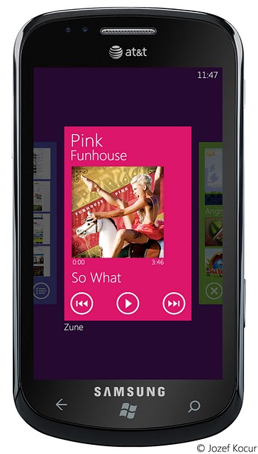
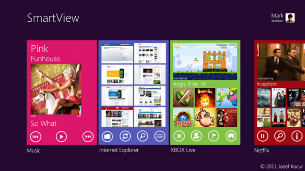
This is SmartView.
SmartView combines widgets with the multitasking cars. And the result is simply, fresh, and interactive. For example, you have a Zune Card. Card would show you music information and buttons. Now look at an Internet Explorer Card. You see all opened tabs and buttons/thumbnails that switch you to a particular part of that app or interact with a part of the app.
To launch Multitasking Menu you would simply swipe in from both edges with 2 fingers, or press home button twice.
You would also use SmartView’s card like a widget. How? Just pin an application to the SmartView (pinned apps would be always showed in the first positions, even if they are not running). For example, Settings’s card may show toggles, Music’s card Now Playing/History etc.
SmartView for Windows 8.
That’s it for now. If you like this concept please share it with others…and follow me on Twitter.
Also check out my older Windows Phone Concept.
Advertisements
Category: Windows, Windows Phone


Connect
Connect with us on the following social media platforms.