Could a Belle update already be in the works?
fyzANDme tipped in last week about a “confidential” Nokia promo video for Belle, advertising that it will be coming to S^3 handsets. This is no new news.
However, what’s in the video is. I have noticed that the interface differs from the one I have flashed on my N8, as well as that demoed on the upcoming 600, 700 and 701 devices. Below is the video I spotted, along with screenshots outlining the changes.
The screenshots are not in the order they appear in the video.
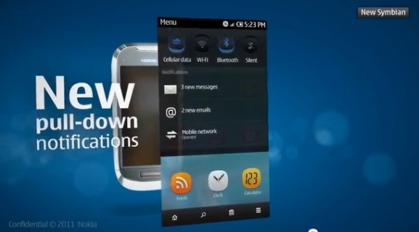
 This shows three differences from the Belle we have seen. The first, is in the Toolbar. The time displays AM/PM (subtle and probably unimportant yet not in demoes that I have seen, nor the leaked Belle). For some reason, 3G is encased in a white bubble, again, subtle yet I’m yet to see this on my Leaked Belle. Email notification is something that I’ve been longing for, for quite some time. This finally appears to be implemented.
The next major difference is in the NavBar. Apart from replacing the back arrow with a “Home” icon, it appears that a shortcut to open the Nokia Store is also present. (Also, “cellular data” replaces “Mobile Data” yet, who cares.)
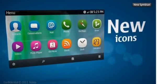
In this screenshot, the “Phone” app has been added. As the text says, “New Icons” are also implemented, such as Drive, Music Player and Calculator. Conversations replaces Messaging, with it’s own icon, and it appears RSS Feeds get their own application(separate from Web). (Also, new icons and apps look like they have been pulled straight from MeeGo.)
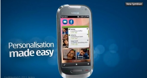
 I know we have seen that Social feed before, although I’m yet to see it on the leaked Belle and I’m not too sure I’ve seen it on the new handsets. “Favourite Contacts” have an availability icon, as well as latest “status”. The positioning of the call soft key, is swapped with the Menu and also changes it’s orientation slightly. (I know this all sounds stupid and insignificant but you never know. Something else subtle, the NavBar is no longer transparent.)
If some of these things I have mentioned have in fact been spotted on the new handsets, please let me know in the comment section below and I’ll update it. Who knows, these discrepancies may be a Nokia concept design error, or simply their subtle way of leaking a new update design.
UPDATE: The battery indicator also is mirrored.
Michael
Category: Nokia


Connect
Connect with us on the following social media platforms.