Videos: Nokia N9 Unboxing + First Review; More reviews to follow shortly (Update: Unboxing is up, Now with written review)
I got my N9 on Friday and below I have included the unboxing of my device, as well as the first review. I’ve recorded all reviews for now, just waiting until they are uploaded. (Bad side of HD recording is long upload times)
I apologise for sounding like a tool, I was just too overwhelmed with excitement. I also apologise for the crappy video quality. My N8 wasn’t doing its best work. (It wouldn’t auto-focus, and several times the filming just stopped. You may notice it when some clips cut to another)
Here’s the unboxing of the device:
From what you readers requested, I have some reviews to follow. I’ve decided they will start with a review of the pre-installed apps shipped with the device, in groups of approx. 4. (Number of apps will vary based on depth of app and timings.)
The first one has been uploaded. It’s a showcase of Phone, Contacts, Search & Web.
If you want to see something specific, and didn’t get to put it in the other post, drop it in the comments below and hopefully I’ll get a chance to review it.
It may take a while as I have exams for the next few weeks, but I’ll do my best.
Update: “Mac” Suggested I compose a written review, and I think it’ll be good. I’ll do this from now on with all my reviews.
So in this review, I take a look at Phone,Contacts, Search and Web.
PHONE
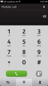
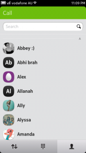
Opening the app brings up the dial pad. Very simple, very easy to use. Unfortunately, there is no smart dialling (type the contact name to bring up their number). Along the bottom there are three “tabs” if you want, the left most being Log, followed by Dialer and then Contacts.
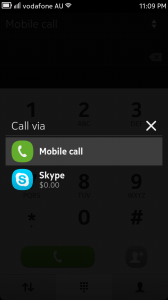
In the dialer, you can add a contact by simply dialing a number and hitting the icon with the plus sign. There is also the ability to make Skype calls, straight from the dialer, clicking the double arrows in the top right corner. It also lets you know how much Skype credit you have left.
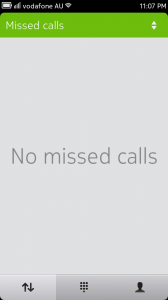
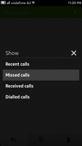
Next we have Log. Log lets you decide if you want to display Recent Calls, Missed Calls, Received Calls and Dialled calls.
The final tab is the Contacts tab. This is just a quick view of your contacts that only lets you view your contacts and their availability (if you are available yourself).
CONTACTS
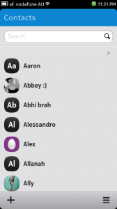
Contacts is relatively simple. The interface simply shows you a list of your contacts, a search bar, and a few options.
The contact list and search bar are very straight forward so I won’t bother explaining them. The options however, I will.
You have the “+” icon in the bottom left, and this is to add a new contact. Hit this icon and then fill in all the relevant contact information. The icon on the right that resembles an = sign (i say its options in a Calculator demo; so stupid), brings up a few different options.
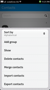
These options are Sort By, Add Group, Show, Delete contacts, Merge, Import, Export.
Sort By allows you to sort your contacts either alphabetically or by their availability. (Online being groupped together). Add Group allows you to organise several contacts together for quick access, eg. Work groups or sporting teams. Show gives you the options of choosing which contacts to display, whether it is all(phonebook), Sim only, or the contacts from Facebook,Skype, Twitter or other social networks.
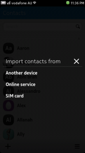
Delete contact is straight forward. Merge contacts is very helpful as it allows you to merge the social network contact card, with their related phone contact card, allowing for easier organsiation of contacts. Import and Export, although I haven’t used it yet, allows you to import and export contacts to/from the sim, another device, and even from an online service.
SEARCH
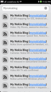
This is a pretty simple app. Simply enter what you are looking for in the search bar. If it is on your device, it will be displayed. There is also the chance to relay that search into a search engine (I have chosen Google), but the results are not shown in this app. The device results range from contacts to apps, from web history to user guide help topics.
WEB
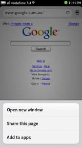
The web browser on the N9 is very good if you ask me, only limitation is flash. When you open a new window, you are greeted with a “Top Sites” page. I’m not sure if this can be changed, haven’t yet had a chance to look. Typing something into the browser’s url box, allows you to directly search for what you have inputted.
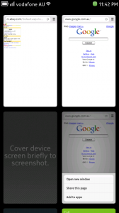
Again, the options icon is present and allows you to do the following; Open New Window, Share This Page and Add To Apps. Open New window does as it suggest, and allows you to have multi-window browsing. Something I like, is the ability to see the various windows as separate icons in the multi-tasking view. Share this page allows you to post the link to a social network, text or email. Add To Apps is a very nice and modern way of having bookmarks. The bookmark will be added to the Apps homescreen and an icon will be automatically generated.
Hopefully the written review was worth the read. If you prefer just the videos, let me know.
Michael



Connect
Connect with us on the following social media platforms.