Windows Phone 8 (Fan Concepts)
 Jay: Hey guys, Jozef is here again with his concepts for Windows Phone 8. He’s done quite a bit of work, sticking within the Metro frames but spicing things up a lot. I think they’re looking great and I hope Nokia and MS are watching out for this guy. It’s great watching his work evolve.
Hi folks, If you read my stuff, you should know that I am a Windows Phone fan. I published many user interface concepts for this platform; most of them were about the custumization such us Aero Integration, Color Wheel, Group Tites, etc. This time, I would like to show you something different. Let’s Start with Internet Explorer.
Internet Explorer
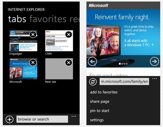
Internet Explorer for Windows Phone is one of the best mobile browsers on the market; everything wors perfectly and smoothly. But is there any way to improve the user experience? I believe so! My goal was was to create more natural user experience while you’re surfing web.
Pivot view for tabs, favorites and recent history
Today, it needs 2 taps to get to the browser tabs, favorites, or history. My solution doesn’t require any. You just simply swipe down from the top of your screen to launch the pivot view showing all opened tabs, favorite websites and the recent history. Extended Menu at the bottom would now show only 4 items. No tabs, favorites, and recent in this menu anymore.
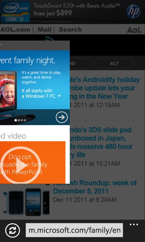
Fast switching between the tabs
Sometimes you just need to switch to another tab really quickly. There’s a east way to do it. I was inspired by Windows 8 Multitasking. So, to switch to another tab just zoom-out and swipe from the edge of the screen. Can it be simpler?
Microsoft Outlook
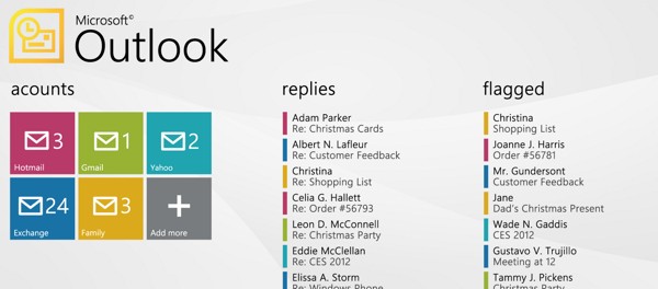
Mail experience on Windows Phone is fantastic, but when you have more email accounts there’s no way to manage them easily. Microsoft Outlook Concept would fix it.
Panorama View for all your accounts
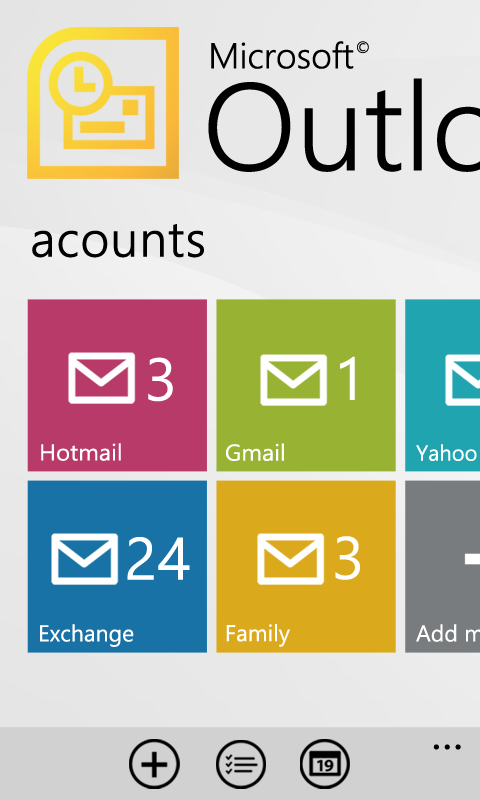
As you can see, Microsoft Outlook is a panorama application showing you all your email accounts on the one place. It makes it really simple to manage them. Slide to the left to see replies, flagged emails, email from contacts, etc. from your all accounts. Each email account uses a different color; it makes it easy to recognize to which account email belongs.
Microsoft Outlook is not a replacement for current email solution. It’s just a supplement that would make emailing more comfortable, it’s a “gate” to your inbox. User would still have an option to pin each inbox to the home screen. But when user has many email accounts, having one Tile for all of them would be a great option to save some start screen space.
Groups
I showed you a way to create a group on WP in my last concept. But let’s push grouping of items to the next level.
My concept is about grouping items into a hub- a hub that can communicate with the applications withinn it.
I have created 2 mock-ups to explain you this idea.
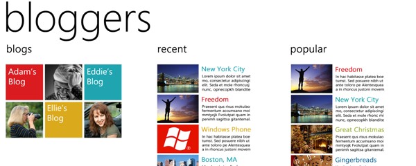
Grouping of Web Sites
As you can see, the hub doesn’t show only the Tiles of Websites. It also shows a brief view of the websites’ content. I this case, you can see recent and popular posts. Basically, this would work as a RSS reader.
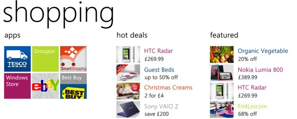
Grouping of Applications
This mock-up shows the group of the similar applications (shopping). Slide to the left to see “hot deals” and the featured products from all the applications within the group.
Groups would also use “Color Separation”.
SOS Assistant
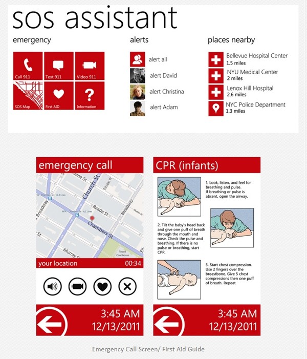
I got this idea after reading an article about future of emergency calls. U.S. Government t is trying to bring the 911 emergency service “into the 21st century” by looking into allowing text, photo and video reports from mobile phones.
My concept is pushing emergency services to the next level- the level where one application lets you to do following things:
1. Call/Text/Video call 911
2. View Emergency Map. This map would show nearby emergency points, position of friends/family, and the position of an emergency vehicle.
3. Search for First Aid. Application would have an image/video guide for most common emergency situation
4. Alert friends/family. Alert Service would send a message to selected contacts.
Zune Hub
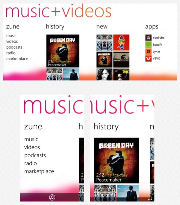
There’s one thing about Zune Hub that really bothers me sometimes- artist image on the background. I know many people like this, but I would welcome having an option to get rid of them. Following mock-ups show how Zune may look like without them.
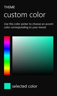
Custom Accent Colors
I showed you in the color wheel in my last concept. This is just an update showing the color picker instead of a wheel. I think solution is more user-friendly.
That’s it for now. Let me know what you thing about these concepts, leave a comment, or send me a private email. You can also follow me on Twitter to stay always up-to-date.
blog at: jozefkocur.blogspot.comÂ
Category: Concept, Nokia, Windows Phone




Connect
Connect with us on the following social media platforms.