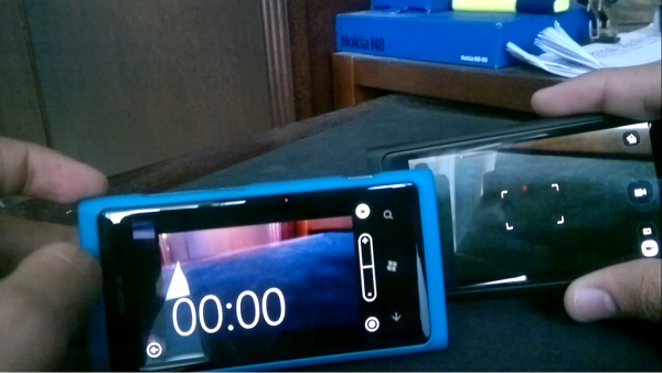
N9 Vs. Lumia 800: Camera & Camera UI #MeegoVsWP
As mentioned last time this was supposed to be part of the Video comparison– but the huge difference in quality called for a separate post for the videos – so here it is, a look at The Camera UI/Gallery on both the N9 and the Lumia 800 as well as some photo samples.
Apologies in advance as I got a bit carried away with some minor ranting and some other things- so the video ran a bit long (around 19 minutes- so I had to split it into two since the maximum time on my youtube is 15)
Part One: Camera UI & Gallery
Part Two: Video Recording UI
Camera:
- First off I’d just like to repeat that I absolutely HATE the fact that the N9 doesn’t have a shutter button; someone PLEASE explain the logic behind that? How would a camera button remove from the “buttonless Swipe experience”
- Unlocking The Lumia 800 by the camera button and instant capture is a super neat feature, available by default on the 808 and as Michael Posted today- an add-on app for older symbain phones
- In my general usage I’ve found that the Lumias camera starts up faster than the N9s camera does- but that’s possibly due to the fact that the Lumia always has more “free ram” due to the whole active resume deal.
- The shutter button on the Lumia is great for taking pictures but holding on the capture area of the N9 gives you similar results (with the added bonus of choosing where to focus, as the Lumia doesn’t focus on a specific point when using the physical button- only when tapping on the screen)
- Tapping on the screen to capture an image on the Lumia is great, but annoying at the same time; as you might have seen in the video it gets a bit frustrating when the phone gets “capture happy”
- Sliding directly into the gallery from the Camera & the side-by-side view is a HUGE plus for the Lumia, although it has no real value but the awesome factor is off the charts (besides the fact that the gallery truly becomes part of the camera)
- Continuous burst on the N9 is a pretty sweet feature; although in my opinion the resulting images could be a bit better- *Cue off topic chat about the One X*
- From an options/settings point of view the two devices are almost similar minus the couple extra scene modes on the Lumia and the resolution changes on the N9
- Regrettably neither phone supports pinch to zoom (although the N9 does support zooming with the volume keys)
Video:
- Lack of the option to zoom in both phones while filming is a real bummer
- The recording “slit” on the Lumia is ridiculously small and almost pointless
- Both have the optional LED light while recording that can only be toggled before filming
- The N9 has the same draggable focus box it has in imaging mode which is useful fro quick focusing (same feature was implemented int eh 808)
- Similar settings as imaging mode
- Personally I like the large countdown of how long you’ve been recording on the Lumia- and it’s surprisingly un-obtrusive even though it’s quite large.
Photo Samples:
Disclaimer- I am most definitely not a professional photographer; in fact photography isn’t even a major hobby of mine so the following pictures aren’t the most artistic– for lack of a better word.- to make things easier the image on top will be from the Lumia and lower image by the N9 (I’ve also watermarked them in the lower right corner but it might not be visible in all the shots)- also all these images are uploaded on Flickr so if you want to look at the full size image just follow the links.
Random Indoor shot of my keyboard- the “blue tint” on the Lumia is obvious, while the N9 seems to have captured better colors but they do appear slightly washed out. (and yes my keyboard is super dirty)
As was the case in video recording the N9 captures the colors of the subject better in direct sunlight; while the subject in the Lumia appears much darker- However the Lumia captures better details in the background (sky isn’t visible in the N9s shot).
Random shot in Landscape mode- they both seem almost identical- but here’s a full scale crop:
Lumia:
N9:
Although the Lumia seems to have captured better colors (green of the trees)- look at the dust coming from around the excavator/digger thing that’s only visible on the N9.
Another shot facing the sun- once again the N9 captures better colors, but the Lumia gets more background details
Surprising results in this shot- for some reason the N9 seems to have some tinting issues while the Lumia’s picture is plain gorgeous
Taken in Macro mode on both- I must that the Macro focus on the Lumia is RETARDED! it gets the object into focus then drops the focus a fraction of a second before capturing the image- making it almost impossible to get a decent shot (no matter what I did the focus always ended up on the background surrounded the flower and not the actual flower)- while the N9s results were quite impressive, I really like how the background is slightly blurred showing off the depth of field and giving it a slight “tilt focus” look.
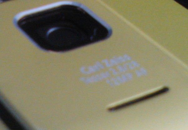
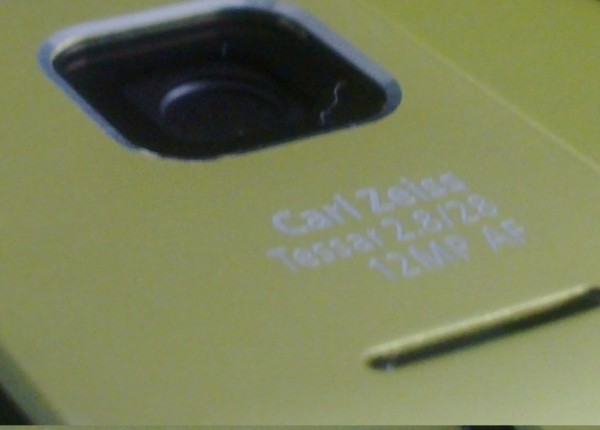
Once again taken in Macro mode the Lumia failed to capture a decent amount of detail- here’s a full size crop:
As you can obviously see, a noticeable difference in both the color (the Lumia comes off looking like a peachy color more than green) as well as the complete lack of detail of the text in the Lumia’s image- I shudder to think of what the 808 could do here- you could probably see the fissure opening between the lenses on it.
Once again the Lumia’s Macro mode focusing is absolute garbage while the N9 is quite impressive- Until you see the same shot taken with the N8:

Flickr sets:
Lumia:Â http://www.flickr.com/photos/23218958@N05/sets/72157629474558244/
N9:Â http://www.flickr.com/photos/23218958@N05/sets/72157629838848195/
-All in all normal shooting they were almost equal both with ups and downs; although the N9 did have the upper hand- when it came to macro mode the N9 beasted the Lumias poor focusing giving it an easy victory. (Apologies for the Lack of low-light shots but I’ve been completely swamped these past few weeks with mid-terms that it completely slipped my mind).
*I had considered taking each shot with the N8 as well but decided against it since it would probably lead to too much confusion.
Final Note: I have about one more idea in mind for this review series (basic service ease: alarms, notes, calculator etc..) so if you have anything else to recommend go ahead list it down below.
Thanks.


Connect
Connect with us on the following social media platforms.