A Closer Look at the “New Asha Design language” Leak
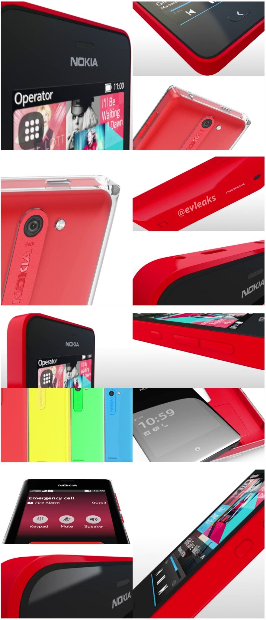
A couple days ago, hours before the Nokia keynote in Barcelona Evleaks posted the image above, captioned “Sneak preview of upcoming Nokia Asha design language”. We saw the truth behind this image in the Nokia keynote, where the Nokia 301 and 105 were both launched taking obvious hints from the Lumia range, however the images above don’t seem to be of either of them (also  both the 301 and 105 are NOT Asha devices).
I honestly never had a chance to closely examine these pictures seeing how they were leaked hours before the event and I was sound asleep in my hotel room, but a little birdie told me to take a closer look at the pictures. Upon closer inspection you can see that all the devices in the picture aren’t the same; in fact there are some pretty obvious differences.

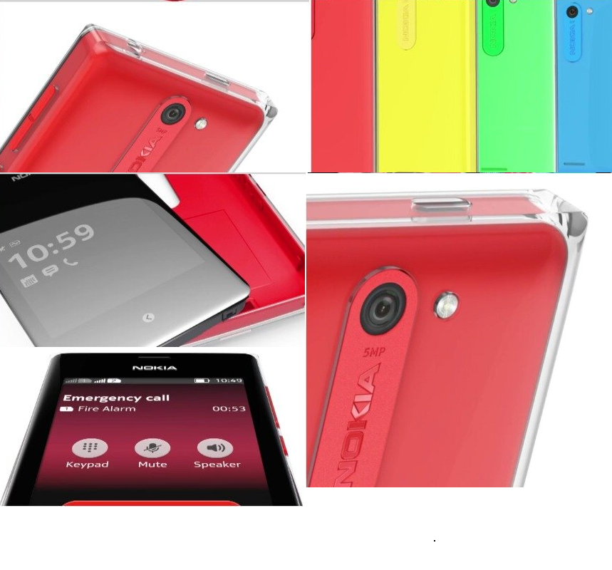
So let’s start with the first phone (Above); the first give away of it being a different phone is the inclusion of a flash on the 5 Mp rear camera; so here’s a quick run down of what I could deduce from the picture:
- Dual shot cover, obvious influence from the Lumia 620; meaning we should probably expect some exciting colors (as seen above).
- Always on screen, a further evolution of the Meego/Symbian influence on S40.
- Dual Sim support
- Single on-screen capacitive button; possibly a completely revamped UI to do away with the hardware call/end buttons.
- 5MP Camera with LED flash.
- “interesting” screen size (going off the picture showing the capacitive button), if that render is accurate the screen is somewhere between 2.4′-3.0″ which made me think of an iPod influenced design.
*The inclusion of a dual shot cover would logically point towards interchangeable covers on the phone, which might lead to Wireless charging and NFC enabled covers in the future.
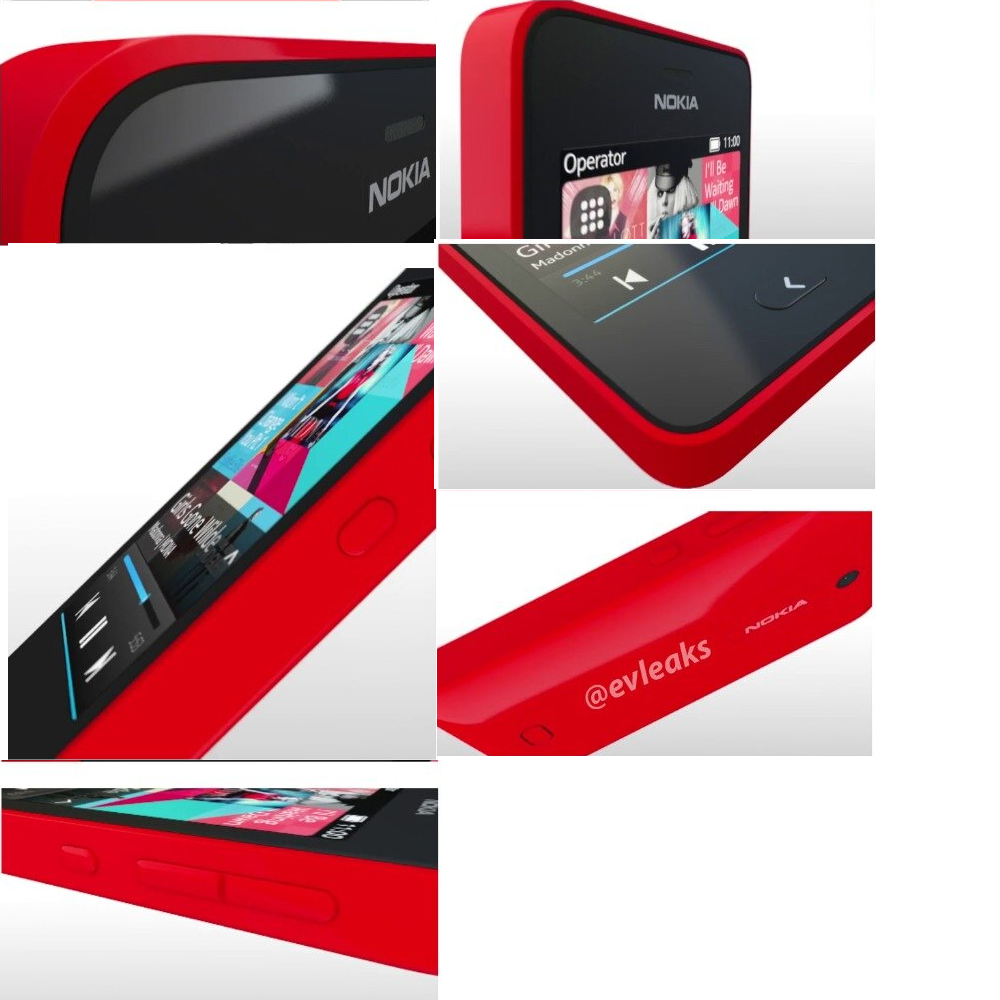
The second phone seems to be pretty standard in shape, but let’s take a run at what we can see:
- Candy-bar design, Lumia influenced; probably similar colors as well
- Dedicated Lock screen button on the side of the device, something we haven’t seen in many Asha devices.
- Same “Back” button as seen in the other phone, this time in physical form.
- Camera on the back without flash
- Always on menu/settings shortcut? This would make sense if there were no other buttons on the phone besides the end/back- but it’s not the most elegant solution, but it would go along with the concept of a new redesigned UI.

- Redesigned music player/ general UI?
This is what the UI for the music player on the Asha 308 looks like:

There has been a lot of speculation that we might see a complete redesign of S40/Asha heavily influenced by the acquisition of Smarterphone; which so far hasn’t bared any obvious fruits, this might be the case; but there haven’t been any solid rumors going around to support this.
So what do you guys think? Did we miss anything? Have any theories of your own? Sound down in the comments down below.
Category: Nokia


Connect
Connect with us on the following social media platforms.