N950 hands-on: Nokia, please take my money!
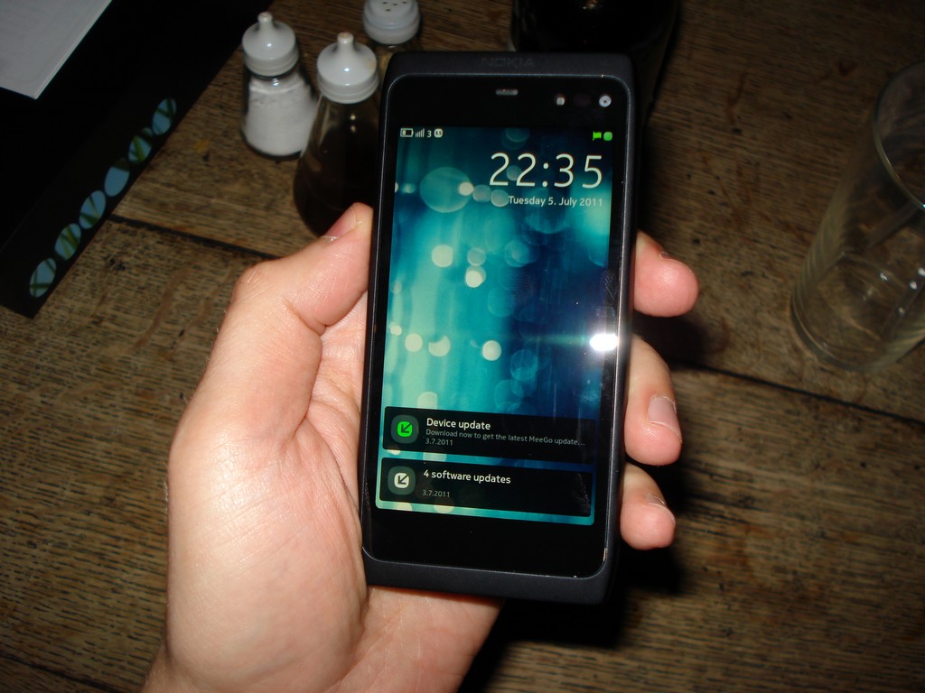
While attending an Intel MeeGo event this Tuesday, there was a chance I’d finally catch a glimpse of Nokia MeeGo phone in the wild. Probably not the N9, but its geekier counterpart… And, well, turns out I did!
While visually the N950 resembles E7 (large screen, similar hinge, keys), there’s also an unmistakable aura of N900 surrounding it. My guess it’s probably becouse of the dark color which resembles the N900 a lot. My initial impression about the built materials were actually false, as I was quickly corrected on twitter: the device is not made entirely of plastic. The interesting element here is that a soft rubber material also covers the aluminium section of the device. Thus, unlike the E7, the N950 is a lot more grippy in hands. I’d still prefer to highlight the metallic elements of the device rather than hide it. I mean, is it possible to easily forget those early leaked pics showing the N950/N9 with its shining, drop dead gorgeous Macbook Pro-like outfit?
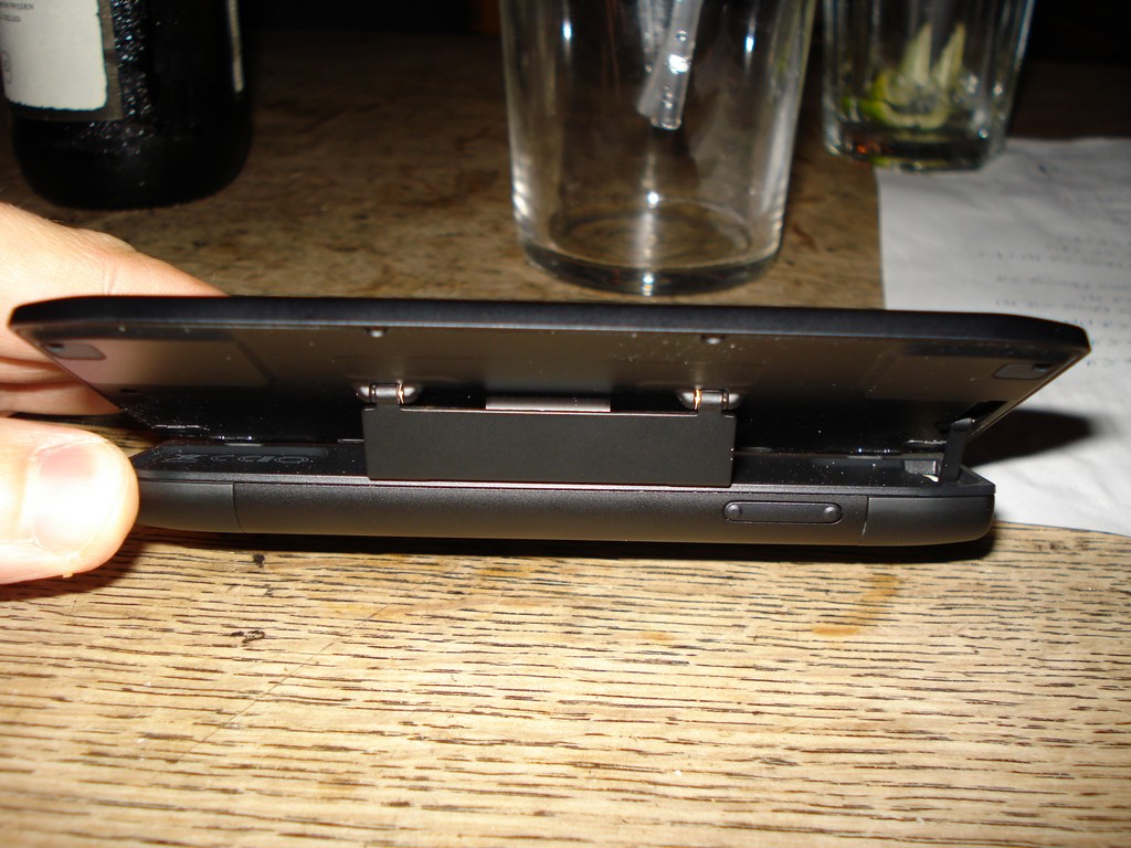
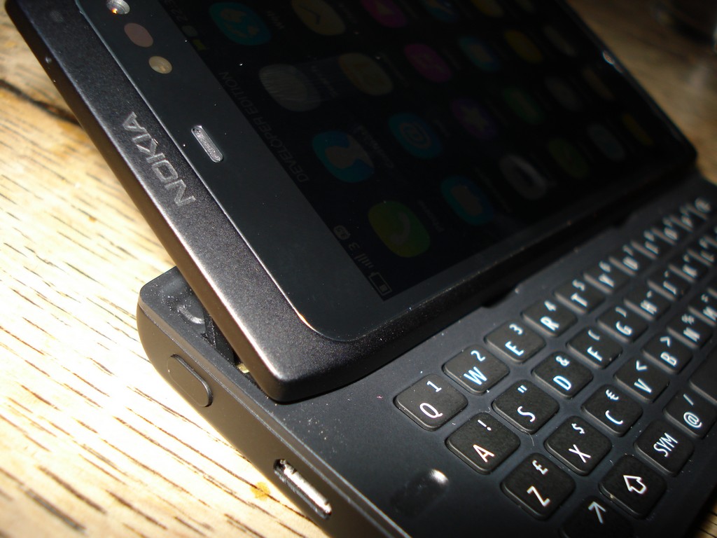
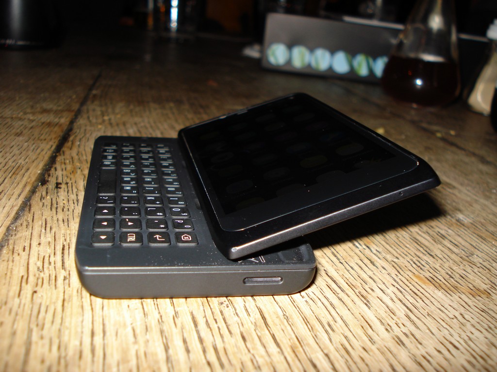
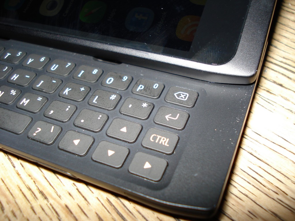
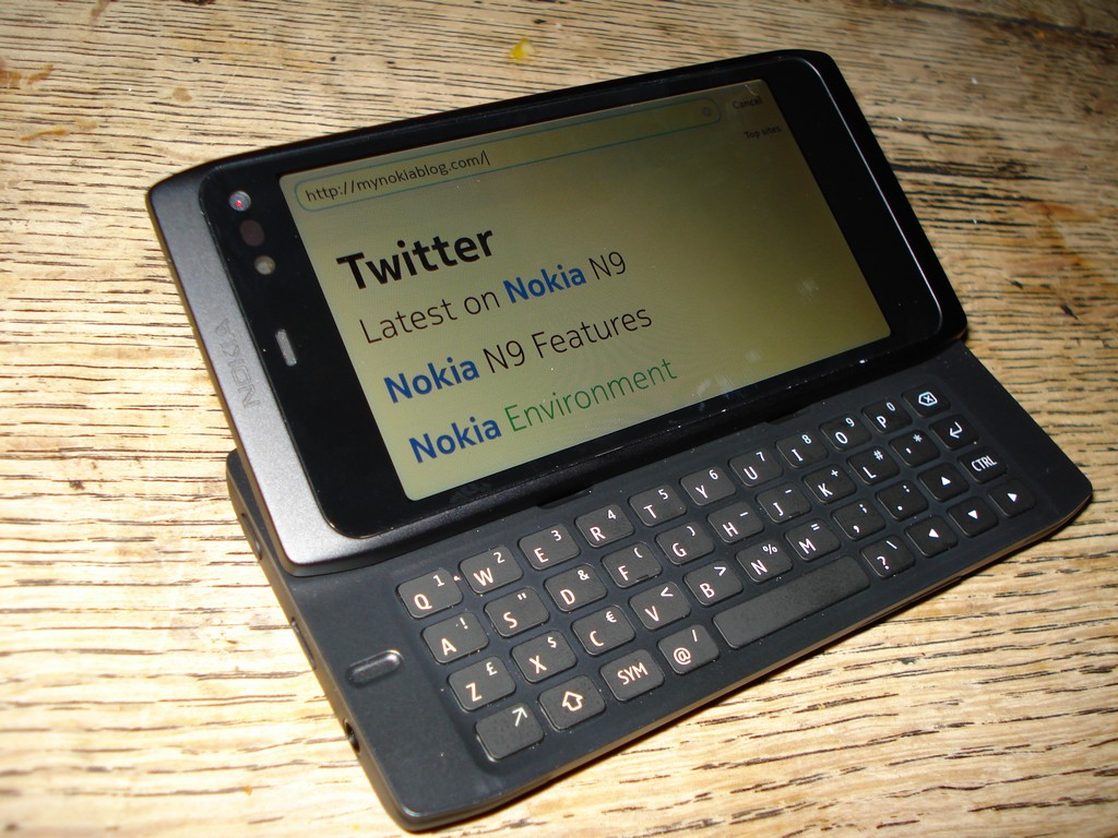
For the short amount of hands-on time I had with the N950, I was continuously impressed with the built quality. Software aside, N950 certainly appeared like a consumer ready device, and the few owners I’ve met had been effortlessly using it as a primary phone. The hinge felt very solid, and engaging the slider was a great deal easier than on the Nokia E7 thanks to the rubber like finish and slightly angular edges on the upper slider. The geekasm then struck a new high as I tried out the physical keyboard: hands down, it beats even the fabled E7 qwerty by a noticeable margin! So much effort, only to impress the developers? I can hardly believe it, Nokia…
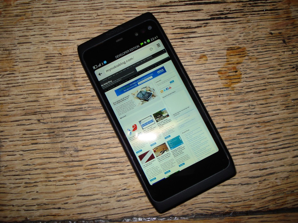
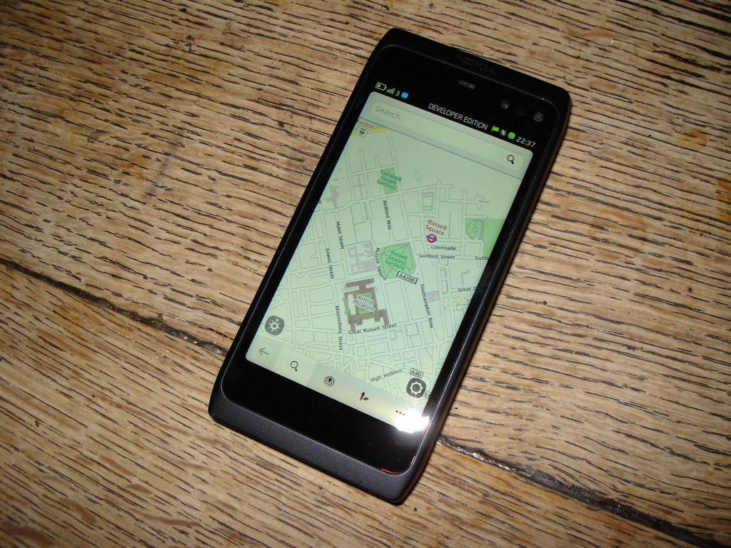
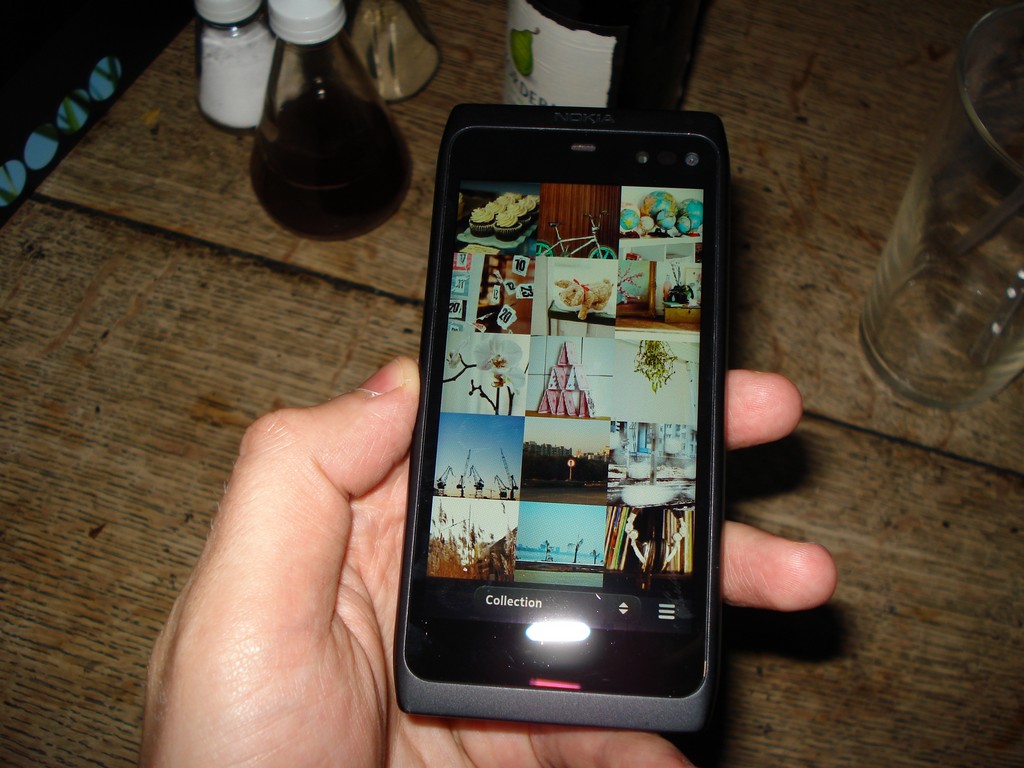
The AMOLED LCD looks staggeringly impressive, and is only matched by the clarity and exceptional view angles of the display. The icons looked extremely sharp on this 4 inch capacitive touchscreen that I’d ultimately consider the best I’ve seen so far on a mobile. A mouth-watering thought is what Nokia will deliver to us when the AMOLED equipped N9 finally hits the market. I can’t wait!
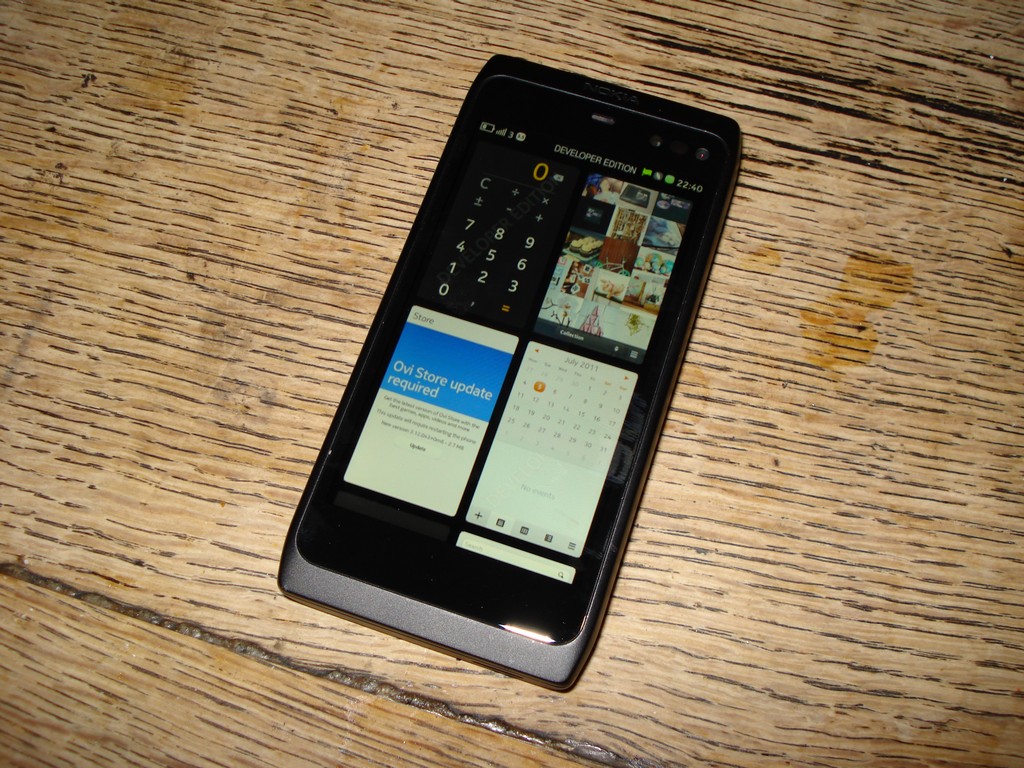
Clinging to the last few moments I had left with the N950 this evening, I peeked into the much talked about MeeGo Harmattan UI that took mobile tech world by surprise. To avoid repeating what has already been said before, I’ll rather focus on my personal and extremely short ‘experience’ handling the OS. The general impression was that the user interface was attractive, well organized and, on top of all, very natural to use. To be completely honest, there was a brief moment when I toyed with the idea to reach out for a non-existing menu or back button on the N950. But the rule of using the OS is beyond simple – the concept of swiping to move between the active applications or returning back to the multi-tasking view quickly fills the mind to stay forever. Focusing solely on the touchscreen to handle the phone not only saves time, but it also keeps the user immersed into the experience for longer. Simple complexity – the new direction Nokia is taking, and I’m more than happy to join in!
Even in its current state, I loved the N950 to bits. It was probably a bad idea for us two to meet in the first place. You see, I immensely enjoy my qwerty slider phones – no matter how big and bulky they might get. The N900 remains my all-time favourite ‘phone’ mainly thanks to the form factor, the physical keyboard and the slick multitasking and customizable homescreens of Maemo 5. And it’s my fear, that the N950 is closest there will ever be to my beloved N900.
But hopefully I’m very wrong. I wish to speak on behalf of all mobile keyboard junkies and N900 fans out there – please Nokia, if there’s a slim chance for us to receive another MeeGo phone next year – please, let it be a consumer version of the N950!







Connect
Connect with us on the following social media platforms.