Review: iWindows for Symbian
This review comes from our reader FireDragon. He installed iWindows on his N8 running Anna. Here’s what he thought.
I was checking this application and I like it so far other than how it looks.
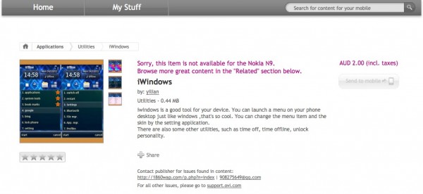
iWindows brings a Windows Start Button to the Homescreen, over lapping the “Option†button. The Start Button’s graphic is horrible for my taste at least. I would like to see it better.
Pressing Start button will bring a menu and I am impressed by the easy arrangement of favorite application and system application. There are other features right under the fingertips such as “Restartâ€
Application is pretty easy and swift, but I didn’t like the fact that I cannot turn it on or off on my will. Once you install it is there to stay unless you uninstall. I haven’t found another way to end it yet. It doesn’t show in App Stop either. No idea its effects on battery either.
What’s missing in the app: Well personally I would like to see a menu of “Contacts†that would allow users to bring most frequently use contacts a step closer.
The menu have 3 theme and personally I didn’t like any of them fit to my taste so with the decent design addition, this application will worth its price for people who would want to keep things more organize in easy and old-fashioned way.
Back in UIQ days, through an amazing UI Designing software GDesk, I made a menu setup for everything and been using it so yes I found this little utility very useful and although I don’t like the look much but I am keeping it.
Like an application? Think others should know what you think? Drop review suggestions or even a review of your own in the tips section and who knows, maybe it’ll get it’s own post.
Cheers FireDragon for the work
Michael
Category: Applications, Nokia, Nseries, Reviews, Symbian, Symbian^3


Connect
Connect with us on the following social media platforms.