Videos and Photos: Nokia N97 and Nokia N86
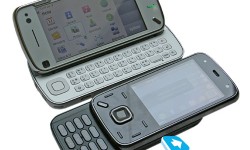
Mobile-Review has some side by side pictures and a couple of videos of the N97 and N86. The text and audio is in Russian, so you may want to use google translator for the text to get a little gist of what it’s about (not that it helped me understand it one bit).
Nevertheless, we can still awe at the pictures.

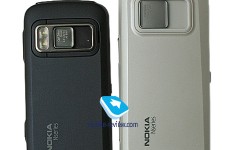
I’m not sure if it’s the colour scheme but from the front, the N86 looks so much sleeker, more professional. From the back though, both N97 nad N86 just look horridly dull and cheap. What’s that about?
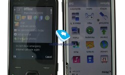
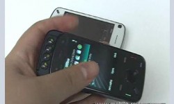
You can get a lot more though from the two videos (embedded on their site). You can see the maturing N97 UI, with the more recent home screen widgets. It looks pretty quick in some areas but frighteningly sluggish in others. The screen though appears very responsive over all. My hopeless wish is that somehow, Eldar is saying in Russian “Ah, yes, Nokia has put a capacitive screen in the N97. Look *squiges fingers around to show responsiveness*”. Haha.

There is also another separate video to show the N86. The phone looked pretty solid and the UI seemed extremely nippy. Very nice to see how the N95 has gradually evolved, refining into this.

Go check it out, there’s more photos of both the N86 and the N97, and of course, you can actually watch the video there.
From Mobile-Review
Category: 5th Edition, Nokia, Nseries, Photos, Touch, Versus, Video






Connect
Connect with us on the following social media platforms.