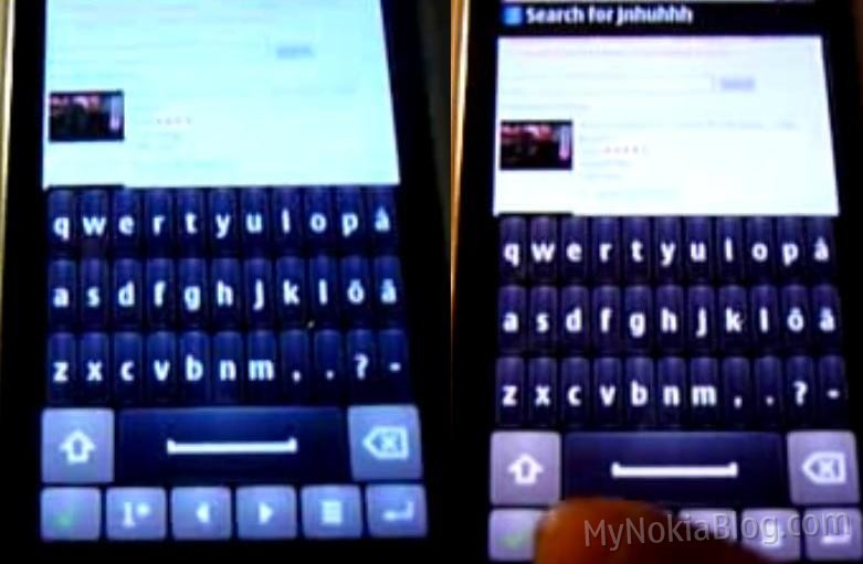
New Symbian^3 Portrait QWERTY and Browser screenshots.
D
 A while ago in October Alex68 treated us to a preview of the portrait QWERTY keyboard. It’s shown above. It was from Alex68’s second video demo on Vimeo (the first got pulled by Nokia).
Jim has tipped us a couple of new screenshots (not sure where from) of the new Portrait QWERTY which seems to have received a little cosmetic changes.
- The first thing you’ll notice is that whilst still parallel aligned, the keys are a little fatter. This maybe more due to the fact that this doesn’t have the additional characters that were previously seen (perhaps on a Finnish N8).
- All the buttons below the QWERTY are shorter, more compact. The Symbols/Number button has 12# instead of 1*.
- Where is the signal/battery/title bar?
- Comma, Full Stop, Apostrophe – main punctuation is there when typing without caps lock. For me that makes sense. The majority of the time I use punctuation is when I haven’t got capital letters. Just take a look at any piece of writing where the apostrophe’s, full stops and commas are placed. If near capital letters, they are before them.
Hopefully when this arrives we’ll see portrait SWYPE in action. BTW after disabling SWYPE, I found I can type really well on the standard landscape QWERTY. Correction seems to be ok (if you pick a certain correction setting) and I can type fairly quickly and accurately. Point: It looks like a right ugly keyboard but it’s really good to use (now anyway).
I’m not a fan of one handed portrait QWERTY unless with SWYPE. Too many errors.
There’s also a screenshot of the new browser, which we can see demoed in this video.
- Address bar at the top
- Single unified URL and Search.
- Persistent back button


Connect
Connect with us on the following social media platforms.