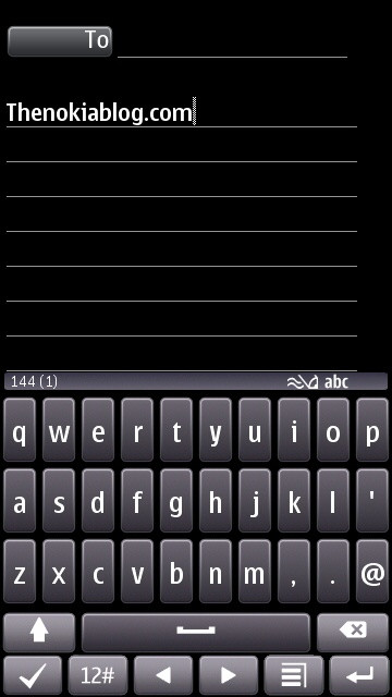
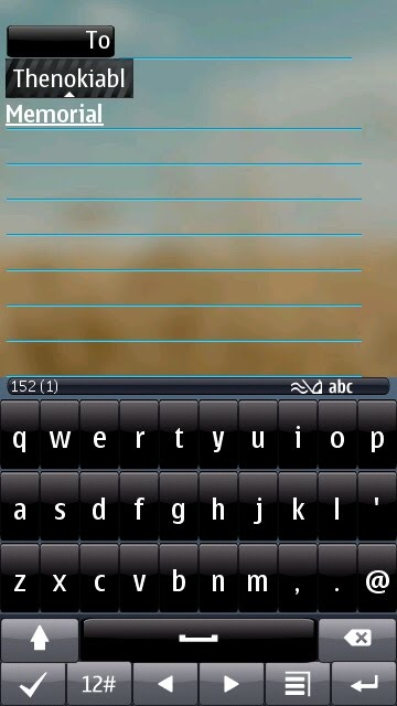
More screenshots of new browser and portrait QWERTY coming to PR2.0
Advertisements
If you’ve been following the blogs, you’ll know we’ve been keeping an eye on that elusive PR2.0 of which is coming a new Portrait QWERTY and New browser (amongst many other things).
Mark Guim at TheNokiaBlog has received some new screenshots.
- The Browser seems to have a new list menu style on top of the other previously seen features, This is actually just the mobile version of Mark’s blog as pointed out in the comments. Ah…blogging on the rush. So many mistakes. Today’s just so Mega busy.
- such as the “awesome bar” aka, search/url bar that is now on top of the window instead of at the bottom
- Persistent back button, and refresh button by “awesome bar”
- Portrait QWERTY looks identical to the last update we saw but this time, shift is off which means you can see full stop and comma (some were concerned this wasn’t in the keyboard at all).
- There’s a new look to the keyboard(may be theme dependent) where the keys aren’t separated. Which style keys do you prefer? I sort of like the look of those bigger keys.
Cheers to mirza for the tip!
Advertisements


Connect
Connect with us on the following social media platforms.