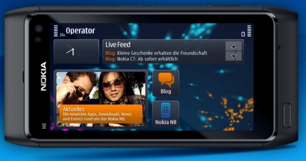
Free Form Widgets – another photoshop fail? Or sneak peek into PR3.0/Belle?
As a follow up to the Symbian Free Form Widgets (that we thought were going to be a part of Symbian^3’s PR3.0/Belle/UI overhaul update.
From the tiny little images, we now have them in full size.
Apart from the clock working, the “widgets” are really just link placements. I don’t know why they would make something like this to tease us. Who ever is in charge of simulated screens, what is it about looking at the actual device and making something representative of this do people find hard to understand? If the widgets are stuck to certain dimensions, make the damned adverts and promotions reflect this. Unless of course they saw something else that suggests this is what’s coming. But then as mentioned before, why is there no bottom bar and why aren’t signal/battery/operator in one slim bar? According to Michael (he’s a reliable source), he commented on the last post that:
this won’t come to symbian anna.. i’ve seen anna on some presentations already, so this will obviously be the next version.
Let’s not get ahead of ourselves and hope for Belle as we haven’t even got Anna yet.
Thanks to Blackidea for the tip!


Connect
Connect with us on the following social media platforms.