Windows Phone 7 (p)review: Mango

I’ll preface this “review†by saying the following. This is NOT final code and there will likely be significant changes and additions to both the aesthetics and performance of the Operating System when the final build is released to OEM’s. Further, the hardware improvement likely to accompany this update, in particular the newer 45nm chipsets should improve user experience significantly. The build used for the majority of this review was Build 7661. Comments marked with “update†were reviewed using build 7712 and the final release to manufacturing build is 7720.
The installation process:
Because the update that I’m currently using is more of a mod as opposed to a pre-vetted press device, my experience may be marginally different than other (p)reviewers of Mango. The installation process, in spite of this “mod†was rather straightforward but by no means short. Before updating, the entire contents of my memory card (yes it works in my device) and the ROM were backed up, all 13 gigs of it. While certainly appreciated, it was a painfully long wait for backup followed by a significant wait for the update to install (on the order of 50-70 minutes for both tasks to be completed).
First impressions:
When the device first boots up you’ll be VERY hard pressed to notice any differences between the old version of the OS and the newer version; thankfully all of that changes with a simple swipe to the left.
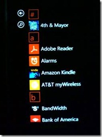
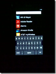
The first thing you notice is the placement of letters in the applications list these are meant to give users an easier time identifying where in the list they are. Whilst scrolling, it’s important to note that the current letter that you’re in is present at the top of the screen. Also, in the event that you have a ridiculously long list, a simple tap on a letter will bring up a jump-list, allowing you to jump to a specific letter. In addition there’s a new search button added to the mix in the event your number of apps exceeds your tolerance for scrolling.
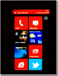
The live tile area as of right now isn’t being used to the extent that developers both first party and otherwise are expected to be using it come fall this year. However, the tiles that ARE available are significantly more responsive, reliable and update more frequently as well as providing loads more useful glance-and-go information. Hopefully with the added developer back-ends we’ll see many interesting uses of live tiles (although, developers seem to be well ahead on that front).
New additions:
One of Mango’s main selling points is the addition of nearly 500 new features and a great many API’s to allow developers to tap into and deliver these features to the waiting masses (definitely not that many people to be perfectly honest).
Search
First up is the most accessible addition and that relates to search. The three main additions are “Local Scout†which is pretty much a faster and better-integrated version of Lonely Planet found on Ovi Maps; Bing Music which is like Shazam except surprisingly faster (both in load time and in song identification), Image searching (finally!) and Bing Vision which is an integrated version of Google Goggles (can’t wait to put this to good use when I travel to Europe) .
Local Scout:
I’ve been living in the same city for the past 4 years and I still haven’t seen most of the supposedly “good†places nearby. Local scout is broken into 4 main “pivotsâ€:-
· Eat and drink
· See + do
· Shop
· Highlights
Local scout creates a list of 20 items, attractions and/or businesses and arranges them by distance (closest is #1 logically). It also collates ratings, price information and addresses for these places. All of which can be navigated to using the turn-by-turn navigation bundled with the OS- more on that later. Local scout though is certainly a much appreciated addition to the OS and I can see myself using it with increasing regularity, especially while travelling.
Bing Music is pretty much like Shazam, tell it to listen to music and it’ll identify the song then you can be on your merry way.
There are of course hooks that tie into the Zune Music Store, though I can’t imagine many of you actually using it. It does the job and does it well, while managing to stay out of your way. Shazam certainly just lost a few customers.
Image search is pretty much like the images tab on Google searches. Nothing special here but nice to finally see it bundled in AND easily accessible (the same can’t be said of other operating systems).
Bing Vision as mentioned earlier is a lot like Google Goggles. Unlike Goggles it doesn’t inhabit a separate space from the regular search feature and while its success or failure in reading text, bar codes and QR codes is very much dependent on the user and the camera in play, the accessibility of the feature will lead to invariably greater use in the future.
Of course, being an internet-dependent service in the case of translation, Bar code and QR code look-ups it will be interesting to see how this technology and other similar ones improve and develop in the future. Did I mention the translate feature ? 😉
Multitasking:
Another one of the big additions in Mango is multi-tasking. Unfortunately it doesn’t quite work for 3rd Party apps, at least until developers recompile their applications for Windows Phone 7.1 (aka Mango) instead of Windows Phone 7.0. As such, the BEST multitasking experience is limited to built-in applications. That said, all indications point towards minimal work at best on the part of developers which will ensure a good experience for end-users.
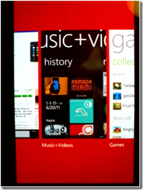
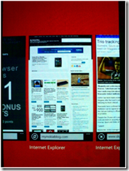
The multitasking UI is called up by a long-press on the “back†key. Unlike WebOS and Symbian, Windows Phone only shows the 5 most recent applications used with this UI. This is NOT to say that these are the only apps paused or running in the background etc. but a conscious design choice to avoid mindless scrolling, especially when there’s no MeeGo-esque pinch to zoom gesture to view more running applications.
Strangely enough (and this relates to Microsoft’s regular user first approach) there’s no visible way to control dismiss an application that’s visible in this task switching UI. Applications CAN be closed by pressing back to repeatedly move through the backstack though it is far from an elegant solution. I can only imagine that Microsoft gave little thought to users that might wish to dismiss applications from this view.
Many applications however, are allowed to run certain tasks whilst in the background. Microsoft has thankfully given users the ability to manage how and when applications can run these tasks, albeit the requisite menu is somewhat buried in the device. Nice to see that they still have some consideration for the more tech-savvy among us.
I won’t cover the specifics of Windows Phone’s multitasking implementation here (especially when I’ve covered it here before) but suffice it to say that it should serve most people adequately. That said, power-users who want to read webpages while simultaneously viewing turn by turn navigation directions while also watching a video should probably look elsewhere.
Windows Live aka MSN chat and Facebook chat:
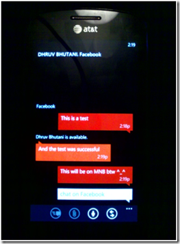
Yes Microsoft recently acquired Skype and that’s all the rage but alas it won’t be making its way to this version of Windows Phone in integrated form. Setting up both Windows Live and Facebook chat is pretty much automatic albeit if you possess multiple hotmail or windows live addresses, only the primary one will work with chat (at the current time at least). Connecting facebook chat requires going to your messenger account on your PC and linking the two before actually utilizing chat. Thankfully the process is barely 3 clicks but it’s still not nearly as smooth a setup as I was expecting. Once done though, chatting with facebook contacts or live contacts is quite a breeze. For better or worse, all threads that are started with your contacts, be they online or offline are housed in the same area.
Threads are grouped together by contact name however, meaning if you have a conversation via text, live or Facebook, you won’t see 3 separate threads in the main threads area. That said, you won’t see online conversations and texts conversations in one chronological thread. Instead they’re kept separated from one another AND there are ever present notifications to indicate which service you’re using at any point in time. I’ve had the service turned on permanently for a few days and I’ve noticed little to no noticeable hit on battery life (probably due to the push notifications used instead of a persistent connection). Frugal data users will also be happy about that little setup.
When a message is sent, there’s no clear indication until you’re in the application itself that the message is a chat or text either via the home-screen or toast notification. Would be nice to know which is received but in the grand scheme of things it matters little I suppose.
In any case, I have little to complain about with regards to this implementation in either form or function and it’s a nice little addition. I’m interested to see how Twitter and eventually Skype fit into the equation but I can’t imagine them being any worse off for it.
Update
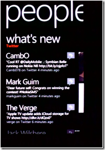
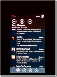
Upon updating to build 7712 I was met allowed to add my twitter account to the people hub. Much like MeeGo-Harmattan on the N9, your twitter timeline is readily available for your perusal. Like the events area on the N9, the What’s new section of the “people†hub shows updates from all your social networks and similarly can be easily filtered by twitter only, Facebook only, windows live only or all accounts.
Twitter is decently well integrated, providing notifications in the “Me†tile of mentions, Facebook updates and the like and allow for fast replies to tweets, comments or wall posts. With regards to twitter, it’s not quite a full suite of functionality; retweets and conversation threads are there but direct messages and “reply all†didn’t quite make the cut. In any case it’s a worthwhile and useful addition to the platform though highly unlikely to replace dedicated twitter applications at least in the short term
NB. LinkedIn is also available but I have little use for it at the current time
Turn by turn navigation
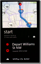
Whilst previously available in a myriad of additional applications, built-in turn by turn navigation finally arrives on Windows Phone 7 courtesy of Mango. Having tried it out a few times, it works. Whilst it doesn’t give as much granularity of control as Nokia Maps does with regards to taking only side roads, avoiding toll roads and the like it functions well enough for regular use.
It doesn’t quite update your location as much as I would like (which I’m sure will be hammered out for final builds) but the general interface and ideas are solid. You’re provided with the exact directions, i.e. which turn to take and distance to that turn, informative traffic information and upcoming directions in text and slightly graphical form at the bottom of the screen and a map at the top highlighting the route and current position.
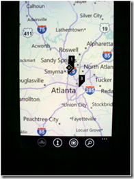
The zoom level of the maps displayed is user controllable (via pinch to zoom of course) but generally varies to give a better idea of distances involved in your journey, closer zoom when turns are nearby, further out zoom when the turns are far away. A nice little touch is the presence of the aforementioned local scout icon just in case.
All in all a welcome and functional addition (powered by Navteq).
Miscellaneous additions
Office and cloud storage
Office integrates better with cloud based storage (though they all seem Microsoft based). I do hope for sugarsync/dropbox access in the near future though. Microsoft also provide 25GB of cloud storage via their Skydrive service and it is seamlessly integrated everywhere in the OS. Pictures, videos, documents can all be automatically uploaded to the cloud and vice versa. There’s even music access.
For even MORE cloud storage, there’s the Windows Home Server Phone connector that allows you to, as it says on the label, connect to your home server from your mobile device. Access there is only limited by your server’s capacity and your mobile bandwidth.
Music and media
The music player has seen a bit of an overhaul to the interface as well. It’s now much more easy to navigate and understand with more vertical scrolling as opposed to horizontal scrolling. There’s the “history†pivot in chronological order of course that scrolls vertically, the “new†pivot, the “apps†pivot where all media related applications (such as possibly Divx if it’s allowed) would accrete and the “Zune†pivot. Nothing earth-shattering but as they say, it’s the little things.
There’s now on-device podcast management, search and downloads and users can decide whether podcast download over 3G, Wi-Fi, or both.
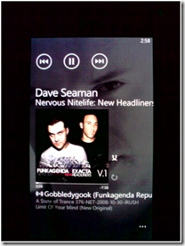
The now playing screen also got a bit of a UI overhaul with all controls readily visible, cutting down on possible confusion for users. There’s repeat, shuffle and rating buttons and the list of upcoming songs is also at hand.
Tapping on the truncated list below the album art brings up the full list which thankfully fades away after being unused for ~15 seconds. Swiping in either direction with a finger on the album art functions as “forward†and “back†buttons and the album art allows you to see what you’re likely to be playing before you remove your fingers.
Tapping on the name of the Album drops you right into the respective artist’s section where you can view their albums, songs, bio(!) and a list of related artists.
You may have noticed a small “play†button with multiple sectors of a circle put to one side this is the smartDJ feature. This lets the music player create a playlist of songs based on a user chosen song or album. It works reasonably well within your own music library and with the most popular songs and artists but the real magic happens when you tie it to a Zune Pass account. When turned on in the settings, it allows Smart DJ to include songs in your little playlist from the entire Zune Music catalog and in reasonably high quality I might add. The small “broadcast†looking icon indicates that the song is being streamed. Streaming works equally well over 3G and Wi-Fi though slower 3G speeds and worse service do result in longer buffering times which are nigh non-existent on faster connections.
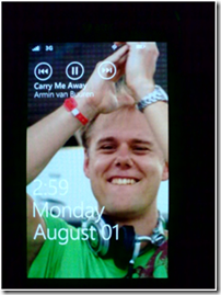
Music controls and album art are visible on the lockscreen for ease of use and aesthetic purposes but unfortunately, there’s no way to jump directly to the music player from the lockscreen. That said, a quick press of any volume key from any application allows access to all the playback controls AND the ability to jump directly into the music app by tapping on the song playing at that point in time.
The only downs in this whole setup are the missing equalizer and audio-altering options and somewhat convoluted playlist creation process. Playlists can be created by selecting a song or album and adding it to the “Now Playing†list. Tapping on the list allows you to save that list as a playlist.
As if you needed convincing, I’ll say this, coupled with a Zune Pass account, the music situation on Windows Phone 7 is easily the best implementation I’ve EVER used. If you need more information on what Zune Pass is, check out this post. If the service isn’t available in your region I’d still say that it’s one of the best implementations currently in terms of functionality, ease of use and simple aesthetic pleasure. I squeal at the thought of a Nokia device with an FM transmitter coupled with this thing.
Performance
The most succinct way of describing performance, even in this beta build, is quick, period. There is rarely a point where I’m waiting for the device to do something and those few points almost always relate to network access and downloading data and even then the device stays remarkably quick, unlike some other devices I’ve used. Transitions are fast and stay out of your way, never stuttering or keeping you from doing the things you want to do, even the loading/busy indicators are tastefully done throughout the OS.
Battery life for the device I’m using is decent enough that I never really worry about running out of juice during the course of a normal day though I can’t say that it’s “brilliant†but it is good enough for me. This however is not a fault of the OS itself but rather the display it’s using. A 4inch S-AMOLED display tends to suck juice like there’s no tomorrow. Doesn’t help that Samsung’s idea of a “low†power setting is what many devices would call 60% brightness and full power is simply blinding, literally.
Other
Changes to the mail app mean that users can “link†one or more mail inboxes together making them visible and accessible at the same time. Further to this is the addition of conversation threads where the mail-box automatically and intelligently links emails from a single user or under a single heading together.
I haven’t had any issues with this so far and it makes keeping track of email conversations that much easier. In essence if you have 4 different email addresses, multiple personal ones and a work one or multiple work ones and a personal one, you can group them together, name them “work†and “personal†and receive separate notifications and have separate inboxes for the two. Again, nothing earth-shattering but it’s a nice little touch.
Contact groups is another minor addition to the people hub, allowing users to create contact groups for quick and easy mass communication. This can be done through text, email or Facebook and I’m certain it’s a feature that some will find great use for. Microsoft has also done a nice little thing in creating a default “family†group which is populated by individuals with the same last name as you “supposedly†based on your phone contacts. Let’s hope you don’t have a lot of friends with the same last name eh?
Contact history is another nice and oft-forgotten feature in Mango, showing quite literally a history of communications and threads with any chosen contact in chronological order. Calls, texts and Facebook are all included here with breaks between threads based on length of time since last communication, form of communication used in the intervening time etc.
The camera can also automatically save user created settings and launches with them if the user so chooses (finally!)
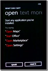
Voice search and commands are somewhat improved now and allows users to literally operate the entire device by voice alone. Want to launch an app? You can do that. Want to search for something? You can definitely do that. Want to make a call and have speaker phone turned on when it connects? Yup, that works too. Want to text a friend? It’ll do that for you without you even opening the messaging app.
Coupled with the rather accurate and surprisingly fast (at least in English) speech to text engine you really don’t need to look at the device much at all to perform some of the most common tasks.
IE9
Supposedly it was meant to bring the browser up to par with the best on the market with HTML5 support and an improved rendering engine. To be fair in terms of performance I can’t quite argue with their claims in terms of rendering speed and accuracy compared to the previous version, the current version scores 95/100 on the Acid 3 test, 141 + 5 bonus points on the HTML5 test which measures how many of the HTML5 specifications the browser meets but says nothing of performance and completing the Sunspider 0.9.1 Javascript Benchmark test in 9631.7 ms almost a 500% improvement in Javascript performance.
Unfortunately this is still some ways behind the majority of Webkit-based browsers on the market, even those using the same SOC. All in all it’s still good enough for most people, mind there’s a rather obvious lack of Flash.
That said, in day to day usage, I want the old version back, just for the UI really. The old version provided 1-tap access to your bookmarks and tab-switcher whereas the current version does away with the icons and hides them in a menu. If you’re reading this Microsoft, bring the old UI back, yesterday; even if it means less visible browsing area, ease of access to the things we want is big deal. That said, each browser window does show up as a separate “app†(much like MeeGo) in the app-switching UI making it just a smidgen easier
What’s missing
I’m sure a few of you have very specific needs that your current or future devices absolutely have to meet in order for you to hand over your funds and fair do’s to you. There are even some that object to supporting the Windows Phone move on the simple grounds of disliking the company, others still on the grounds of “openness†and use those things as negatives when speaking in regards to the Nokia Windows Phone decision but none of those are concerns to me so I will not be considering them as “negatives†or things that are missing from the device of operating system.
Now that that’s cleared up there are a fair few annoyances and missing things that are OS specific, some of which I hinted at in my first review and further here.
Notifications:
Maybe Microsoft feel that live-tiles are/should be enough but it’s rather annoying not having to my notifications without having to go to the homescreen every time. Yes there are toast notifications but these are transient and permanent notifications often take up valuable screen real estate.
Further to this, one cannot directly access notifications from the lockscreen without swiping up then scrolling then finding the right email inbox/texting app/calendar etc. It’s certainly not impossible to implement, especially as both MeeGo-Harmattan and iOS5 do this in pretty damn decent fashion.
Similarly the system tray with battery indicators, network status and a few other things isn’t always visible in the applications that you’re using. Sure one could argue that seeing such things isn’t necessary all the time and they certainly take up useful real estate but making them more accessible is certainly preferred.
Roll better notifications and system tray into the improved volume control setup (which is both a transient UI element AND readily accessible) and users will thank you.
USB mass storage mode:
While the implementation of this feature would very much depend on OEM’s writing the right drivers etc for this, make it an option please, even if it means creating a minor partition in the NAND memory and only allocating that to non-.xap/.exe files. It’s quite a useful feature on Android and Symbian devices and will complement the cloud storage and data accessible everywhere approach you’re currently taking with Skydrive et al.
Video out/Mirroring:
We ALL know it can be done, we’ve seen you guys do it in demos while on stage, make it happen for us. And while we’re on the subject, getting screen caps on this OS is bloody hard. Can’t imagine that making a little utility for us that doesn’t necessitate installing the SDK and/or taking pictures of the screen with other devices or hacks
Multitasking UI and paradigm
I would very much like if I could see more than 5 of my most recent applications at any one time in the app-switching UI, even if the default is set to 5 for most users, the option to see more would be appreciated. Further to this dismissing which apps show up in this view requires having to jump into the app and tapping the back button idly ‘til the app reaches the default screen and THEN closing it.
Themes:
Self explanatory really
Conclusion: I have eaten the forbidden fruit (Mango) and strangely enough I like it, very much I might add. As an OS with a lineage barely a year from launch and ~18months from its initial announcement at MWC 2010 it’s come on by leaps and bounds to be honest. Is it good enough for me? In spite of it’s limitations I’d have to say unequivocally yes. Is it an OS that I’d recommend to my friends and relatives? In the Mango iteration, absolutely and without hesitation, something I haven’t been able to say about Symbian in quite a few years sadly.
As a standalone OS it works and works well but when connected to the full suite of services it really comes alive and is truly a wonderful experience. Unfortunately, due to the limitations of the current Marketplace for applications (not that many locales so far), lack of language support for some rather large regions and services like Zune Pass not being available everywhere your experience with Windows Phone can vary wildly.
It is for this very reason that Windows Phones by Nokia will only be launching in very specific regions and only those regions for the time being. The areas that support the full suite of services will get these devices first and all other markets getting the N9 and other Symbian devices.
That made it hard for me to give Mango an accurate numerical rating as the experiences may vary significantly and my rating will not hold true for many prospective buyers. If you’re in a region with full support for all the features offered with the OS and utilise them with the OS, Mango is just shy of a 9/10 whereas not utilising these features and being outside of the fully supported regions would leave it as more of a 7/10 product.
That said, I can honestly tip my hat to Microsoft for building something competitive, easy to use and user-centric in such a short period of time. Will Nokia succeed with this avenue? Who knows,but I’ll say this much, if it doesn’t it’s not because it wasn’t good enough.
Final Score: 8/10
I’ll also be taking questions in the comments, some of which will be added to the this post 🙂
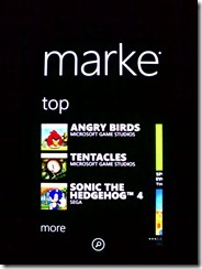
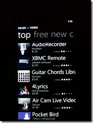
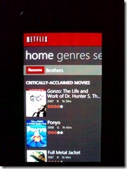
Pictures from around the OS
Category: Nokia

![clip_image002[4] clip_image002[4]](http://mynokiablog.files.wordpress.com/2011/08/clip_image0024_thumb.jpg)












Connect
Connect with us on the following social media platforms.