Video: Another look at N9 camera/gallery and some swiping
Advertisements
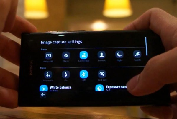
Stylinred has found some more Nokia N9 videos. The first shows the Nokia N9 camera again. Video by sapiensbryan
- Here you can see that within the camera app, you can quickly go into your pictures from the gallery button to review not just the last photo but all the others. I wasn’t sure if it was just the last photo as other demoes (and there were many) didn’t really show it.
- Thankfully unlike all previous Nokia’s this is quick and not a painful wait. I’d much prefer the Windows Phone implementation though where you can just swipe to view the gallery (no button pressing) that would suit this whole swipe UI much better, no?
- Seems to take a little too long to bring up the share option
- But there is a little cool extra where you can just Touch to Share (using NFC to quickly pair and send over bluetooth)
- Switching between video and stills is instant.
- Camera UI as I’ve mentioned (and ranted about on previous Nokias) is wonderful – it’s still packed with features mostly reserved for higher end pocket cams, but the best thing is, it makes all the features so easy to use. No more digging through stupid endless menus. It’s all there, all visible, minimising clicks needed to effectively set up your pics beyond simply automatic.
- The only thing I dislike is the lack of camera button – but I guess this makes the whole touch experience essential and more consistent.
http://www.youtube.com/watch?v=hILoKG7MbXA
This next video, we’ve seen demoed before but more specific to show this feature.
- Different swipe directions – left/right to put an app in the background and multitask it
- Up/Down to close the app
http://www.youtube.com/watch?v=V8o5Ttf6Rdg
Video by sapiensbryan
Advertisements


Connect
Connect with us on the following social media platforms.