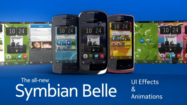
Symbian Belle custom theme effects, “Anna” on 5230 and Animation/UI effects Rant
 As well as all the new and pretty changes in Belle’s appearance, one of the things that won’t come across in screenshots are the lovely new animations/UI effects. These are pretty important as you’ll see in my mini rant after the videos.
Anuj and Jill tipped these videos in of custom firmware in Belle with custom effects. It may be worth comparing to Belle UI demoes from Nokia or hands on of the Belle trio (600, 700, 701).
by andrenlsbr
by symbianworld
UI animation effects. They have to cater for three main things:
- Make the UI look prettier
- Distract the user from any possible delay in loading something
- Give indication/direction to the user as to exactly what is happening on the page.
4. Â animation balances the eye-candy appearance with being appropriate and not over the top (to some going to the point of being nauseating).
5. Animations and theme effects should not hinder the performance of the rest of the phone.
Here’s an example of nauseating. Here you will see some nice effects, but some are over the top like the spinning screens. This is on a 5230, so actual Anna isn’t coming to this handset. But it’s nice to see custom firmwares still pimping its appearance.<
Animation is one of the key things, in addition to the overall appearance that was missing with Symbian. Although you can go between two pretty screens very quickly, an intermediate animation – depending on the context of those two screens, is more pleasing to the eye and more useful for the user.
Examples of this include perhaps digging into menus. Instead of just appearing another layer further down, you see the screens slide to the left. That motion indicates you have moved within the UI. If the animation slides to the right, that indicates immediately you have moved back.
Another example is screen rotation. Isn’t it much nicer when the device’s screen rotates with you? Something live and dynamic like a bubble in a level. Of course it could just switch without that, but it’s just not as nice. It’s worsened when there’s even a fraction of a delay showing a black screen.
Finally, opening apps. You have to indicate that the user’s input is accepted and you are loading something. Blankly doing nothing with no animation suggests to the user either they have not pressed something or their phone has frozen. A wheel as introduced in Symbian Anna is helpful but because you don’t know how many rotations will occur, it’s still somewhat of an annoyance. Something more indicative of a progress bar or a different type of full screen animation to indicate something is happening and to distract would be more welcome.
I could go on. Within those examples the animation themselves have to be EXTREMELY SMOOTH. In 2011, there is no room for stuttering, lagging, low frame rates.
Fortunately these things are mostly addressed and implemented well in Belle. There are more animations, they are appropriate to that context, they are smooth and have not yet displayed lag (not in the Belle Trio anyway). N9/N950 with MeeGo-Harmattan is another brilliant example of animation/UI effects done very nicely (it is pretty much CORE to N9).
Category: Rant


Connect
Connect with us on the following social media platforms.