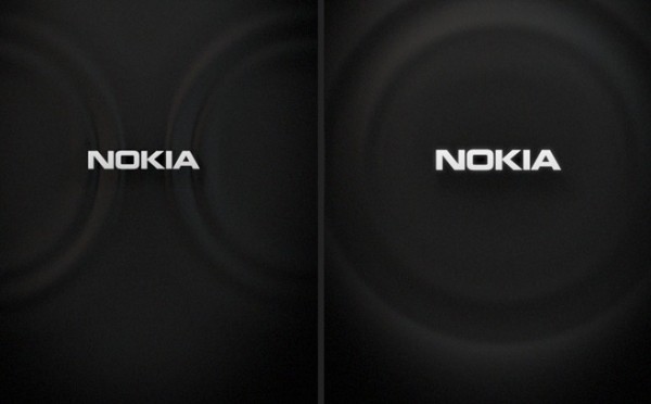
Making of the N9 start up screen
Advertisements
One of the subtle but nice things appearing on the N9 is that new start up screen – that kind of pulse and ripple as opposed to the classic Nokia hands.
It looks very swish and modern, upkeeping with the new age N9. Mark at TheNokiaBlog found an article by the creators of the N9’s start up sequence:
It’s also intruiging to see other design ideas in the making.
Source: TheNokiaBlog Via manvsmachine.co.uk
Cheers DM for the tip!
Advertisements


Connect
Connect with us on the following social media platforms.