Nokia N9 Review – Summary and overall thoughts (Warning: Long read)
Okay so I know I haven’t done the best job out there and I’m the first to agree it was rushed. Mainly because people want to know everything about a phone before they buy it, and seeing as it’s being released already in many countries, there isn’t really the luxury of taking my time. Still, that’s no excuse for poor reviewing. So I’m sorry.
Anyway, I’ve taken Harangue’s advice, and compiled my thoughts into one written review. Obviously, if you want to take a look at each part in the video series, you can check out my YouTube channel.
Contents:
- Design
- OS
- Swiping
- Social integration
- Multitasking
- Calling
- Camera
- Sound Quality
- Screen
- Text input
- Issues
- Overall judgement
1) Design
I know we’ve all heard about how “beautifully simple” the phone is from various Nokia staff, and the fact is, it’s true. The phone has an elegant look, mainly due to the subtle curve in the glass, the laminating over the screen and the feel of the phone itself. It’s the simple things that make it, well, beautiful.
The phone’s body has a slight curve that fits well in the palm of your hand. It allows the user to go across the screen with one-handed use, and it’s an easy and enjoyable experience. Although I thought I’d find having the power button on the side a bit annoying, it’s easy to get used to.
The silicon case that comes in the box is a nice addition. It sits relatively flush with the phone, sitting at under a millimeter above the phone’s screen and about 3mm above the camera. It’s soft yet durable, and doesn’t take away from the feel of the phone. (The main reason why I don’t use protective cases, however, I have purchased a White one with a screen protector and will show it on the site when it arrives.)
2) OS
Although it is an open OS, as a Symbian user, I wish there was more customisation in terms of themes for the N9. I also would have liked the option to disable transitions. I know it makes the UI a little bit better, and there are people who want transitions. I just find that it can give the (false) impression of delay or lag on the phone.
It is easy to use and, if you’re a fan of the N900, there is still a lot of modifications that you can do, once you enable developer mode. Even if you’re not into modifying and hacking your phone, the N9 is still a good all-round smart phone.
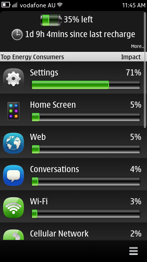
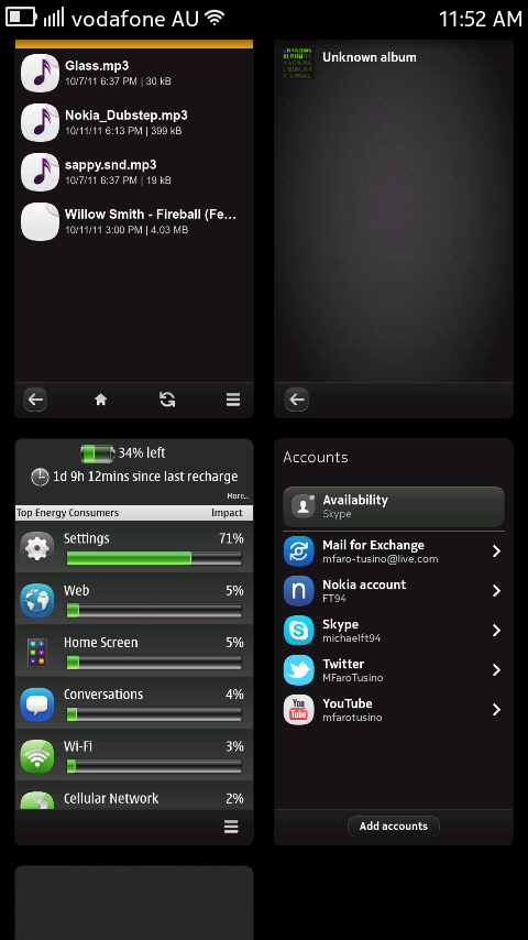
It’s been a bit hard to make a judgement on battery life as I’ve been using it a little more than I would in everyday use, but as it stands, the battery life is still very decent. At first it was poor, but as I’m moving into using it more on a day-to-day basis, it’s getting better. I’m averaging more than a day on a single charge. At the moment, my battery if on 35% being on for 1d, 9h, 4mins. A lot better than my N8 used to be. (I’ll showcase the app below in reviews in the near future.)
 3) Swiping
The swipe interface is something that takes no getting used to. In fact, after I first used the phone, I went to swipe on my N8. It’s such a fluid and easy way of using the phone. Contrary to some of my videos, it’s not that easy to accidentally swipe away. My only issue is misjudging the screen, although when it’s not a black themed app, it’s not that hard.
There is no requirement for the speed at which you swipe, so long as your finger moves from one edge to the other. Some games, I’ve noticed, disable swiping unless the game is paused or you are in a menu, most likely as a way to prevent accidental exiting, like I did on Angry Birds.
4) Social Integration
Many of us use our phones to keep in touch with our family and friends via social networks. I think the N9 does this quite well, mainly with the integration of Social Networks throughout the OS. In addition to the dedicated apps, the ability to share to your networks straight through the gallery is very useful. Having your Facebook and Twitter feeds easily accessible via the Events homescreen is also a nice touch.
The ability to connect your contacts with their Social accounts, is at first a little tricky, as you can’t just “link” like you do in Symbian. You need to allow the network to add the contacts to your phone, then you have to manually merge their contact cards. The issue is that I personally prefer automation. Then again, when things are automatic, they generally tend to go wrong.
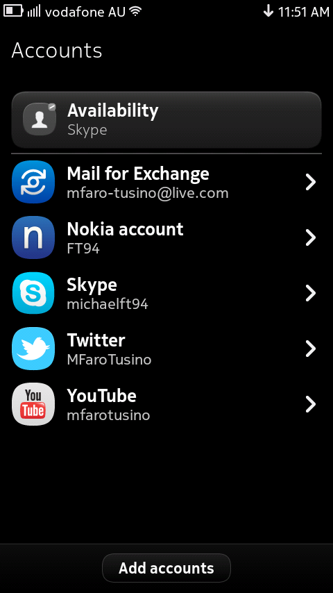
The only thing about having such deep social integration, is the management of these accounts. That’s where the Accounts app comes into it. The accounts app is a good way of managing the accounts you link with your phone, as well as adjusting their respective settings.
5) Multitasking
You’ll probably think I’m lying after seeing my terrible settings video, where the lag was actually painful to watch, but multitasking is quite good. As I’ve learnt, if you limit the number of resource hungry apps (Maps, Games, Streaming etc.), you should have no issues. I suggest enabling “swipe down to close” as it just makes it a lot easier.
The interface for multitasking is rather nice. I like the live thumbnails as it helps when you are loading a few webpages and want to see what’s ready first. It also just makes it that little bit nicer to use. It’s hard to explain, but for those that have used the phone, they know what I mean.
6) Calling
I’ve made quite a few calls on it already and so far it’s been pretty clear. When I have issues it has coincided with poor network coverage, so I believe it’s service and not the device. Not only do I hear the person on the other end well, but I’m yet to call someone who has had trouble hearing me. Like stated in my reviews, the only thing I’m disappointed about is a lack of smart dialing and video calling.
7) Camera
The camera has been better than expected. It does a great job in low light conditions and I’ll make sure I showcase some photo samples in the weeks to come. The ability to choose a manual focus point is the feature I like the most. Adds a little more professionalism in my opinion.
The video recording is implemented well. I like the fact that continuous auto focus is a lot more noticeable than on the N8 and the focus box is present during the entire time you record. The focus box is initially white and after it focus, turning blue. This is very helpful, especially when filming close-up videos (like phone reviews).
8 ) Sound Quality
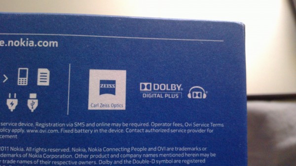
Although I haven’t used it intensively for music playback, the sound quality seems to be good. It has depth and doesn’t sound tinny. The “Dolby Digital Plus” isn’t just a badge they put on the box, you can notice the difference. (Will compare audio with N8 soon.)
9) Screen
The first big difference for me was the screen size. It feels a lot bigger than the N8 and made it so much better for watching YouTube on my phone. The fact that it is bigger, also made it easier to type using the portrait QWERTY. (That and the fact, the buttons are bigger and the keyboard is set out better, removing redundant buttons.)
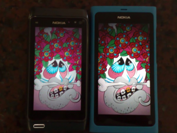
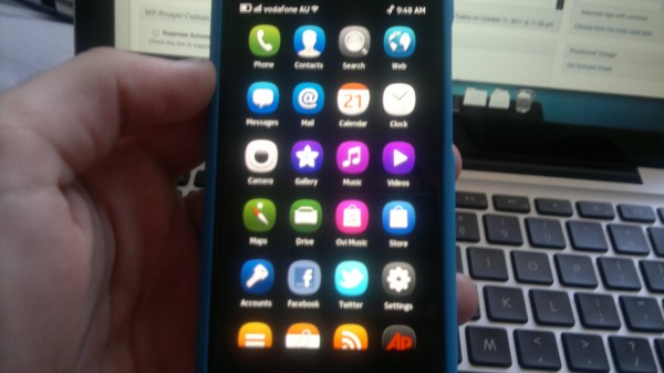
The screen is very clear and vibrant. A lot nicer than the N8. I know it’s not the best photo (used my N95), but you can still notice the difference. When I first turned the N9 one, and even today, a week later, I can’t get over how fake the app icons look. They are so crisp that, with the aid of the laminated screen, it looks painted on.
Even in direct sunlight, I find the N9’s display is still good. That is something I found a struggle with my N8. Too often I’d be under the sun and the screen was just way too hard to see. So far, I haven’t had this issue with my N9.
 10) Text Input
I haven’t touched on this in any of my reviews so I thought I should give it a mention. Firstly, there is NO SWYPE and NO T9 ALPHANUMERIC input.(Just to clarify, Swype will be coming to the N9, just not yet, but you can find a demo of it by MicahelxHell on youtube.) For me, Swype is no big deal, but after years of Nokia’s, not having Alphanumeric is a bit daunting. Thankfully, the QWERTY is good enough (unlike Symbian). Like I mentioned above, bigger screen has meant easier typing, at least for me.
The ability to change your input language (once enabled) by simply swiping across, is pretty cool. Again, it brings the whole “swipe” gesture into the OS, aside from multitasking. Swiping on the QWERTY comes into play again, this time to remove the VKBD. I know in a video I mentioned it gets annoying sometimes, as it’s hard to remove the KBD. I was wrong. After a comment from one of our readers, I reviewed those Nokia Australia N9 videos, you simply swipe down, and it disappears. However, you need to give it a real flick, otherwise you’ll type something.
11) Issues
Although I absolutely love the phone, and would definitely recommend it to anyone. There are still things that I would like to see in future updates, as well as things that I think could have been done a little better.
The first being the use of the Front Facing Camera. Why is it there if it is not supported natively? Why is there no option in Camera to use the secondary camera? Why not include Video Calling in Skype? I know Peregrine, a Skype client, is introducing Video Calling in their next update, but in my opinion, it should be native.
I would like to see WLAN done a little bit better. I’ve had the issue of the network disconnecting, while my N8 stays connected with full strength. When I reconnect it, the network is fine. This has mainly been happening towards the end of the battery cycle, so it may be a power saving issue. (I do have power saving mode enabled automatically at 10%.) Still on the topic of WLAN connections, there has been an issue with automatically connecting to selected networks when within range. Again, not sure if it’s me or the FW.
Being a relatively “open source” OS, you would expect to have access to the phone’s system in some way. What I’m trying to say is Nokia should’ve included a File Manager. Although with developer mode, you can code your way into deleting, renaming or moving files etc., the majority of users don’t know how to do that. Thankfully, I’ve found an app that does what I want and quite well too. (Another one I’ll review for you.)
Not sure where I read it, but at one stage it was noted that the N9 would support USB OTG and HDMI Output. I wish this were true. Would’ve been a nice feature to have, but I know it’s not necessary.
12) Overall Judgement
Despite the few issues I’ve noted above, and those that may have come through in my videos, it’s still a very good phone. I like that the boot time is fast and I can start using the phone almost straight away without any lag (unlike N8). I believe there is a good compromise between features, speed and good design. For those who don’t mind spending that little bit extra I think the N9 is a suitable choice and, from personal experience, is a good upgrade from an N8.
I’m sure there is a lot more to cover but I think I’ve written WAY too much, and that’s the main stuff. Hopefully I can bring you some more reviews soon. Am currently deciding to do a Multitasking pressure test (based upon the outrage of lag on my settings vid), comparisons between N9 and N8 (camera, video, web) as well as an OS comparison (MeeGo Harmattan vs. Belle vs. iOS vs. Android) of various features. I promise I wont rush them so please give them a chance, and be patient as I have exams for the next few weeks, so they may take time. Thanks for reading and again, sorry for the shit reviews.
Michael
Category: Battery Life, ideas, MeeGo, Nokia, Nseries, Rant, Reviews



Connect
Connect with us on the following social media platforms.