User Comparison of Nokia Lumia 800 and Nokia N9
We got contacted the other day by Richard White who wanted to share his review on the Nokia Lumia 800 and comparison with the N9 with our readers. Rich has been a long time Nokia user since the Nokia 3210, a Symbian veteran with the likes of N95, 5800, N97 and the uber cool Maemo 5 powered Nokia N900. He has also owned the Windows Phone powered Samsung Focus and the Android Samsung Galaxy S2. The focus (like my Omnia) to try WP and the SGS2 as insurance replacement of a broken N900 (though he had since bought a replacement one. Anyone who has owned a N900 know how important it is to still have one :P). Rich is not new to the blogosphere, he also writes for booredatwork.com and can be followed on twitter  @richwhite08
Now onto the review:
Introduction: The device Nokia needed
Despite retaining its position as the largest handset maker in the world, Nokia’s marketshare has dropped significantly in the past few years, with increasing numbers of people dropping Symbian in favour of the iPhone or Android. When CEO Stephen Elop announced in February that Nokia would be adopting Windows Phone as its new primary platform, opinions were divided. Part of this division was based on the announcement of the N9, with many considering MeeGo to be a better path to follow as it would allow Nokia not only separation from the competition, but also total control over the software on its phones. With the launch of the Lumia 800 running Windows Phone 7.5, aka Mango, consumers can now decide whether they think the decision was justified – and whether they will make a return to Nokia handsets.
This review is based on the user experience of both the Lumia 800 and the Nokia N9 to offer an opinion on whether Nokia was right to jump to Windows Phone or if the Finnish giant should have stuck with MeeGo.
Overall: stunning hardware, fresh software
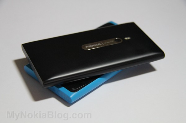
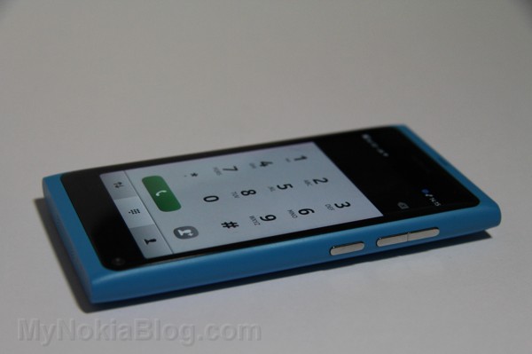
The design of the N9 was a major hit with reviewers, offering a sleek unibody exterior with no joins or seams to be found anywhere. The screen is slightly convex, providing improved viewing angles, and the Clear Back Display displays colours brilliantly even in direct sunlight.
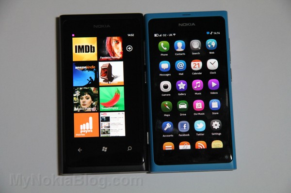
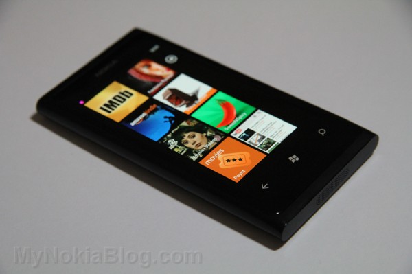
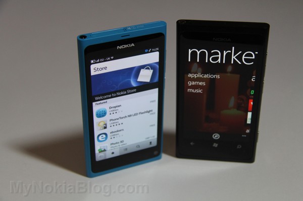
The N9 is slightly more striking than the Lumia 800 because it lacks any buttons on the front at all, whereas the Lumia has the obligatory three Windows Phone buttons, albeit capacitive: back, home and search. The N9 also boasts a front facing camera and a charging light, both of which would be welcome on the Lumia 800.
Both devices could be heralded as the devices Nokia fans have long been wanting. The N9’s MeeGo is completely new and fresh, but still has hints of the N900’s Maemo 5. Boot-up time for the Lumia is mere seconds, and miles faster than the N9. Both Windows Phone and MeeGo are departures from Symbian, with streamlined and easy to understand menus and a noticeable lack of lag. In day-to-day usage, though, the Lumia 800 has the edge: in my time with it there has been no lag whatsoever, despite a populated home screen and lots of installed applications. In contrast, the N9 is prone to stutter when scrolling the list of apps even without having anything new installed. It’s still a very quick device, especially when playing games, but it isn’t the faultlessly smooth scrolling experience that is offered on iOS and Windows Phone.
Â
Social Integration
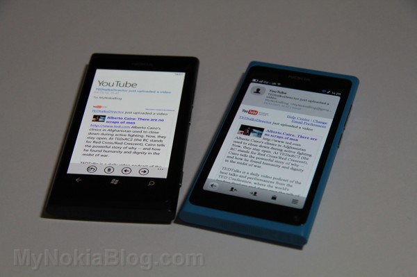
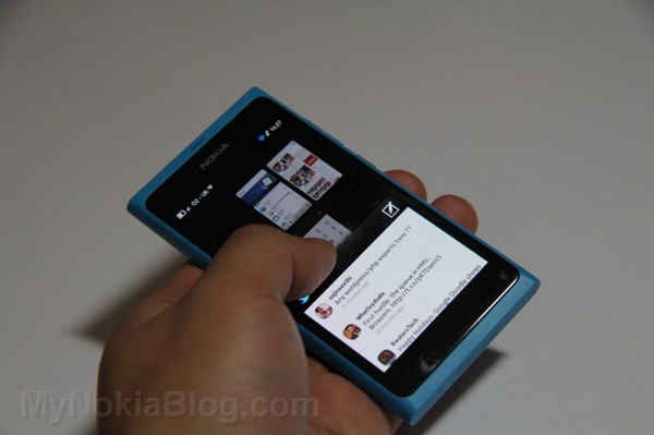
Both the Lumia 800 and N9 are social powerhouses, allowing the user to add various accounts. The N9 currently offers more though, with Skype, Picasa, Flickr and YouTube being in the native accounts list. The MeeGo device also has a native feeds client, so you can keep up to date with your favourite blogs and news outlets easily and quickly, even having the option to have new feeds pushed straight to the events homescreen. Aside from feeds, Facebook and Twitter streams are updated so you can see the latest happenings without opening the respective applications, and notifications for everything appear above the feeds. This screen also has a weather app located at the top, and tapping this will give you a ‘lifestyle’ option, where you can see the forecast for walking the dog, jogging, or even having a migraine or being affected by your arthritis.
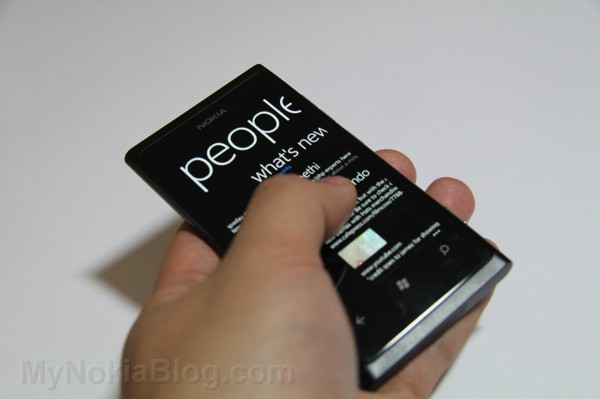
The Lumia 800 offers support for Twitter, Facebook, LinkedIn and email accounts. While it doesn’t (yet) offer the same amount of social services as MeeGo, it’s still the winner for this category because the quality of the services is better. When you link to your Facebook account, for example, you can merge contacts in your address book and your Facebook, then if you turn off having your social media friends in your address book the phone still shows the ones linked to your contacts – meaning you can see the latest from the contacts you want to, without having hundreds of friends clutter your list. The address book, known as the People Hub, allows more functionality than MeeGo, too. If you scroll to a particular contact you have the option to write on their wall, see their latest status updates, who wrote on their wall and their latest photo uploads. Similarly, the Me Hub will give you real-time updates of who has mentioned you on Facebook, Twitter and LinkedIn, and lets you respond immediately – without opening an app.
This level of social integration is what separates MeeGo and Windows Phone from iOS, which has always had quality apps for social media but still lacks any true integration of it. While iOS5 integrates Twitter to the degree that you can share anything, this is also present in MeeGo, Windows Phone and Android, and the truth is iOS still is limited when it comes to having comprehensive fields in the address book. Moreover, it is precisely this level of integration that allows Microsoft to talk about “Your world at a glance†– whereas other phones require you to install applications and open them to have notifications or contact someone, Windows Phone lets you do it all right from the homescreen, making it all quicker and much more seamless.
SMS inbox now a communication hub
Â
With Maemo 5, Nokia introduced a true communication hub by having online conversations (such as MSN Messenger and Facebook Chat) stored in the inbox alongside SMS conversations. The N9 continues this as does Windows Phone, but the latter takes it a step further by storing all communication with a particular contact in one thread. This means you can be talking to your friend Joe on Facebook and when he goes offline you can continue the conversation through text messaging, and it all shows up seamlessly in one thread.
It’s a simple touch, but it’s one that makes us wonder why it hasn’t been implemented before. As phones are communication devices, it’s a touch of brilliance to offer such a simple and obvious improvement over the competition.
Browsing and email
Both of the new Nokia phones have great browsers. Neither play Flash, but rendering, scrolling and pinch-to-zoom are quick and smooth, which will have Symbian users around the world releasing a sigh of relief. Website content fits to the screen and a double tap will enlarge that particular area.
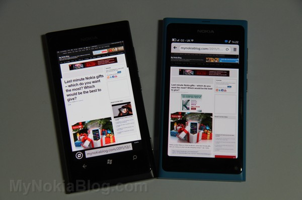
Microsoft developed the Lumia browser, so credit for improvements over Symbian can’t go to Nokia on this one. It can, however, for the N9. It’s perplexing that Symbian has the cumbersome and painful to use browser that it does considering the exceptional one the N900 had – the Maemo 5 device’s browser had a cursor allowing for hovering over drop-down menus and rendered pages like a full desktop browser. The N9 isn’t quite so advanced, but it’s easily on par with others. It is quick, both to render and for navigation, streamlined and tapping the address bar will bring a list of your most-visited sites as well as letting you enter an address or search the web.
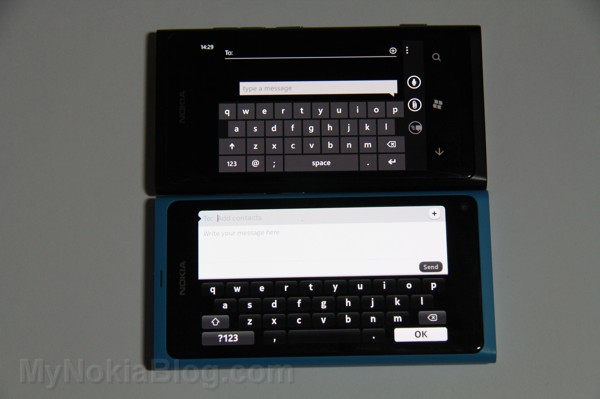
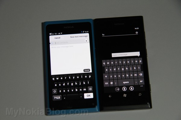
The Windows Phone keyboard is a joy to use, and the Lumia 800 is probably the first phone without a hardware keyboard that I enjoy typing on. As with the browser, credit for this must go to Microsoft and not Nokia. The keyboard is uniquely designed in that it predicts what letter you will type next and slightly enlarge it, making typing more accurate than it can be on other devices. It has an excellent auto-correct that is only rarely wrong, and unlike the iPhone it offers more than word when it makes suggestions – the bolded one is what it will correct to, while the others can be selected manually.
The N9 keyboard is comparatively weak. Oddly, it takes up a minor amount of screen estate, which is good for composing long messages in a text field but can make typing difficult. It has auto-correct off by default, and when first used out of the box is cumbersome and difficult. After a few seconds in the settings menu and a few tweaks, though, it becomes much more manageable and it becomes easier to type quickly. The main drawback, however, is that the space key is narrow, meaning the full-stop button is often pressed instead.
The email clients on MeeGo and Windows Phone are both very good, although the Windows Phone’s edges out MeeGo’s because it offers threaded messages and the N9 doesn’t. This reduces clutter and makes it much easier to find a message as it removes any need to open countless emails to find the one you want.
The main drawback regarding emails on Windows Phone is its peculiar feature of disconnecting the Wi-Fi when the phone is locked. If you have data enabled, it automatically switches to that – if you don’t, then basically you go without emails. While it isn’t really a problem in terms of receiving emails if you have a data plan, the fact is that Wi-Fi consumes less battery than 3G, so it isn’t the battery-saving measure Microsoft claim it to be. Conversely, the N9 keeps the wireless connection active while the phone is locked and so emails and messages from Skype, Facebook and so on continue to be pulled down.
Marketplace (Metro apps)
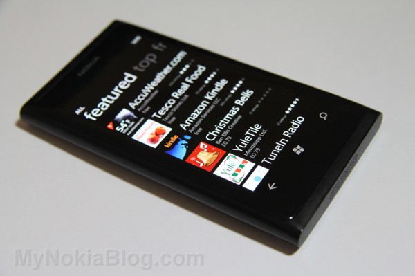
One of the biggest criticisms of Windows Phone is its lack of apps compared to Android and iOS. As it stands today, there are over 40,000 in the marketplace and most of the main ones are covered. From that perspective, the majority of users will not find it a problem. The biggest issue will probably be for those used to the iPhone App Store who enjoy using quirky apps like insta.gram or playing games specific to that platform.
Aside from actual numbers, what separates the Windows Phone applications from their counterparts is the way they are done: the Metro interface. Whereas other platforms require the user to press the screen to go to, on Facebook for example, messages and notifications, Windows Phone does it all with a swipe. The approach is far more intuitive and takes away the frustration of trying to tap a button that isn’t responding due to its small size. When using a Twitter application, the user swipes to see timeline, a swipe to mentions, and another for messages. This approach is used in all applications, and is a pleasure to use. One of the pains of the Galaxy S II’s 4.3†screen was needing to use two hands in order to reach an icon in either of the left corners, but on Windows Phone a larger screen size will usually not inhibit usage, because it only requires a swipe.
This interface is similar to the N9, except the N9 swipes in and out of apps but still requires pushing a button to open something within an app.
Streamlined menus
Â
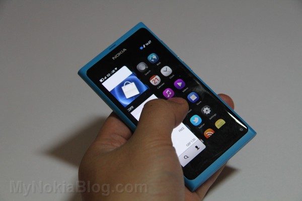
A strength of both Windows Phone and MeeGo is the easy access to everything. Fans of Android point out that it can be customised so you can have your favourite thing available quickly, and this is true. It is also true that iOS permits moving icons to the first screen and having apps and games in dedicated folders. What hasn’t been addressed, though, is how users of both operating systems need to scroll through multiple pages to find something that isn’t immediately available. MeeGo solves this by having just the one page, and Windows Phone has the start screen with user-defined content, and the app list, which lets the user filter by typing the first letter to bring up everything beginning with, for instance, ‘B’, or typing the entire name of the app. By categorising alphabetically the user can find things much faster than scrolling through menus. Critics of Symbian mentioned that it had a home screen, then the first menu level, then folders to get elsewhere, then further folders, making it sometimes difficult to find something in particular. This is rectified in both Windows Phone and MeeGo, with everything available almost immediately – although once again Windows Phone has the edge because it not only categorises alphabetically, it has multiple ways to find an app quickly.
Conclusions
It’s difficult to pick a winner out of the two devices. Both phones are stunning to look at, but they are different under the hoods. The N9 has a front-facing camera and charging light, but the Lumia 800 has a faster processor. In actual usage, the Lumia 800 is much more fluid while the N9 stutters in places, but the N9 offers more flexibility – it supports almost all media formats, allows Bluetooth transfers, can be used as mass storage for dragging and dropping of content from computer to the device, the multitasking is second to none as it behaves like a computer in that it keeps things open until they are closed.
At the end of my time with it, my opinion is the N9 is the experience that all phones should have, as it is so intuitive. It’s not until using it that it can be realised how obvious it is that a swipe to exit an application is a better option than adjusting your hand position to hit a button. Similarly, swiping to see the open applications and even closing them by swiping from top to bottom of the screen. Swiping from bottom to top will show a dock similar to iOS, with phone, messaging, camera and web; in other words, the most commonly used applications so the user can access them quickly without swiping to the homescreen then swiping to find them. The N9 is unlocked by double tapping the screen, and having got used to this I found myself repeatedly tapping on the Lumia’s screen to unlock it – which isn’t implemented, but hopefully will be in the future.
Despite that, the Lumia 800 is the device I found myself reaching for most of the time and the one I would say is the better overall. In general usage, it is more fluid and feels more polished, complete and often more intuitive.
However, it seems so obvious that there needs to be a merging of features. As Nokia’s agreement with Microsoft allows them to make adjustments to the software, it would be a huge benefit to Nokia and Windows Phone as an ecosystem to implement things from MeeGo, namely double tap to unlock and swipe to exit applications. As Windows Phone is centred around swiping to get things done, it’s an addition that is begging to be included – and Stephen Elop has stated MeeGo’s swipe will live on in future Nokia devices, so perhaps this will happen.
A third screen displaying the events view would also be welcome. This would mean Windows Phone would have its tiled start screen and app screen like it does right now, but a further screen with weather, centralised notifications and feeds from Twitter, Facebook and blogs.
Both phones are extremely capable and worthy of anyone’s money, but for those lamenting the discontinuation of MeeGo, certain additions to Windows Phone will certainly help it regain control of its dwindling marketshare.
Category: MeeGo, Nokia, Video, Windows Phone




Connect
Connect with us on the following social media platforms.