My Dream Nokia #49: Nokia Lumia PureView 920, Windows Phone 8 Concept
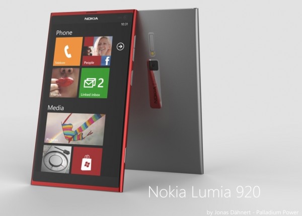
At first glance it might just seem to be your standard Lumia 800/900 design. Well yes, but this is so much more refined. These are designed by Jonas Dahnert
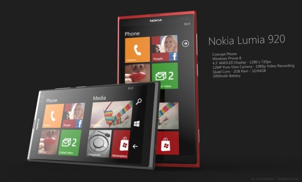
First and foremost, let’s look at the specs:
- 4.3″ screen
- 720p resolution
- 12MP PureView
- Quadcore
- 2000mAh battery
- 1080p video
- WP8
- (Xenon, Curved display, front facing camera)
The design is very eye catching. I know some say that the N9 seen from last June is an old design now. I’d say there’s some life left in that design which the world deserves to see live in in Nokia’s Lumia smartphones.
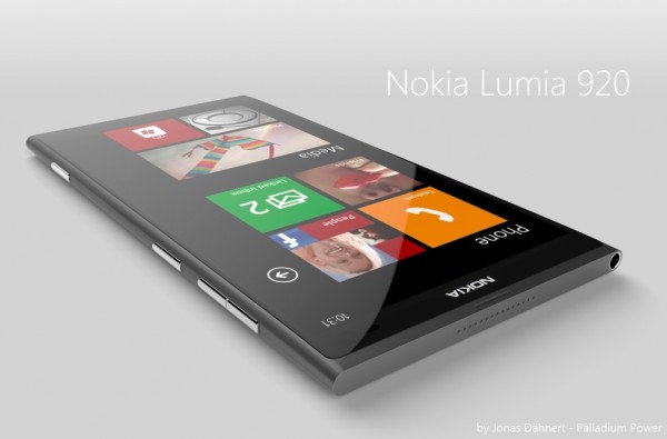
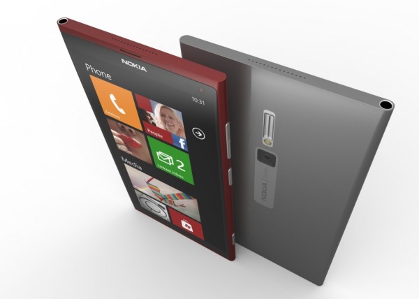
It features a curved screen – something that might add extra weight and possibly some vulnerability on a screen this large. Undoubtedly looking gorgeous though, right?
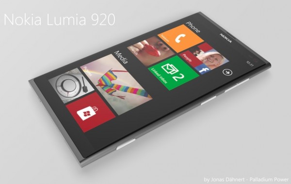
You’ll notice that there are no buttons. It’s much more N9 style. It’s just  you and the screen. However, like Windows 8, they do make an appearance (possibly contextually or with a swipe.
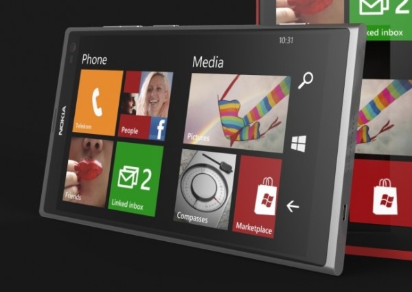
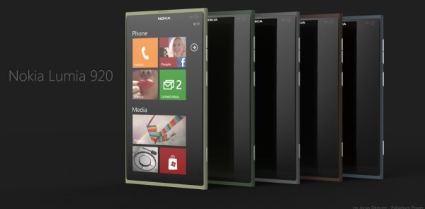
Also note how the tiles are more like W8, separated into little categories. There’s also a landscape view. This. I want this. Â This tile grouping is available somewhat via an app called New Groups.
http://mynokiablog.com/2012/01/22/lumiappaday-68-new-group-demoed-on-the-nokia-lumia-800/
The back still has that metal piece though it now proudly says Nokia again. Having said that, it was always good to hear people mention Carl Zeiss optics over and over because of it. We can also see what looks like Xenon flash with LED assist. If only such things could fit in a diminutive frame and be decent.
Although I want to see a new Nokia design (complete one colour, no visible seam, everything a smooth obsidian black, screen only visible when it’s on) this design is seems to be winning the crowd for Nokia. It’s something that you can’t just get back from specs (unless of course you just try to copy these designs from Nokia, which is happening)
The available colours are not so bold, possibly more understated and classy? I’d still like to see that Cyan though.
About “My Dream Nokiaâ€
I’m sure you’ve dreamt up your PERFECT Nokia device/UI. What it would look like, what it would feel like, what features it would have. Why don’t you share it with the world? Or at least with other Nokia fansÂ
 .
It could be your own photoshopped or rendered work (seriously, you don’t need mega skills in either, basic paint job is often enough to convey a concept) of your dream product.
SEND this in similarly to tips@mynokiablog.com with the title “My Dream Nokia†and perhaps the model number (and a little description, maybe a few specs in the message area? Though this bit not necessary).
Who knows, maybe an image might flutter over to Nokia and through whatever route end up being real.
Source: WP7App
Cheers Fireshutter for the tip!
Category: Concept, Dream Nokia, Nokia, Windows Phone



Connect
Connect with us on the following social media platforms.