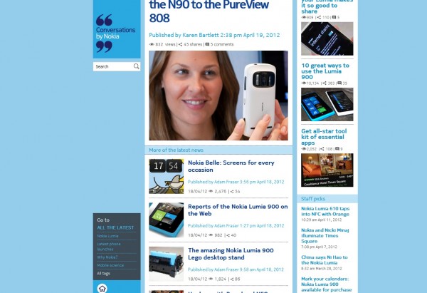
Tiles be gone – at least from Nokia Conversations layout
Advertisements
Nokia Conversations has finally gone under site design that makes all its stories more easily accessible.
Previously they turned the site into a tile-fest, but made some errors by having the homepage display one story only. Also, they seemed to have gone tile for the sake of it (and not the Metro style tile). Some of the Nokia bloggers were just complaining about this the other week. Squares/rectangles aren’t the issue, it’s how they were implemented. Remember the new Nokia Connects site? They had a recent facelift too that made their news even easier to get to (it was already in a linear format).
Thanks  Marc Aurel  for the tip!
Advertisements
Category: Nokia


Connect
Connect with us on the following social media platforms.