Weekend Watch: Vibrance vs Saturation (and white balance)
This isn’t a directly Nokia related video but being a crazy Nokia fan  everything somehow ends up being Nokia related anyway.
So, the connection here is the ‘trouble’ Nokia’s having regarding colours. Most recently in the Nokia Lumia 920 they’re sometimes accused of having overly saturated colours. Quite surprising since Nokia’s always been known in the past for having the most natural colours (to the point, some would say they looked dull. Though you could ramp that up in settings). It’s odd hearing some reviews where they point out the iPhone as being the truer colour. For some reason, the iPhone’s over saturation was still preferred as the colours ‘popped’ and now it’s the opposite.
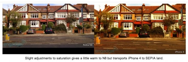
Here’s a filter that we put on some N8 images in the past.

N8 top, iPhone right, N8 edited left
Here’s a video that explains the difference between Vibrancy and Saturation (in Photoshop).
Vibrancy boosts colours without affecting hues that you’d find in skin tones. Useful when you have people in your pictures. If you don’t, then saturation adjustment might be better. It would be easy enough to do this manually but time consuming for the masses. Perhaps the use of face detection to detect a person might help?
If you’re a fan of using either photoshop, or perhaps Nokia Creative Studio or Fantasia Painter, or the N8’s in built picture editor, this might help you when adjusting those colours.
Here’s a similar video:
These are fairly basic tips that newbies like me might find useful.
I find the over-saturation in the 920 inconsistent. Sometimes it’s there, sometimes it isn’t (Seems to be an age old Nokia thing where colours vs Sony E – the main contender in the Nseries days, were somewhat always colder up until the N95). Video with the 920 is a little more erratic. Turning automatic white balance off helps. Though I guess that’s another topic.
Slightly more advanced, more for movies:
Category: Nokia


Connect
Connect with us on the following social media platforms.