Concept: Redesigned Whatsapp for Windows Phone
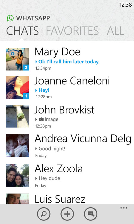
For many of you guys out there (yours truly included), Whatsapp is an essential app in our everyday lives; I for one use it much more than the actual messaging hub on my phone. Unforuntaley the Whatsapp on WP is close to garbage, sure they’ve made some interesting updates and worked hard; but it does indeed still suck (on occasion). Below is a concept that very subtly changes the UI in the app, but makes it look so much prettier and efficient.
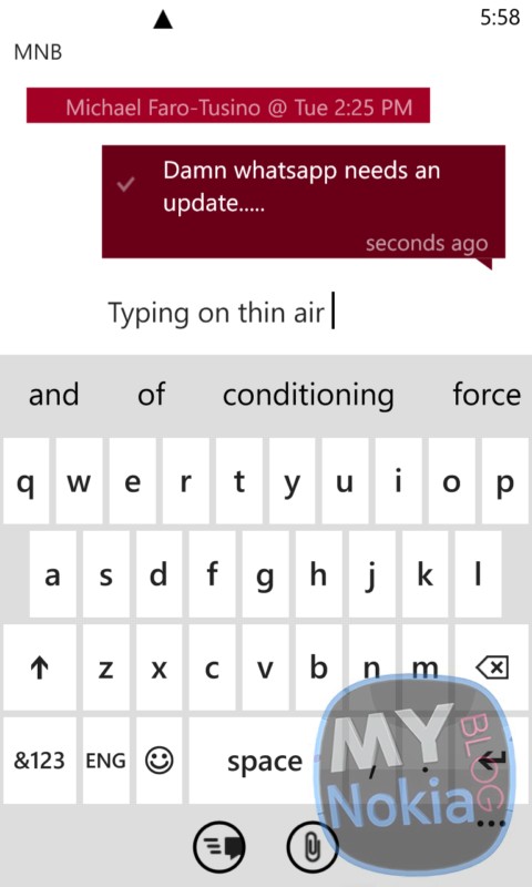
The app utilizes a lighter background instead of the dark/following whatever  you’re using; however at the current time Whatsapp is nearly unusable in light theme, as you can see in the image below where the text box is invisible, and the background looks absolutely ugly with its plain look .
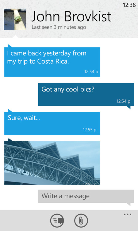
The concept also uses a textured background similar to the Whatsapp splash screen, however I’d prefer for the full background to be textured and not just the navigation panes on the top (similar to the Android client).
Also present are larger profile pictures, and smaller fonts for the pane navigation, as well as larger image previews inline when an image is shared (something that’s coming in the next update).
 What I’d actually like to see (as I’ve said before) is deeper integration of Whatsapp into the OS itself, possibly even into the messaging hub, like Facebook chat (but we all know that’s not happening)- For some reason even BB10 doesn’t have Whatsapp integration into the BBHub, which would’ve been awesome..Shame.
So what do you guys think of the concept, yay or nay?
Check out more details about the inspiration and changes over here:
http://blog.andrescanelones.me/post/52150496229/redesigning-whatsapp-for-windows-phone
Category: Applications, Lumia, Nokia, Windows Phone


Connect
Connect with us on the following social media platforms.