Review: Nokia Lumia 925
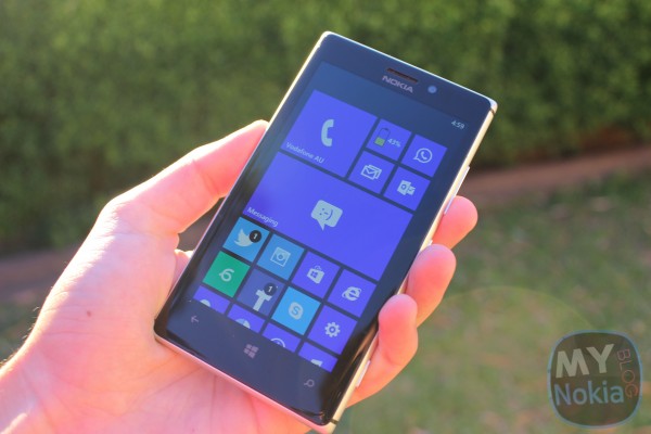
The Lumia 925 is one of Nokia’s latest flagships, and as such, does not disappoint. The Lumia 925 rocks a 4.5″ AMOLED PureMotion HD+ screen, 8.7MP PureView Camera with Zeiss optics, and a front facing camera at 1.2MP. It’s got a 2000 mAh battery which will; get you through the day. 1.5GHz  processor and Adreno 225 GPU, provides you with a fast and fluid experience, and some impressive graphics. Sadly though, the 925 only has 16GB (32GB models are available in some regions however) which can be quickly filled up with music, apps, and the amazing photos you’ll take with this thing.
Being a Nokia Lumia, you get access to Nokia’s bevy of exclusive apps, as well as the entire HERE Suite of location services. Roadtesting the Lumia 925 on my trip to Europe was possibly the greatest way to put the device through its paces. HERE Maps was definitely THE thing I enjoyed the most. Having downloaded the Offline maps of the cities (and in some cases the whole country) I was visiting was extremely handy. Getting lost in Stockholm, I just whipped out the Lumia, got a location fix, and found our way back to something familiar. Navigation wasn’t the only awesome thing included with HERE. Being able to open a list of places near you was super cool. On a night out in Paris, we were looking for a nice restaurant to go to for dinner. Not knowing where anything decent was, once again, I took the 925 out of my pocket, and boom! Found a whole bunch of places. Neat huh?
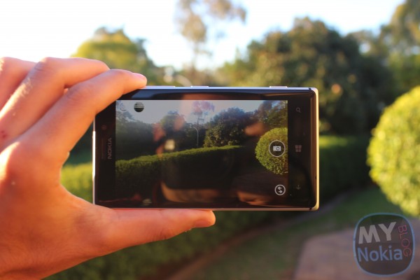
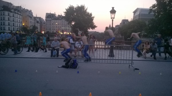
Equally as impressive, and important on a holiday, was the camera. You don’t just go on holidays and not capture the awesome time you’re having. Thanks to the Lumia 925’s PureView technology and insanely good low-light capture ability, there was no excuse to miss a moment (unless like in my case, I took so many pics and used GPS heaps that the phone had died). Being able to set Nokia Smart Camera as the default camera app (launchable even when locked by holding the camera key) was pretty refreshing. Never was a big fan of the default camera UI, but man does Smart Cam (and Pro Cam for that matter) have a gorgeous UI – with an impressive range of features, such as Best Shot, Action Shot, Motion Focus, Change Faces and Remove Moving Objects
Take a look at the Remove Moving Objects in action, with Action shot below that.
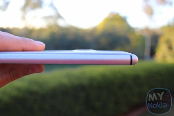
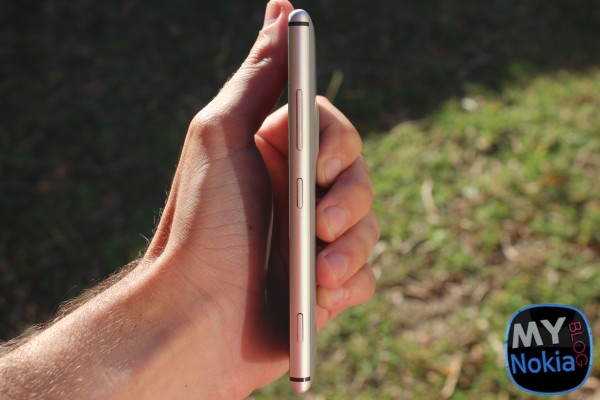
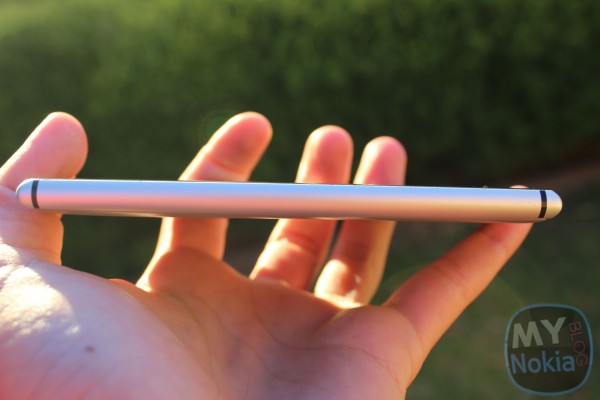
Moving on from the camera, the device’s profile is incredible! Its sleek, lightweight and thin, and feels AMAZING in the hand. I wasn’t sure I would like having polycarbonate settled inside the metal “bumper” but it gave it a pretty solid grip (unlike my N8 which slipped out a fair few times). Admittedly, 95% of the time I used the device with the Charging Shell (which adds bulk – but still thinner than the Lumia 920 I feel), but every I time I used the device naked (without the case – not myself being naked :p ) I kept on going WOW! For me, the Lumia 925 is the best feeling device I’ve handled (second spot would go to the HTC One). Oh, did I mention it feels REALLY GOOD?!
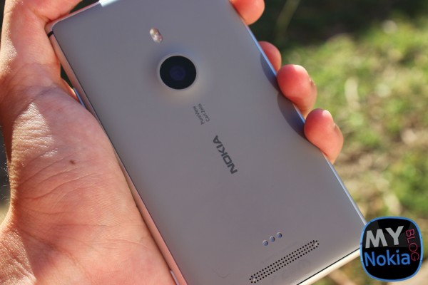
The buttons, being metal, feel a lot sturdier than on my 820. In fact, the entire metal construction gives the device a really premium feel. The speaker, located on the back towards the bottom, is fairly loud, although on full volume with some electro/dance music (yes, I listen to “doof doof”) it can get a bit tinny, but I guess thats why I use my Purity Pros 😀 Having an AMOLED screen makes everything look so much better. In my review of the Lumia 920, one of the main criticisms was that LCD made things appear washed out. On the Lumia 925, colours are amazingly vibrant (though some will argue too vibrant/saturated).
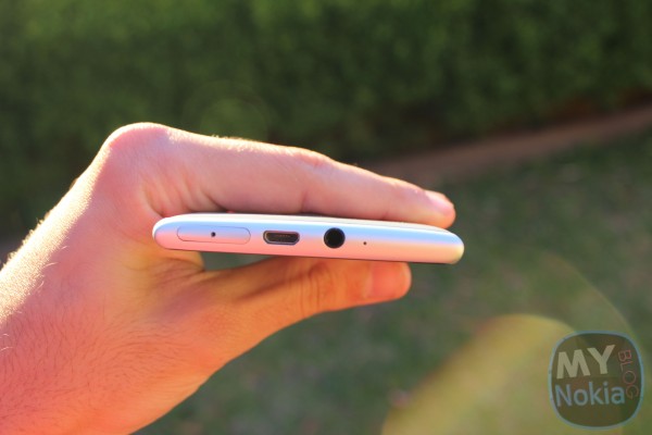
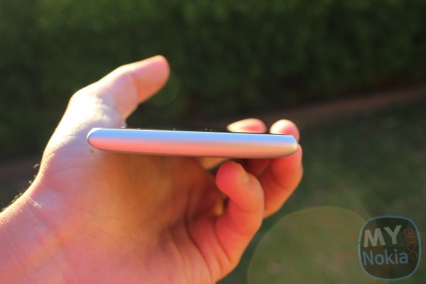
Like the Lumia 720 and 920, the Lumia 925 has a SIM Card tray located on the top of the device. Unlike them however, the 925’s USB port is located on the top. Personally, I prefer it on the top as it makes it easier for me to use when its charging, although having it at the bottom is convenient for docking stations (if Lumia ever gets that kind of treatment :/ ). The last port on the top, is the standard 3.5mm headphone jack, with a microphone hole located next to it. This leaves the left and bottom completely empty.
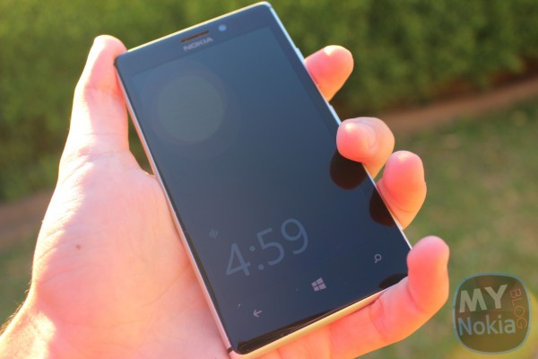
Moving away from hardware, touching on software once again, the Lumia 925 comes with the latest Windows Phone 8 Update, GDR2 as well Nokia’s additions, part of the Lumia Amber software package pre-installed on all Lumia 925 devices. Glance Screen is easily my most favourite feature. No more need to unlock the device to find out the time. Just look at your phone. Sadly, its not as useful as the N9’s Standby Screen, which also provided notifications, but it supports charging and vibrate mode indicators. One issue I have with WP is the length it takes to charge a phone from empty. Nokia has added the ability to have the Windows Logo (aka Home button) flash, to let the user know that its charging. The Lumia 925 can also be woken up from standby by simply double tapping the screen, like on the N9. Very refreshing to have this feature back. It wasn’t always a perfect experience though. Until last week, when the 925 got an update for 8.0.10328.78, I had a few random reboots, and spontaneously locking, where I’d be using the device and suddenly it would bring up the lock screen. (This all occurred on 8.0.10327.77).
All in all, the Lumia 925 is my favourite Lumia yet. All the criticisms I had with the Lumia 920 have been fixed, and my favourite aspects of the 720,820 and 920, are all included (except the micro SD card). If you’re looking to pick up a new Lumia, then the 925 is definitely worth checking out. However, if you have a 920 I wouldn’t consider this as being a huge upgrade. Also, if you’re extremely camera centric, you may want to wait for the Lumia 1020 to be available in your country.
Shoutout to the Nokia Comms team for allowing me to test out the Lumia 925 while travelling!






Connect
Connect with us on the following social media platforms.