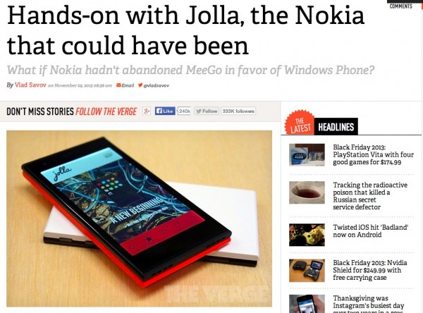
TheVerge: Jolla – what Nokia could have been, what if MeeGo wasn’t abandoned for WP?

TheVerge looks at the Jolla phone and reminisces of what could have been for Nokia if they continued the path of MeeGo.
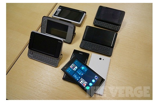
Remember Vlad’s opinion on the Nokia N9 was the beginning of the turn around regarding praising Nokia in both Hardware and Software. N9 felt fresh in design and in usability. Whilst Nokia went a different path, some ex-Nokians kept the candle burning and forged a new path inspired by N9/Qt/MeeGo. The first result of that is this device from Jolla.
I myself would have preferred Nokia sticking Maemo on their phones. Mmm. N900 slim with 41mp. 😀
http://www.theverge.com/2013/11/29/5156446/jolla-smartphone-hands-on-preview
Oh the Family!
Their feedback on the Jolla device isn’t as flattering as the N9 was.
- ‘highly unintuitive and unwieldy to the point that the UI paradigm can be considered broken’ – Hoping it’s initially just difficult to learn but then is easy to use thereafter? Ideally you’d just pick it up ASAP though. VLAD seemed to find it a frustrating learning experience (more info on why in the link). Unlike the N9, Ahtisaari was proud that he had simplified the Swipe UI better than Apple.
- Fundamental issues with apps crashing
- Slower to load
- Jolla wanted to get the phone out to customers ASAP. Bug fixes will come to iron these things out. (Best that way given that the current audience won’t mind that anyway. Better than waiting months/years to perfect something that suddenly is obsolete).
Hardware wise, a good first impression. Blocky utilitarian sandwich design appeals.
Since we talk about anything Nokia related and Jolla’s connections are still very strong with Nokia, we’ll share more Jolla news.
For just Jolla things, you may like to try, as per suggestion in comments
Cheers all for the tip!
Category: Nokia


Connect
Connect with us on the following social media platforms.