Review: The Jolla
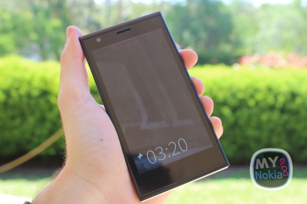
I’ve been extremely privileged to test drive Jolla’s first device, and the first device to ship with Sailfish OS. As a strong advocate for the Nokia N9 and MeeGo Harmattan, I was excited to try the phone out, even if it was only for three days. Â Jolla, the Finnish start-up consisting of mainly ex-Nokia employees, took what they knew, both as device makers and consumers, and went down a path to create a device and OS unlike anything on the market.
Starting with the hardware, the Jolla has a 4.5″ IPS LCD display, at a qHD resolution of 960 x 540. A 2100mAh battery keeps the device juiced up, while it runs at 1.4GHz on it’s Qualcomm Dual-Core chip. To store all your data, you get 16GB internal storage, and MicroSD expandable options. Photography is standard on the spec side, sporting a 8MP rear camera, and a 2MP front facing for getting some decent selfies.
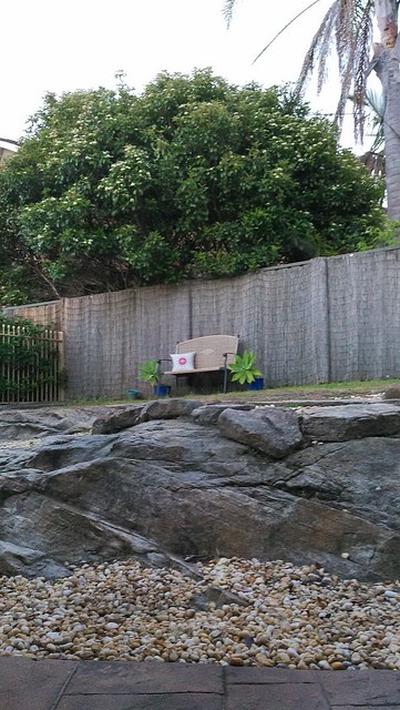
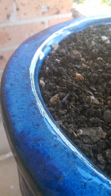
I wasn’t the biggest fan of photos taken with the phone, though this can all be tweaked with some software enhancements I am sure – just like we’ve seen with the Lumia range. Here a few samples I took around the house and out in the city on the weekend (full set of samples and screenshots are here). The pictures below are all on Auto settings (flash on/off depending on shot) – though the Camera app on Sailfish doesn’t have many settings anyway which is upsetting. [Note: Camera improvements have been made as of 1.0.2.5]
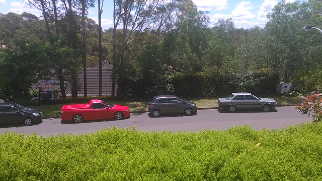


Without Flash

With Flash

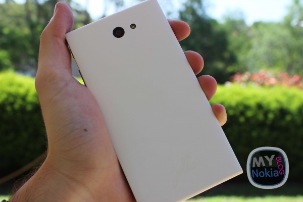
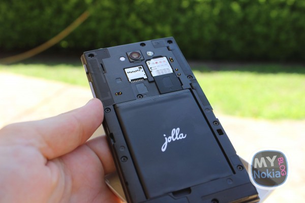
Jolla has given it a unique twist, designing what they’ve termed, The Other Half. It is essentially a removable back, though the back side of the device itself, has ports and connectors that allows device functionality to be extended. Currently, the device ships with a White Other Half (or Poppy Red if you got the pre-order) and it changes your device’s Ambience (I’ll get to that a little later).
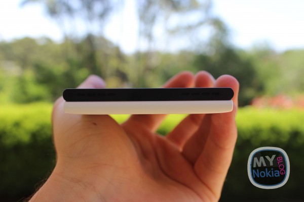
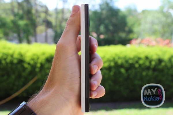
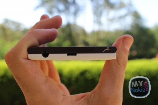
The phone has no physical buttons on the screen, instead running an OS that utilises gestures for navigating the UI. On the right side, you have a power/lock key, and volume rocker, with the left and base being flush. Up top, you have the 3.5mm audio jack port, and MicroUSB slot for charging and data transfer.
You get your typical connectivity options, Bluetooth, WiFi, Mobile Data (3G/LTE – depends on the frequency your country supports obviously), and NFC as well as i2c via The Other Half expandability options. (Can even be tweaked to wirelessly charge.) I was rather disappointed with the speakers, finding them to not be very loud at all.
Moving over to the software side of things, Jolla runs off Jolla’s self-developed Sailfish OS. Based off of Mer, the community build of MeeGo, Sailfish seems to be the evolutionary step to Harmattan, that was introduced on the N9 in 2011 – and rightly so given that most involved on that product are heading Jolla.
Typically, OSes are arranged with a lock screen sitting above home screens, which are running horizontally, with a launcher stack on top of that, and app windows on top of that. Sailfish is a little different. The lock screen heads the home screen, which is layed out vertically.
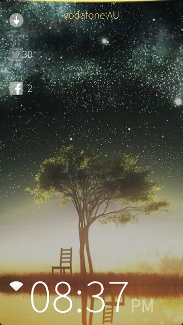
As you swipe to unlock, you get shown the time, device charge, network signal, chat presence, bluetooth status, gps etc. On the homescreen, you can swipe from top (just above the screen) to bottom to lock the device. You only ever really need to use the power key to turn on/off the phone. (To unlock, you have that awesome double tap to wake gesture.)
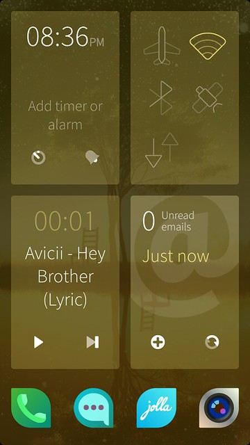
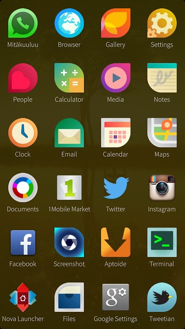
Carry on further and you see the multitasking screen and a quick launcher for 4 of your favourite apps. The multitasking is a card like view, that shows the currently open apps. It will show the 4 most recent, then make the cards smaller and show up to 9. Dragging further you see the rest of your app launcher.
The multitasking aspect of Sailfish OS is something remarkable. Not only is it real time, meaning you can see the apps updating while in the card view, but there is a feature called Active Covers. What this is, is a custom card view for the app, that allows you to carry out up to two actions on that app without the need for going inside (or jump to a feature).

For example, the Music player allows you to pause, and skip track without the need to even open the app. Where as the Phone app allows you to open directly to the dialler, or to your contacts list. Simple, yet makes getting things done, and where you need to go inside apps, quick and rather effortless.
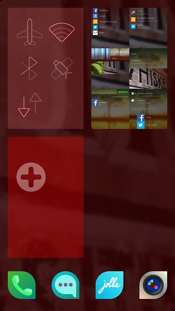
Sailfish OS has another unique interaction, in its pulley/push menus, and the gestures to navigate back a page, or forward to accept options. The pulley is handy for being able to access settings without looking, due to the haptic and audio feedback. Its a standardised way to access various options throughout the OS, and has even been adopted by almost all third party apps. My only issue is that 4/5 times trying to swipe to close an app, the pulley menu is dragged down instead. Also in some apps with a scrollable UI, the pulley is drawn instead of scrolling content (though thats just poor app design by the third-party devs – easily fixed).

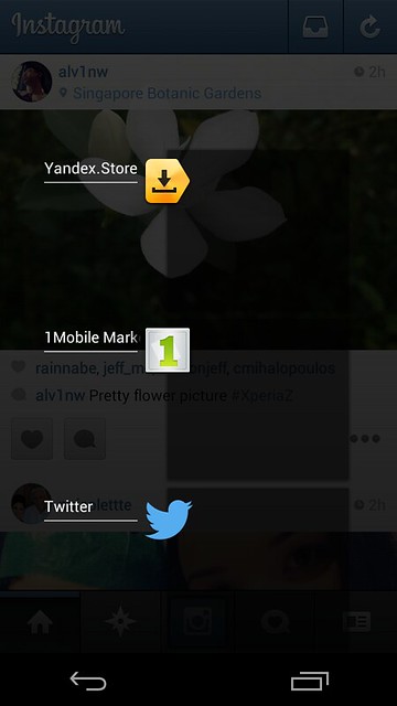
Whilst on the subject of third-party apps, Sailfish has the ability to run Android apps, similar to BB10. Where it differs though is in the way it runs these apps. Sailfish essentially runs an Android Virtual Machine, meaning your apps inside the Android layer can all talk to each other, and act as a single app on your device, with various processes for the Android apps. For example, you can enter the Android layer, and use the multitasking virtual key and see the open apps. This does mean though, that you close all Android apps when you close one (using the swipe down to close gesture or the X in multitasking view).
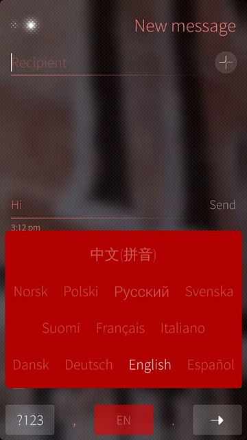
Switching between languages in the keyboard is as easy as holding the space bar, though I have found that text input is generally rather average (and with a fair bit of the UI locked to portrait, you can’t create SMS with the keyboard in landscape).
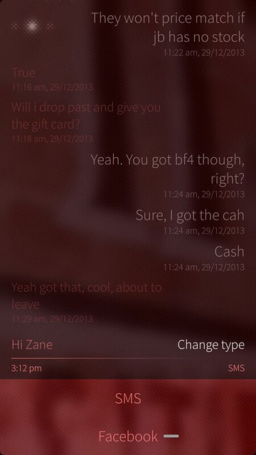
While Messages combines your SMS with Chat (Facebook, XMPP etc), Sailfish is yet to support MMS, which is a shame given its such a basic feature.

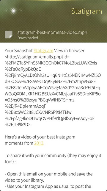
Email was also a bit of a let down. Whilst it is set out really well, most richly formatted (html) emails are pretty much useless. Links don’t work, and it just shows text everywhere. I’m sure this will be improved as time goes along, but for first impressions (and I’m limited on time for this review) it is a big issue in my books. I’ve also had trouble sending emails with attachments – having the email occasionally sent repeatedly (thankfully it was only to myself). [Note: Email has been updated (1.0.2.5) so this may have been fixed]
Battery life isn’t the best, though it is greatly improved given the right conditions. I averaged about 7 hours of heavier than normal usage, though managed to drain it in as little as 3, with a flaky 3g connection, no wifi, Bluetooth, GPS and online in my Chat accounts. (A tip for battery saving is to kill the Other Half detection service.) My longest battery life has been 16 hours.
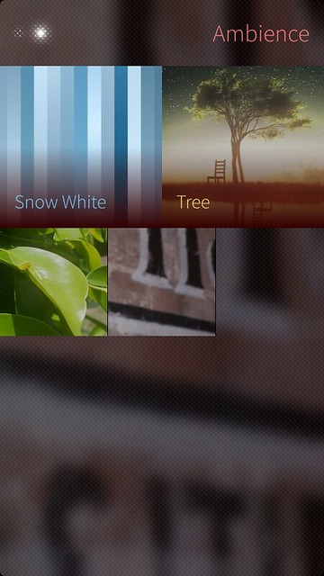
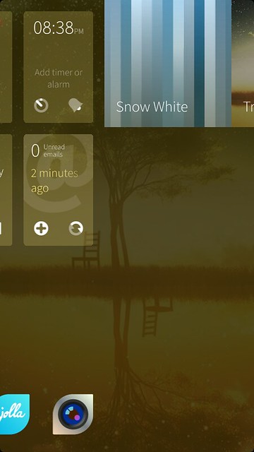
Ambience, as mentioned earlier, is possibly the most unique feature of the Jolla’s Operating System. Sailfish allows you to choose an image, and creates a theme based on predominant and secondary colours. The UI is semi transparent throughout, so you will always see your wallpaper. It does make the phone seem super personal. You have the choice to set the a few Ambiences as favourite, accessible from the Home Screen by swiping from just outside either side of the device to the other.
There are built in services, that you can set up during initial boot, or later on via Settings, such as Facebook, Twitter, Google, XMPP etc, with the option to add Exchange via a Store download. Whilst Facebook and Twitter are there, they have no native app (third party excluded), inside the events feed, you will see notifications, though it will open the browser – which I found could be a bit laggy.
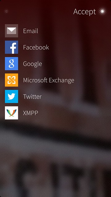
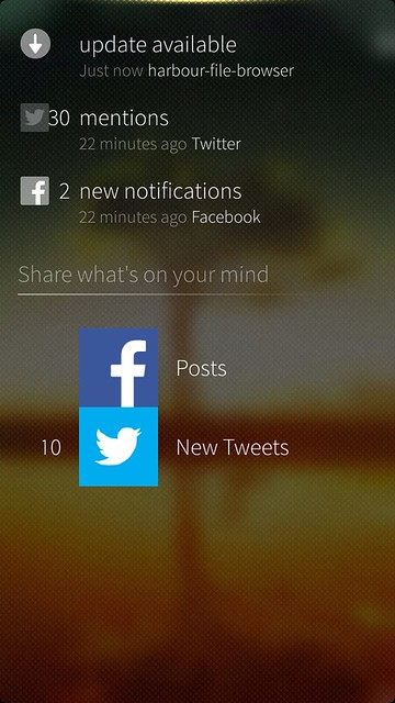
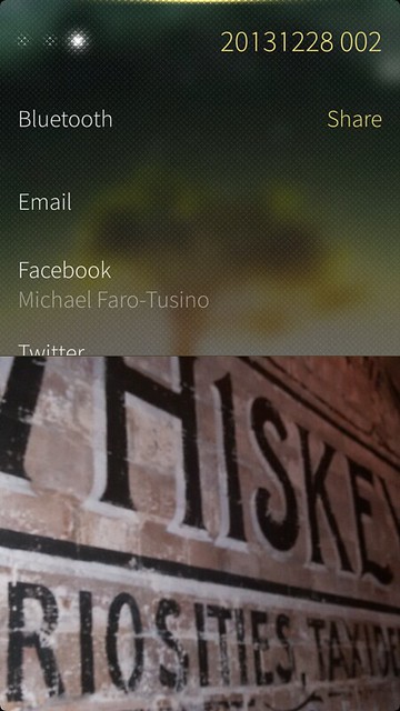
Most of these services are integrated throughout the OS in various ways, namely through the share feature in various apps (like Gallery). A let down is that png files can’t be shared from the Gallery. This makes it hard to tweet screenshots from the current OS build.
For the N9 user, there are lots to love and that you’ll find familiar. It does seem like the natural next step. Unlike the N9 and Harmattan though, tinkering isn’t as easy to fix. Due to the way that Sailfish has been developed, whilst still Open Source, means there are close sourced components Jolla can’t distribute. As a result, there is no Flashing utility like the N9. If you’d like to find out more about it, read this post from TMO.
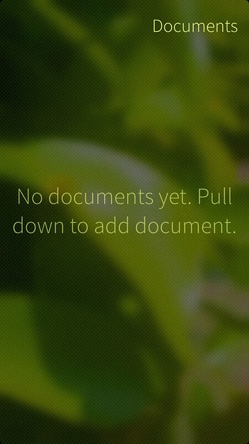
“Pull down to add document” – Umm, there’s no pulley menu
There are little things of the Jolla and Sailfish that got on my nerves, though, as you use it, you find you tend to like it more and more, and those niggles, become less annoying. (I assume its because you get used to it.) The phone and OS are clearly aimed at a niche target, and as such, if you want a phone that will just work out of the box and do EVERYTHING, then this isn’t want you’re looking for.
However, if you like to fiddle with your phone, and discover some hidden beauty, as well as be unlike everyone else, then the Jolla is worth a look. Personally, I find the device is priced too high for its capabilities, though I hope the fact that Sailfish still retains a BETA tag, means it will only get better as the days go on. (And look, we’ve already seen 3 updates in a month)
Massive shoutout to Jolla for graciously loaning me the device, despite being on the other side of the globe. You guys rock!
Category: Jolla, Nokia, Sailfish OS



Connect
Connect with us on the following social media platforms.