Windows Phone 8.1 outfoxes Android’s navigation bar
It was almost three years ago Nokia announced the Nokia N9, it was the first smartphone to come without physical or capacitive buttons, it was a financially sound decision where making smartphones without hardware or capacitive buttons will be way cheaper and easier to do.
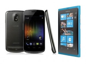
Naturally Android soon followed suit with the Galaxy Nexus via the ICS Android update and later many Android handsets started using on screen navigation bars, sadly as Android is all about customization a limitless amount of navigation bars existed further fragmenting an already fragmented OS experience.
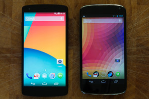
Android’s navigation bars took some screen real state too except in certain OEM apps, that real state was only brought back by rooted apps and custom roms both of which meant breaking warranty and being a little bit of a geek to achieve, it also wasn’t the prettiest looking solution.
It was only on Android KitKat offered users the ability to see beyond the navigation buttons in the home screen, it also gave developers the option to let their apps go full screen without the bars via a mode called Immersive mode.
Kitkat users still couldn’t enter that mode on their own though, Cyanogenmod added the option to go full screen to users but some apps and games would crash instantly upon forcing immersive mode on them.
Another problem I personally had with Android’s navigation bars is screen rotation blackout; in the moments it takes to switch from portrait to landscape, your access to the navigation buttons is gone,  you’d think that wouldn’t annoy anyone but it actually drove me crazy.
(Samsung insists on using hardware buttons still for the above reasons too)
Windows Phone was lagging behind other OSs for a while but it didn’t mean it wasn’t learning from Android’s mistakes, Windows Phone 8.1 the major update for WP8 handsets will also use virtual navigation bars for upcoming devices, so how did Microsoft implement its navigation bar?
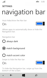
Well, we might not get a glowing theme matching navigation buttons (except on that horrid Huawei) but you’ll be able to set the navigation bar bellow the button to match your themes accent color.
If that’s too fun for your taste you can go with the always dark option! and if you’re one of the few who like using the Light theme the Match Background option will ease your sorrows.
[I can’t shake the feeling that this option hints at new background options- fingers crossed-]
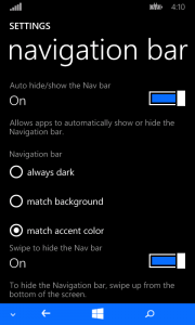
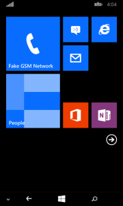
Windows Phone 8.1 however understood the need to hide the navigation bar so instead of the developers enabled immersive mode, users could take matters into their own hands and actually hide the navigation bar immediately using a neat little arrow, WP8.1 also limited the search button responsiveness which will be a welcome change for old WP8s and a must for virtual on screen buttons.
I can’t believe how proud I am of what Windows Phone 8.1 update shaped up to be, its dauntingly beautiful that Microsoft introduced a completely thought out navigation bar while Android still didn’t manage to perfect its navigation bar three years after its debut!
Thank you WP team.
Category: Nokia, Windows Phone



Connect
Connect with us on the following social media platforms.