Pics: Nokia Lumia 1520 vs Sony Xperia Z2 + Sunlight readability test video (Note 3, vs iPhone 5 vs 1520)

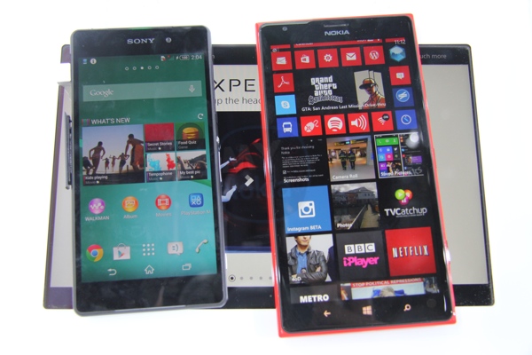
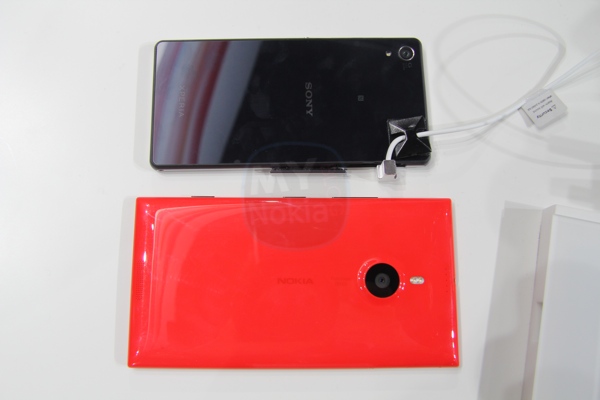
It’s often difficult to see screen comparisons from another picture or video. They’re usually best seen in person. Such was the case here when comparing the Nokia Lumia 1520 against the new Sony Xperia Z2 with what Sony calls an improved display.
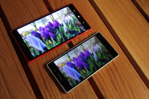
Credit where it’s due, it’s a beautiful and vibrant screen. Where sunlight readability is concerned, that’s where that assertive display technology and clear black display comes in.

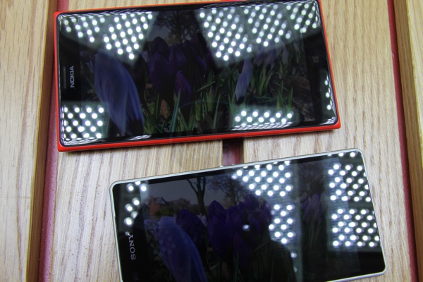
It’s hard to tell from looking at the pictures through the camera. The photo was a picture shot from the 1520 itself. The Sony demo guy wanted to take pictures from the two different cameras but then I reminded him the cameras are different. He also conceded and said the Nokia Lumia camera would be better so might make his screen look worse. (Though he was very nice and helpful, even coming all the way to the Nokia booth)
Again, difficult to tell. When the sunlight readability mode kicks in, the screen is night and day and becomes thoroughly more visible. See the grass bits.
Here’s a demo you might be familiar with as Ali has shared something before when the 1520 was first launched. The difference is quite remarkable.
Category: Nokia


Connect
Connect with us on the following social media platforms.