Suggestions for @WindowsPhone: Reordering the Settings Menu

There’s been a bit of discussion over our last post joking about the settings menu. To get something positive that could be developed further here’s just some suggestions on how the settings would work better for me.
The aim here is “efficiency”. Whilst things might work out as they are, it could be simpler, easier, quicker, no?
Perhaps you have other suggestions (or could even help translate what I’m suggesting into a photoshopped screenshot) feel free to share that. Bouncing ideas off each other might help us get to the most efficient way of interacting with the settings.
I don’t have the facilities at the moment to give any visual demonstrations other than with text so apologies in advance.
Lets take the gripes on WP one thing at a time. This post is just about the settings menu.
Problem:
The menu is spiced with disorganisation. Yes there are groups and yes, there is some subtle attempt at organising things with titles somewhat closely related as you scroll down and more frequently used at the top. However, the thought process behind it is a little too subtle, which ends up with a lot of people having to hunt for items.
Solution:
Reorganising the menu. There’s already rumours that the settings menu will be updated to have alphabetical listing options. Whilst this is welcome, I found that with long lists (e.g. app lists) things still get lost.
So here’s my suggestion:
- Imagine a thin line with small(ish) writing on the right side saying phone settings and it could be collapsible if you want but it isn’t collapsed by default.
- I don’t want it to be hidden by default so as it would end up with people having to click it open and shut just to find what’s inside.
- However when you cannot see the list below, you will see that there are options for “connectivity” and “personalisation” and “phone settings” in a tab like interface. As mentioned, these ‘collapsible’ groupings are already open (the collapsible nature of live folders is nice. You aren’t transported to a new page, you can still interact with the main screen. A bit like this)
- It just makes it easier to get where you want to (perhaps purists will say this goes against the WP way?)
- Small and on the right because it would be best to avoid having too much nesting and hiding away.
- The “Most used” dynamically changes.
- Note also how the main subgroup for the settings (other than ‘most used’ are in alphabetical order). I’m not sure what would be best, whether the individual items inside should have the items listed in most popular for each category or alphabetical (alphabetical less needed as there’s fewer items).
- Category names not final. Can be changed if it helps.
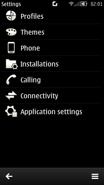
This is just a quick fluff of an idea that I thought might be worth sharing. Oddly enough, the very old Symbian settings was sort of laid out like this.
__________________Most used
Ringtones and Sounds
WiFi
Bluetooth
Flightmode
Brightness
_________________Connectivity
Flightmode
WiFi
Bluetooth
NFC
Network
Internet sharing
VPN
Location (GPS)
USB
Transfer my Data
Project My Screen
_______________Personalisation
Email and accounts
Start and Theme
Ringtones and Sounds
Lock Screen
Kids Corner
Notifications
Quiet Hours
Call+SMS filter
Audio
__________________Phone settings
Date and time
Keyboard
Language
Region
Ease of access
Phone Update
About
__________________Screen settings
Touch
Glance
Screen Brightness
Screen rotation
Project my screen
Category: Nokia, Windows Phone


Connect
Connect with us on the following social media platforms.