Impressive and Elegant Xbox Music 2.0 Concept for WP (+Video)
Advertisements
The image below is quite long so I’ll start here. This is a concept piece by Alex Worthy, from Brisbane (Australia).
He says that with Android Lollipop around the corner (taking cues from WP in flatness and minimal design) WP is starting to look a little dated. So based on the principles mentioned below, he’s given Xbox Music a new whirl.
- A Minimalist design bringing your artist/album imagery to the front while having the playback controls as natural gestures instead of buttons.
- Album art that becomes a part of the UI. The accent colour changes depending on the song you’re listening to, changing the seek bar, alphabet slider and background tint.
- Meaningful Motion. It’s what makes the app feel more premium. Menus congregate appropriately, surfacing up or down, sliding in and out. Resulting in a visually appealing experience.
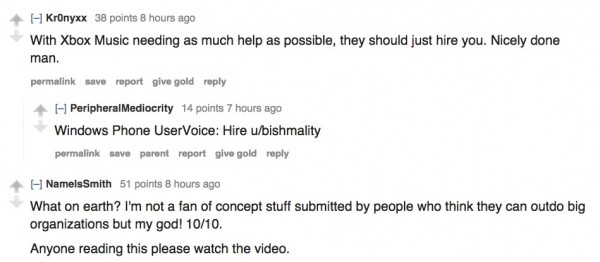
It’s certainly a very impressive demo. Â It’s going down very well on r/windowsphone who are usually quite strict regarding sticking to ‘Metro/Modern UI’.

Here’s the concept in picture form. Fingers crossed the Microsoft team get to see this.

Advertisements
Category: Nokia


Connect
Connect with us on the following social media platforms.