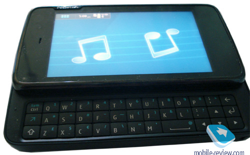
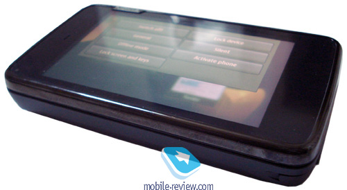
Review: Mobile-Review's review of the Nokia RX-51 aka Nokia N900 – Live Photos and screenshot overload – milestone both for Nokia and the industry
“N900 feels more like the Apple iPhone”
“it’s the true mobile powerhouse in every sense of this word, that comes wrapped in a very eye-candy and functional UI at that”
“N900 is a milestone both for Nokia and the industry that won’t just go unnoticed.”
This must be peak of RX-51 news by now, right? After only finding out yesterday that Eldar’s been testing out the RX-51, and a blog post here or there about a screenshot and a live photo,

Eldar opens up the flood gates and unleashes a barrage of information on the upcoming Maemo 5 powerhouse from Nokia. MR=Pure Awesomeness.

Check out their “first impressions“.
Noteworthy information:
- Build quality on par with the E75
- Resistive screen – though apparently very responsive (sigh…waiting again for capacitive with multitouch – could still be an excellent resistive screen)
- 800×480 resolution (on par with previous tablets, but extremely high density, same colours apparently as N97, no AMOLED)
- Camera is identical to the N97 with S60 camera interface
- Quite power hungry and lower capacity battery than N97 (previous reports day 2days standby, 6 hours active use)
- ARM Cortex-A8 CPU but actual specifications will not be disclosed till Nokia World 09 (finally a beefy processor/more than sufficient RAM/a decent dedicated graphics chip?)
- GPS accuracy comparable to N97
- 32GB + hotswap micro SD (like N97)
OS
- 3X5 grid. Step up from S60s 3×4 but why not 4×5?
- Homescreen – not sure if that’s Maemo Standard or something active like the N97’s.
- Calendar revamped – very finger friendly.
- Palm Pre like Application Switcher of active applications?
- Permanent status dock/bar with quick settings viewable in all/most screen views.
- N900 boot time much faster than S60 (is this indicating sub 20second start up?)
- Smooth transitions and decent reaction time of the touch screen – very visually pleasing, much like HTC’s newer line up
- N900 feels more like the Apple iPhone
- “menus are made in the form of pop-ups which are easy to dismiss. All you need to do is press on any area of the screen outside the menu and it’ll be closed in an instant”
“…supposed to hit the shelves late in 2009 and will go for 550 Euro”
Really? Can Nokia get it this side of 2009? By Christmas 09? Um…”Dear Santa Claus…on your way from Lapland, please stop by Nokia’s production line and pick up a N900(code RX-51 Mr Cringle) for me please?”


Via Mobile-Review


Connect
Connect with us on the following social media platforms.