Nokia working with Digia on new Nokia Conversations App
Nokia Conversations – Nokia’s official blog is working on a new app for their site – conversations.nokia.com. Digia, who have a long history with Nokia, will be developing it.
See: http://conversations.nokia.com/2011/06/13/appstravaganza-working-on-wireframes/
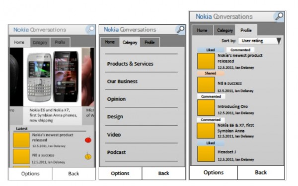
At the moment, they’ve received some sketches and wireframes:
Wireframes also to help us concentrate on functionality, rather than get sidetracked onto issues about visual appearance at too early a stage.
- Navigate with Home/Category and profile screen (latter may not make it in finished version)
- Gray is NOT the theme colour. This is the usual bland thing you do as final colour schemes can be sorted later.
- Yellow boxes are the thumbnails
- Red/Orange circles indicate levels of interest (represented perhaps by page views/comments/tweets/likes)
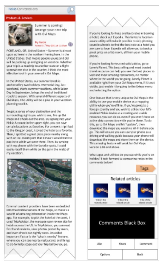
App full story is as demoed below. You’d be scrolling through this of course. I wonder if this is just for NokConv or something they might roll out for their AppWizard thingy?
Head over to Nokia Conv to share your feedback:
As we move to actually developing the app, we’ll probably find that we need to cut down on some features. But also add some if they’re highly requested by you
What’s missing from existing blog-reading apps, in your opinion?
Cheers HaugMedia
What I’d like? Possibly ability to have a panel for most read/commented? I’m not sure we need the whole clunky “like/share/comment/options/back”. I find it somewhat antiquated. Can’t we have this pull up, leaving as much space for the screen as possible?


Connect
Connect with us on the following social media platforms.