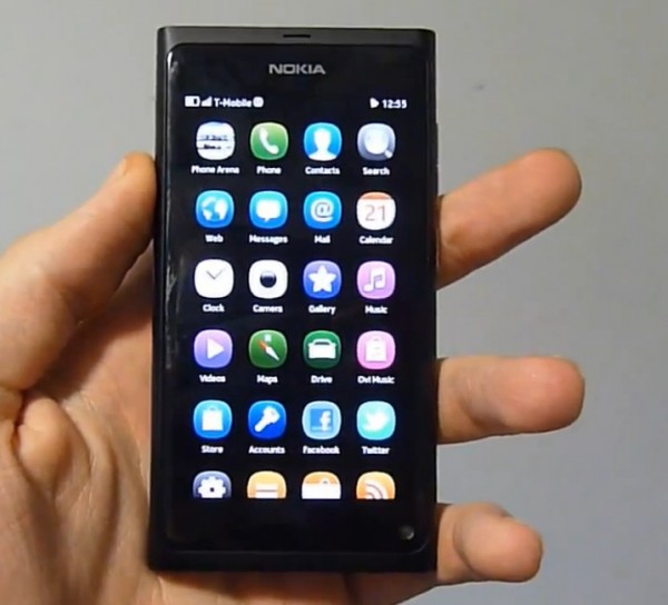
Video: PhoneArena and Nokia N9 hands on
Advertisements
Now it’s the turn of the folks from PhoneArena to check out the Nokia N9 (launched only last week, seems like I’ve been waiting forever already :p *want one now*). According to the N9, this was recorded on Tuesday.
- They’re really shy about showing facebook off.
- Love the use of subtle animation and motion to hide loading apps
- Demo guy seems to be having hard time to press buttons now and again (I don’t know if the N9 is loading and there is no animation to tell you or if the screen did not register a press for this handset)
- ‘no’ slowdowns in multitasking
- I like how we can slide both ways into one continuous panorama. Why WP has only left right panning I dunno. Part of Metro philosophy I guess, one that I don’t agree with and feels disjointed in comparison to rest of UI (that has continous pano)
- The quickbookmark that turns websites into app launcher icons is great. I live for these in Maemo 5 as they really did become my apps. Desktop facebook, desktop GMAIL, google docs on web, wordpress on web etc. I think it’s a great idea to turn them to feed them to the app grid because essentially quite a few Ovi Store downloadable apps do this. Like the crappy BBC app that is basically a link. I wonder if you can compose where the image of the icon is chosen (like with WP) for your bookmark icon.
- There’s a focus for one handed use (several sites are saying this has been something Nokia was recommending). That’s great considering that touch essentially makes people use two hands (and Nokia’s forte with non-touch was single handed phone control).
- With touch to focus, I’m not totally sue about having to choose the focus point and THEN press shutter. What about just tap where I want and then photo snaps? I guess for majority of compositions, the way Nokia’s done it is probably better.
- Map scrolling is possibly the only thing that has appeared laggy in demoes.
- Many apps locked to portrait (except browser and gallery). I guess with the focus for one hand use, it makes sense (and this was the UI shift that changed from two handed landscape N9(50)
In case you missed it, here are tons of Nokia N9 hands on we’ve collected so far.
- http://mynokiablog.com/2011/06/25/video-nokia-n9-hands-on-for-the-weekend-compilation-number-4-d/
- http://www.mynokiablog.com/2011/06/24/videos-nokia-n9-hands-on-batch-3/
- http://mynokiablog.com/2011/06/23/video-bunch-of-nokia-hands-on-wave-2/
- http://mynokiablog.com/2011/06/21/video-collection-every-single-nokia-n9-show-floor-hands-on/
Crickey, I can’t get enough of this thing. I love it, our readers love it, the blogosphere loves it, tech folks that don’t usually like Nokia love it, iPhone fans love it, I bet secretly inside Eldar loves it too :p.
Imagine this was ready last year.
via PhoneArena
Advertisements


Connect
Connect with us on the following social media platforms.