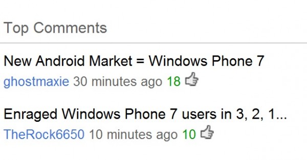
New Android Market = Windows Phone 7 pivots, swipes and tiles?
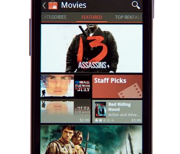
So – Windows Phone Tiles – they’re boring right says some commenters. Android doesn’t seem to think so and has updated their market/app store to behave a lot like Windows Phone Metro. Why? It’s functional and works.

It’s not just Android, Apple is taking some cues too. Like the swipe within camera to view the gallery.
Anyway, as you can see in the video, the new MarketPlace for Android has changed. It has tiles and a lot of left/right swiping, ala, Windows Phone Pivots.
It even has off cut titles
This is a great thing for Microsoft. More people getting used to this style of UI, and what better way to experience a complete user experience of this nature? Windows Phone :p
Old
Category: Windows Phone


Connect
Connect with us on the following social media platforms.