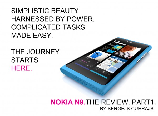
Nokia N9. The Review. Part 1.
Advertisements

The long and controversial journey of Nokia N9 is finally over. Whether or not one should be worried that it’s the first and last MeeGo phone from Nokia, one thing is clear – it’s an incredible smartphone worthy of attention.
Author’s note: My initial idea was to deliver all my impressions and conclusive thoughts on Nokia N9 in one massive post of awesomeness. It turned into quite the deathball so I’ve decided to lighten up the article by splitting it into two parts, leaving my N9 software impressions for later.
___________________________________________
 *What’s in the box? The retail box is extremely small. If you thought X7 box was tiny, think again. The box itself is almost completely devoid of any specific product description, staying true to the minimalist styling of Nokia N9. All the basics you come to expect from Nokia are inside, including instruction leaflets, simple headphones and a charger that also doubles as a data cable.


Surprisingly enough, there was also enough space for a rubber case that comes in a matching colour. There’s really nothing particularly noteworthy to say about it, except that it’s accurately fits the device and stays on there for good. I do think it takes too much away of what makes this phone so unique looking, mainly…
*The polycarbonate unibody. It is simply marvellous to behold every time I have to reach out for the device. The solid unibody design, coupled with the expressively vivid display, makes Nokia N9 the most photogenic phone I’ve ever witnessed. Indeed, the device is very organic looking, giving the impression that its internal components were grown inside the body rather that fitted later in the production process. According to Damian Dinning, it’s been one of the most challenging components Nokia has ever made. I believe.


Soft matte plastic encompasses the unibody shell so, save for the front, the entirety of the phone is very grippy (very much so in comparison to the aluminium clad N8 or the E7) and leaves no visible fingerprints. The rounded edges help retain a comfortable grip around the sides of N9, but, depending on how you hold the phone, you might find the 4 corners to be somewhat sharp.


All physical keys on the N9 are located the right side. The solid and durable aluminium built of those keys is somewhat offset by their ineffective design. In particular, I found it rather tricky to engage the volume keys while the phone was in my pocket. A little ways down you can also find the power/ lock key, which is also too flat and smooth for my liking.

While N9 isn’t exactly the slimmest phone out in the market, its profile is enough to effortlessly slide the otherwise large phone into a pocket. My only gripes with the unibody design is the microUSB port cover.

That’s not to say it’s poorly executed, but with the port being so busy (charging and local data transfers are all handled there), I think covering it up isn’t the most practical solution. What I’m looking for here is something like on Nokia E7, or perhaps implement slide action door for the microUSB port so you could at least preserve it for as long as possible. Overall, however, Nokia N9 is a remarkable continuation of the solid unibody design inspired by N8, and makes me excited for the Finnish company’s upcoming Windows Phones…
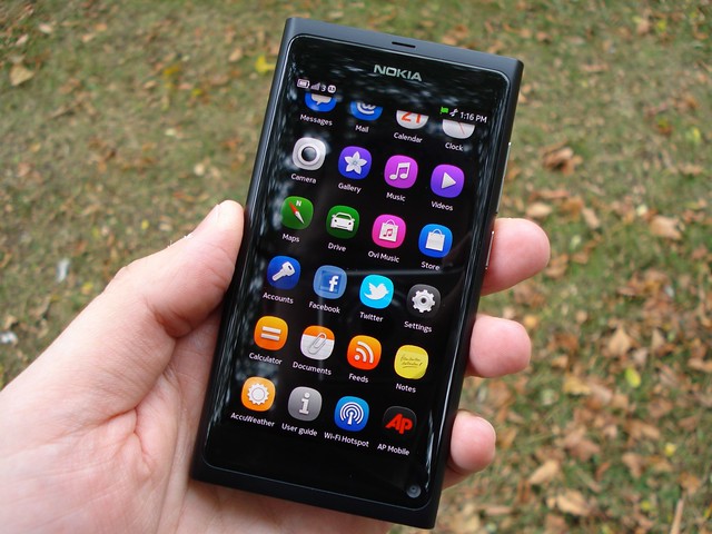
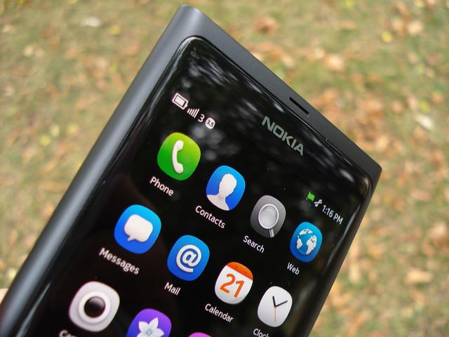
*AMOLED 3.9″ display with 480 x 854 pixel resolution is yet another crown jewel of Nokia N9. It’s crystal clear and bright, and delivers vivid colours at an exceptionally wide viewing angles. Best screen on a Nokia phone, period. The icons truly pop on the screen, with the blacks virtually indistinguishable against the bezel of the display. Leave the phone on a table with the screen on, and it’s bound to catch plenty pairs of wandering eyes. It is, quite literally, eye-catching.


The curved glass display pics I saw from Nokia were exceedingly exaggerated. What you should know is that the display isn’t entirely flush with the front of the phone (to probably help with Swipe UI gestures). I would be especially careful about placing the phone face down, however.
*The loudspeaker on Nokia N9 surprised me. I simply didn’t come to expect such level of performance from a single spakers grill located at the bottom of the phone. Both the volume and clarity of the speaker is simply great, and hands the down best I heard since N900. That is to say, you can’t really beat good quality stereo speakers like on Nokia 5800, but N9 comes close… very close!

*The wide angle, Carl Zeiss 8 Mpix camera with dual LED flash – great, but not amazing, or at least not Nokia N8 level of amazing. I guess it goes without saying that N9 will not fully replace your N8 in that respect – you’ll have to wait for a direct successor from Nokia’s WP lineup instead. Still, it’s a very competent 8 Mpix shooter (in 4:3 aspect ratio, and 7 Mpix in 16:9) as you can see for yourself with these photo samples:
Auto-scene, 16:9 mode
Macro scene, Flash, 16:9 mode
Auto-scene, 16:9 mode
Auto-scene, Flash off, 16:9 mode
Macro-scene, Flash, 4:3 mode
The number of settings to tweak the camera is quite limited in comparison to the N8. Photo quality aside, the two things that particularly stand out in comparison to N8 is the very clean and organised looking camera interface, and the speed of photo capture. The camera UI rotates automatically in both landscape and portrait modes, which is another nice touch to this sleek looking camera app.


I do sometimes miss the ability to simply hold down any area on the viewfinder to automatically focus and take the picture – instead, you always need to use the virtual shutter key to finish the job. A useful feature I found during my tests – if you have the photo preview mode enabled, you can zoom in the photo you just took without having to visit the gallery app. Of course, if you wish to fully utilize the speedy N9 camera, it’s better to leave the preview mode off.

Overall, I’d be very much interested to see how N9 would cope against the mobile camera powerhouse that is N8 if it also had a 12 Mpix sensor. Sadly I don’t have a Nokia N8 at hand, but judging by some of the comparison photos floating in the web, it would possibly be a very close call between the two in most cases.
*The Li-Ion 1450 mAh battery – With medium to heavy usage, I was initially getting a day on a single charge – quite an achievement with that sizeable screen 🙂 That’s far better than Nokia N900 and still better than Nokia E7; it’s nevertheless impossible to beat the impressive battery life of Nokia N8. Lately I’m getting *almost* 2 days worth of battery life on the N9 by moderately using the web browser, music player, twitter and camera. Did I mention that is with a constant 3.5G connection?
In the second, and, hopefully, final part of my review, I’ll be looking at the software side of N9, including Swipe UI, integrated apps and services, Nokia Store content and something called #N9Effect… So stay tuned!

Advertisements


Connect
Connect with us on the following social media platforms.