Gallery: Nokia 800 vs Nokia N8 vs Samsung Omnia 7
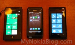
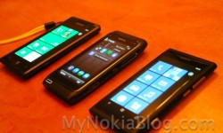
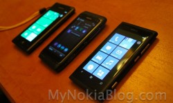
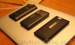
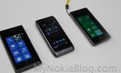
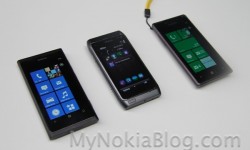
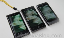
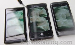
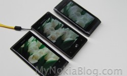
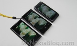
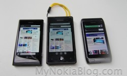
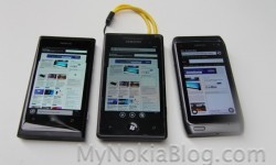
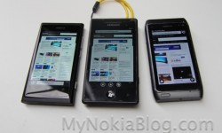
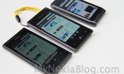
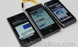
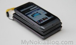
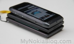
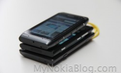
Ready for another gallery? Here’s one of the Nokia 800 vs Nokia N8 and  that Samsung Omnia 7 of mine.
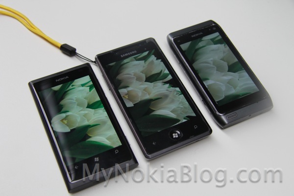
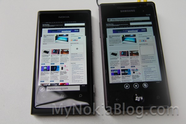
OK the image above isn’t a fair one if you’re thinking of comparing screens because as well as screens, the images are actually from their own respective cameras. As you’ll see in another post, by my eye the camera and screen produces colours closer to what my actual eye (and DSLR) saw on the 800 (at least for the indoor subjects tested).
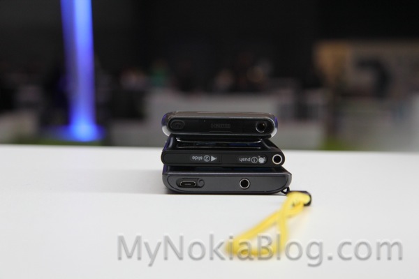
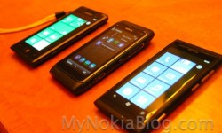
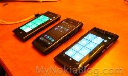
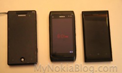
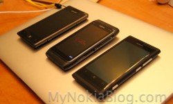
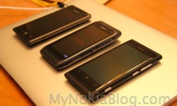
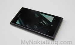
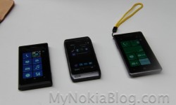
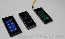
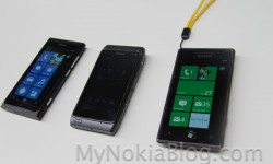
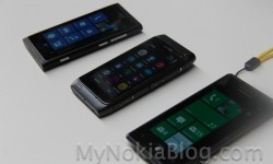
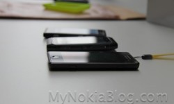
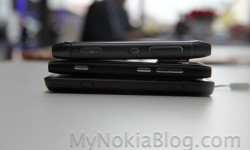
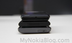
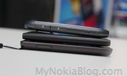
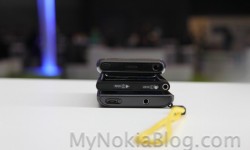
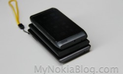
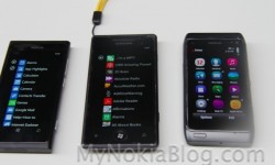
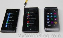
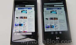
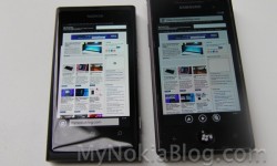
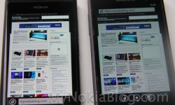
The 800 looks like it’s in a complete whole league of its own in terms of design. Here’s a fairer sample. All device brightness are on auto.
I should have really thought about doing proper screen tests like last year, alas, the problem of not being able to bluetooth images :p. I could have thought ahead though and just downloaded a bunch before hand but seriously, this NW was so hectic, I barely had time to tie laces.
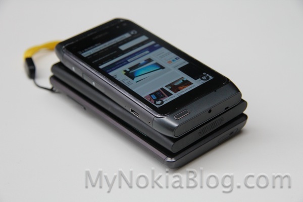
N8 has taken a bit of a beating. The bottom cap was actually falling off. Ah, it has served me well though.
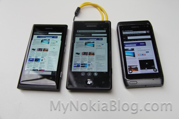
If only the browser was decent enough.
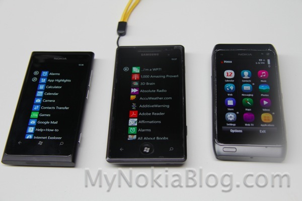
 The more you use Windows Phone, the more colourful it becomes. The stock “bland” icons are completely hidden by my apps. That doesn’t even include my games which can’t be seen from menu view. Appropriately they’re in my games hub.
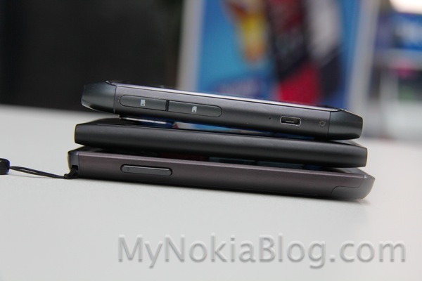
Would you have sacrificed the design for a hump that could film like the N8?
Category: Nokia, Symbian, Windows Phone



Connect
Connect with us on the following social media platforms.