Nokia Music Site Redesigned; Ditches All Signs of Old Ovi Branding
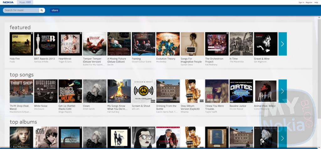
Alongside today’s initial roll-out of Nokia Music+ for Lumia devices; the online site, Music.Nokia.com has just received a sleek new UI refresh in the form of a new HTML5 browser site, similar to the recently revamped official nokia site. The new site ditches all signs of the previous OVI markings (it was one of the few remaining Nokia services that still used the Pink/White color scheme as well as some other signs of the Ovi brand.
The new layout brings a streamlined interface, showing the top songs/albums as soon as you open the site; making it much easier to find new songs rather than the honestly distracting previous site design which was a bit overloaded with content that you had no idea where to look. Currently the new interface is available for the UK and Ireland site; and should hopefully roll out to other regions soon.Check out the redesigned site over here:


Category: Maemo, MeeGo, Nokia, Symbian, Windows Phone


Connect
Connect with us on the following social media platforms.