Gallery: Nokia Lumia 1020 vs Nokia Lumia 920
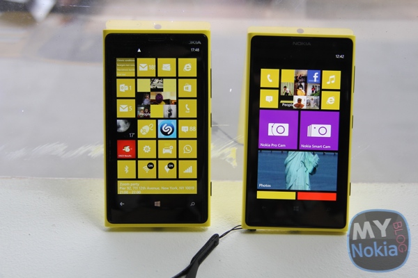
Here’s a comparison gallery between the Nokia Lumia 920 and the new 41mp Nokia Lumia 1020. From the front, they’re pretty much identical. The only hint that they’re different is the fact that there’s a wrist strap/lanyard coming out of the 1020 (which would not be noticeable if you took it off).
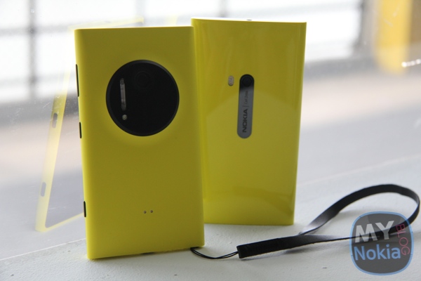
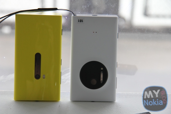
In contrast, it’s all different from the back. The pillowy curved glossy rear of the Nokia Lumia 920 meets an instantly attention grabbing ceramic black circle and a matte finish.
It’s personal preference as to which finish is better. Some feel the gloss is more premium others think that’s the matte variety. Having used the 920 in gloss, I think matte might be preferable in terms of having less noticeable scratches? And it also feels better in the hand due to the added friction.
Whilst the camera is a very subtle part of the 920’s design, the 1020 is all about the camera.
The wireless charging is built into the 920 so you can’t see anything visual to indicate that capability. On the 1020, there are two dots for the attachment of a wireless charging shell.
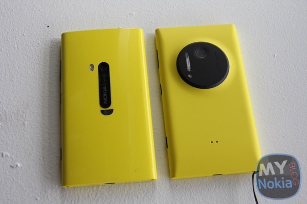
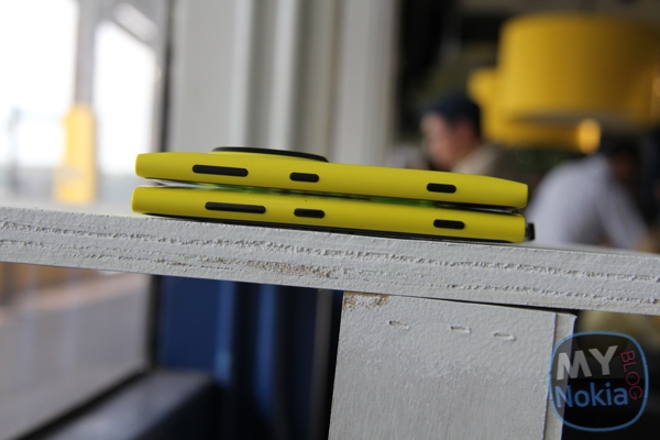
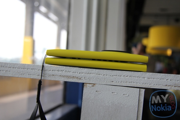
Taking out the wireless charging and other internal improvements have meant that despite that 41mp sensor, the Nokia Lumia 1020 is actually slimmer, lighter and easier to hold.
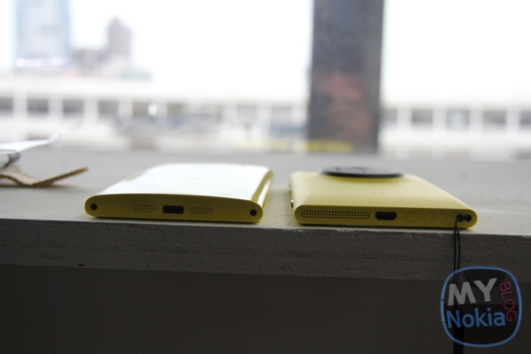
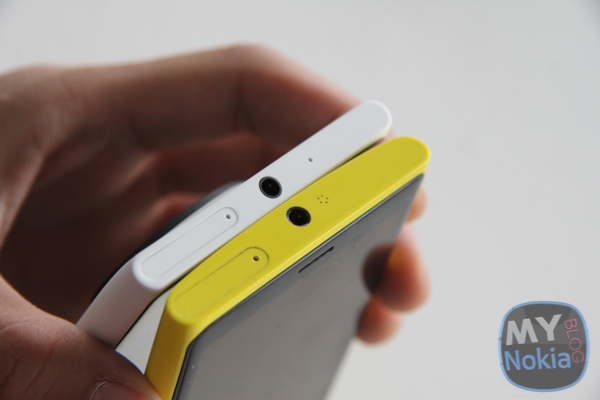
This is easier to see with a white 1020.
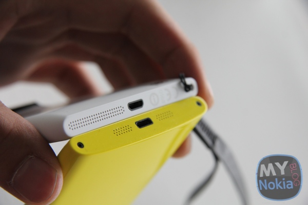
The underside shows the speaker grille on the 1020 is just on one side but more than double the size of the one found in the 920. That doesn’t mean anything regarding the actual speaker quality. Inside that speaker grille of the 1020 is one of the two stereo recording microphones.
The microUSB slot is the same, but there’s now a lanyard/wrist strap slot at the bottom. There’s no industrial looking screws on the 1020 either.
The position on the buttons at the sides are identical
Category: Nokia


Connect
Connect with us on the following social media platforms.