Biggest update for UC Browser, v4.0 available on WP
UC Browser has undergone a major update to v4.0. Â For some reason, auto update did not update this for me and I was stuck on V3.6 until I reinstalled. I like this new look. Cleaner. The wallpapers remind me of Jolla’s ambience a bit. I like that I can easily choose what search engine the browser uses in the nav bar; a feature I lost after getting the latest Cyan update to dev preview on the 1520. Full screen view is also welcome. I think all these updates are enough that I’ve pinned UC browser again on the first part of my homescreen and will be using this a lot more. The only thing I’d miss is pinning specific pages.
-Accept no substitutes when it comes to browsing on Windows Phone-
UC Browser, the most popular browser in the Windows Phone Store, has released its biggest update yet. UC Browser 4.0 for Windows Phone is specially designed for WP 8.1 and features a complete revamp of the user interface, giving users a fresh and aesthetically pleasing visual experience. After months of anticipation from UC Browser fans, the latest update does not disappoint as the refreshing visual design and intuitive user experience blend so well with the overall Windows Phone experience that users are already saying UC Browser should come as the default browser on WP.
UC Browser for Windows Phone has long earned its place as the best alternative to the default Internet Explorer browser by providing users with the fastest and most comprehensive browsing experience. Â Its ease of use, site navigation, gesture-control, smart download manager, and sharing feature that allows easy file transfers between phone, tablet and PC have proven hugely popular with fans of the browser.
Although UC Browser 4.0 took a while to be released, its new features are testament to the hard work poured into it. Check these out:
1. Redesigned user interface for a better visual experience
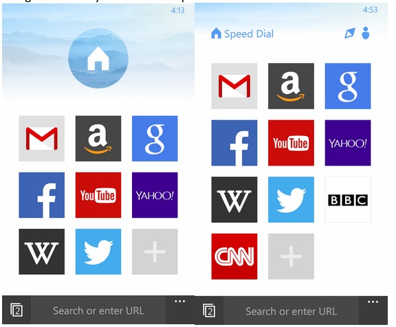
Windows Phone’s adaptation of the Modern Style design language is one of its distinct attraction points. UC Browser 4.0 offers its own interpretation of Modern Style with a beautifully redesigned UI. The icons are sleeker and switching among Speed Dial, Site Navigation and My Collection is super smooth.
2. Richer Site Navigation
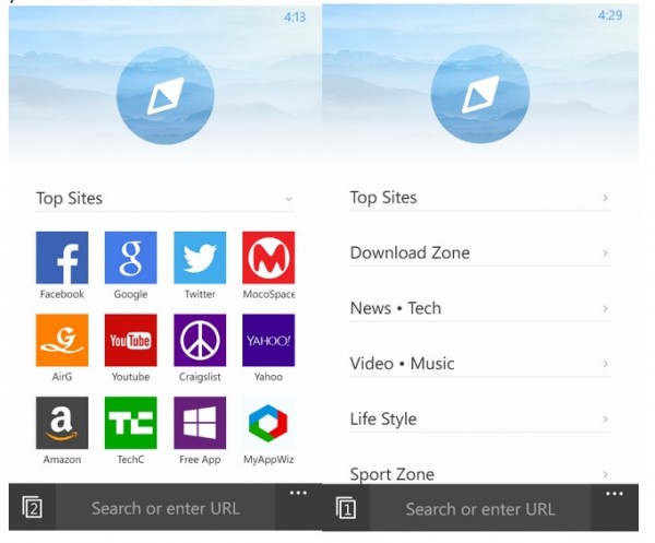
The Top Sites icons on the browser home screen have also been re-designed to match each website’s brand color, giving you a more colorful site navigation page. This makes it easier for you to find the latest hot sites.

3. Merged Address Bar and Search Box
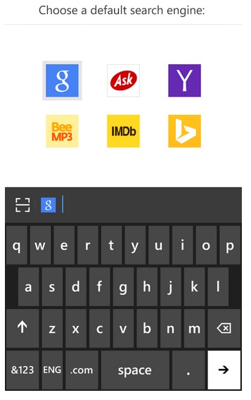
Frequently used features should be easily accessible, and that’s why the address bar is now placed at the lower part of the screen. It is more user-friendly than ever as it’s now easily reachable within the range of your thumb. Moreover, the search bar is now merged with the address bar, offering you a more intelligent input experience. You can now enter a link or keywords directly into the address bar. If you want to change the default search engine, simply click on the Google icon and choose from the list. You can also activate a QR scanner from the address bar for quicker access.

4. Better Tab Management (for WP devices with at least 1GB RAM)
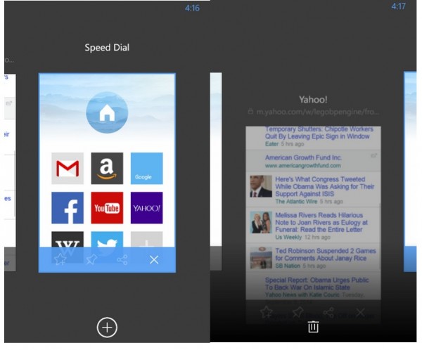
Specially designed for WP 8.1, UC Browser 4.0 has a more intuitive gesture control for tab management. Click the tabs icon next to the address bar to manage your tabs just like how you would manage your apps in WP 8.1’s app switching mode. Flick right to see all of the open tabs, then tap the one you want to open. Slide down or click the “x†button to close a tab, and click the “+†button to add a new tab.

Category: Nokia


Connect
Connect with us on the following social media platforms.