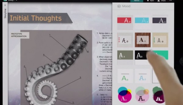
New to Office Family: “Sway” for polished yet simple web design and presentations.

There’s a new member of the Office family: Sway. It’s a tool for creating polished, elegant looking sites and presentations. I can only describe them as being able to simply create experiences like those new sites adopting the single scroll down feature (e.g. check out Jolla/Tesla’s site or this one).
LOL at the awkward screen simulation.

Cool ending to show it’s “different”.

Create these on the web. In time there will be a windowsphone and and “possibly a windows app”
Check it that presentation yourself here: https://sway.com/northwest_aquarium The formats are quite different. I like the single scroll down best. You can even interact with different things on those pages. Possibly not the best layouts for all, but for story telling, it’s pretty awesome.
I could see this as a neat way of presenting a review. These presentations appear to be embeddable.
Source: Office
Via: TV
Category: Nokia


Connect
Connect with us on the following social media platforms.