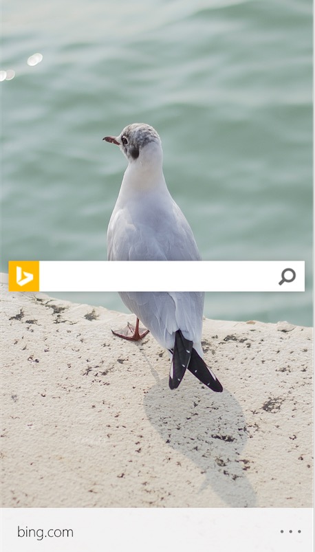
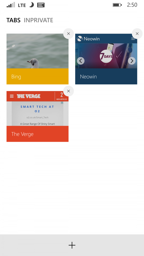
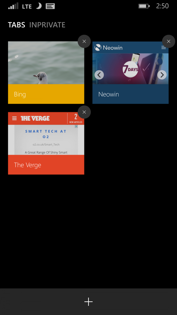
Spartan Browser redesign screenshot #concept
Advertisements

Redditor, imJanski felt that the appearance of Spartan Browser isn’t getting much love so he’s made some changes. Things like the tabs button were quickly added after replies so it’s a pretty dynamic concept in that regard.
Some users noted wanting a back button – not for replicating the back button of WP but for moving back and forth between pages. I’ve found the swipe feature to be useful on this regard but perhaps a button would be useful too.

Different colours for different tabs. 
Source: Reddit
Advertisements
Category: Windows Phone


Connect
Connect with us on the following social media platforms.