Pocket-lint's Nokia X6 Review: Improved experience all around – what the 5800 should have been [7/10]
Advertisements
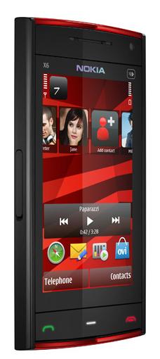
 Stuart Miles of Pocket-lint has reviewed the Nokia X6. One of the only two in the new Xseries lineup, the music centred X6 boasts Nokia’s first phone with a capacitive touch screen.
So with all the flack Nokia’s been receiving on ‘hampering’ flagships with ‘out-of-date’ resistive screens, how does the X6 fare?
- Pocket-link says the X6’s 640×360 3.2″ screen is responsive – zero lag. No pushing or stylus necessary [though stylus necessity is more what you’re doing, right? Not that it would work. But even if you’re on a resistive screen, if you’ve got big buttons you don’t need a stylus. Anyway, I digress]
- It hosts the same 32GB as the flagship Nseries and N900 but lacks microSD – still plenty for the Comes with Music service – your all you can eat busic buffet.
- Camera is OK – though apparently not on par with the camera centric Nokia range. [Do they mean Nseries or the select photography bunch in Nseries?]
- Even though the X6 has the same sized 3.2″ screen as the 5800, surprisingly they found “touch interface buttons are big it’s not as fiddly”
- Ample memory to run most things though you still get low memory errors if you push it [just a note, in the Nokia range, N900 does not do this]
- As good as the X6 could get, it’s running Symbian with S60 interface – looking old and out of touch compared to the competition and Nokia’s own Maemo 5 beast.
Via Pocketlint
Advertisements
Category: 5th Edition, Nokia, Nseries, Symbian


Connect
Connect with us on the following social media platforms.