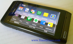
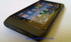
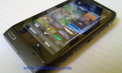
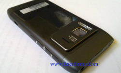
New Gallery: Sexy Nokia N8 Black
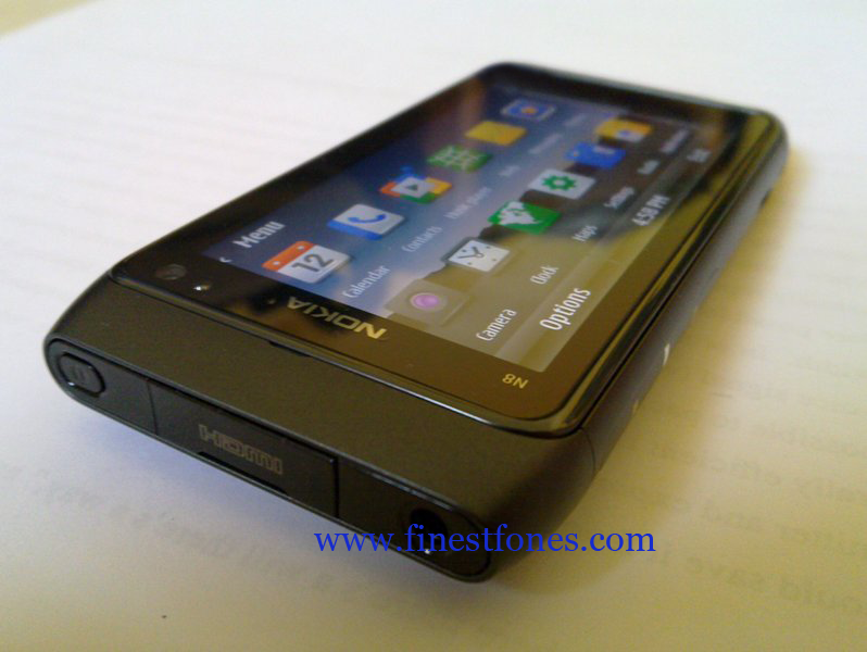
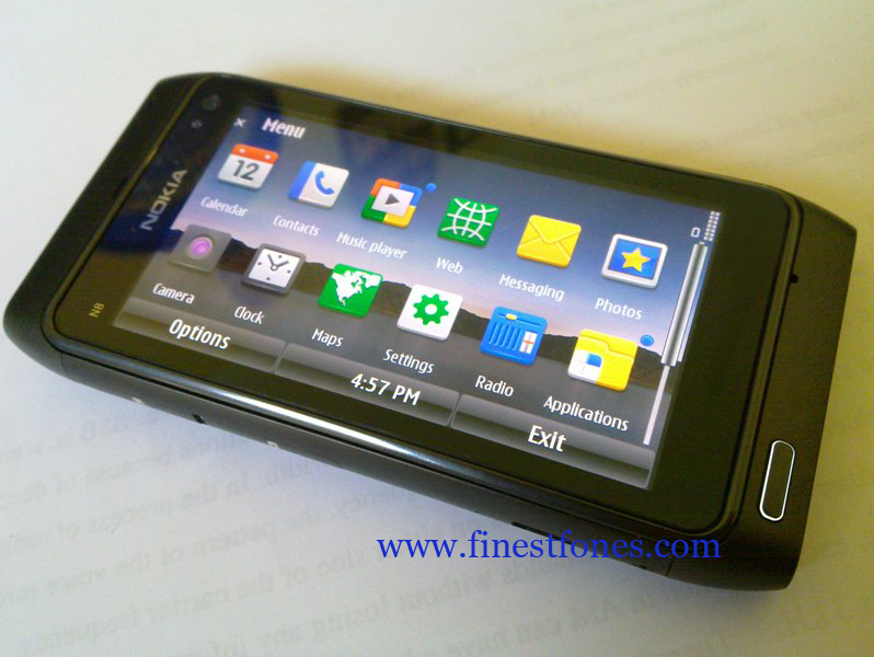
Mr X from finestfones has received some nice photos from “a friend”, some N8 Black photos (I don’t care if Nokia calls it Dark Gray, it looks black dammit! :))
It’s looking pretty slick, no? It best matches the glossy black bezel anyway.
Thanks for the heads up Jim!
Mmmmm….. I want one now! -_^
lol @ the iPad theme. I do prefer these more uniform icons to Nokia’s standard icons from the 70s. What’s great about Symbian of course is your huge range of themes that could alter icons/fonts and possibly even animations (might require additional ‘hacking’).
I really do not see what genius controlling S^3 decided, “hey, now that we’ve saved some space by killing that fat ugly sidebar, let’s waste some space at the top and bottom!”. This seems to be remedied somewhat in S^4, but seriously. Why did it have to take another revision to sort that out?
via finestfones







Connect
Connect with us on the following social media platforms.