Advertisements
Jay: I’d like to introduce to you guys, Jozef Kocúr. If that name sounds familiar it’s because he’s the high school kid that astonished us with his concept pieces.
You might remember such pieces as:
Here you can see the Windows Phone Metro UI ethos. Just take a look at Metro on Windows Phone and you’ll see the panoramic long view (Were you able to see it all) looks very fitting in tablet mode.

Nokia have sternly said they wouldn’t just enter the market of tablets and just be another forgettable slab. Elop also said it might be powered by Windows, it might not be. Seeing this touch optimized experience (and not desktop windows with touch), I wouldn’t mind either. Possibly be more WP if we’re locked into that ecosystem.
Today, I am coming up with the next generation of Windows UI combining the power of Windows 7
with the simplicity of Windows Phone 7. The result is called Windows Slate 8.
Yeah, it looks like an older Windows Slate 7 concept. But, the final result is simple and innovative.
Home Screen
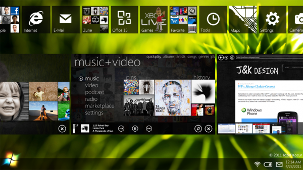
Is it possible to have a home screen that has some elements from W P7, but still has an appearance of a desktop version of Windows? Yes, it is. Let’s take Hubs and Tiles from WP7, and combine them with “windowsâ€, start button, “taskbarâ€, and AERO UI from Windows 7.
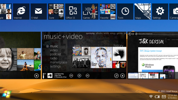
And this is the result:
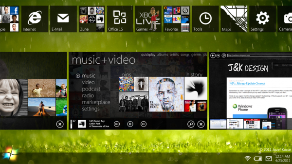
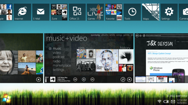
Home Screen has three parts:
1) Top Bar, with the live tiles and horizontal scrolling, enables you to have all your favorite apps, folders, and apps categories on the home screen.
2) Window Bar shows all your opened applications. You can control each application right in this mode (real multitasking). Each Windows may also have (unless user turns this feature off in settings) a control bar; the purpose is simple, to provide quick access to commands for your application.  For example, it may show music information, music control buttons for music+video hub, opened tabs in Internet Explorer, and favorite contacts in People Hub, etc. I was inspired by Jump List in Windows 7. Zoom-out to make windows smaller.
3) Task Bar is basically a bar with Start Button (which shows all applications), status icons, and time/date. User may also minimize application from Windows Bar to the Task Bar.
Jay: I’m not sure how app launcher would work for Jozef’s concept. I do remember really enjoying how Jozef presented App launcher in his MeeGo concept which has inspiration from Metro. I’m not sure Joe Balfiore would go for “Apps in a grid” thing any more though (I would!!!)
Lock Screen
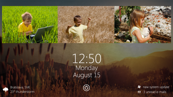
My Lock Screen concept is really simple, but still has a unique look. To reveal the Lock screen you slide up (same gesture as in WP7). The Lock screen contains time/date, system notification, actual weather, and a button which allow you to shut down/restart/hibernate your device. User may also add his favorite picture to the top.
Hubs
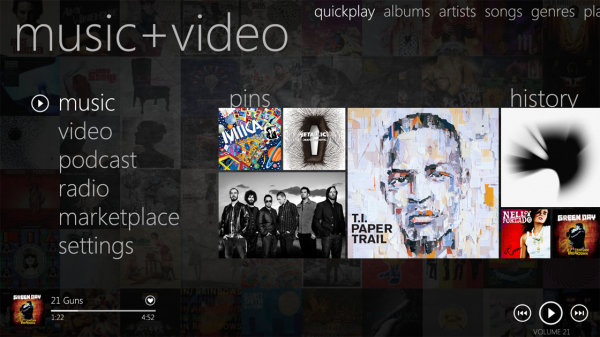
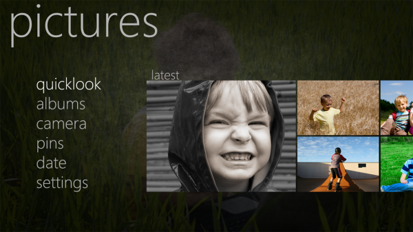
Hubs are one of the main features in WP7. Thus, I show them in my Windows Slate 8 concept. They basically look like the hubs from WP7, but they would show more information (look at music+video). And I am using the transparent mask on the background to dim an image, which makes everything clear and easy to read.
Jay: Metro UI works really well in this context. You have quick categories on the side, further filters at the top, ever present media buttons and pinned album art. It looks great and it’s really functional. It looks purposely designed for tablet
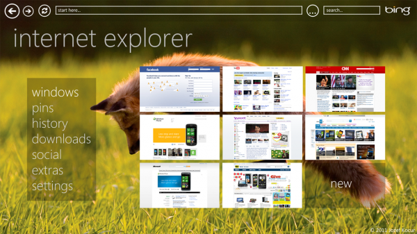
Internet Explorer 10
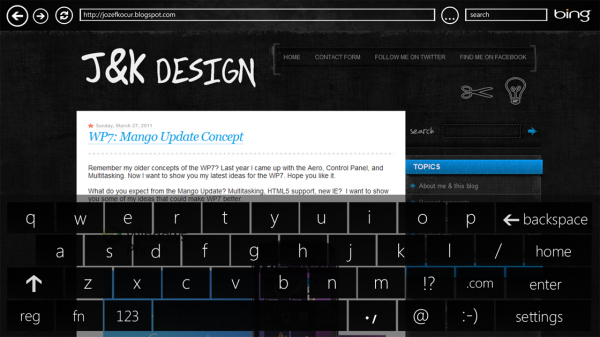
IE10 combines the look of Bing with the appearance of Hubs. Â User would be able to use his own wallpapers, or used those automatically actualized by Microsoft. Do you see a button with 3 dots? This button transfers you to Home. Home shows opened tabs, history, bookmarks, etc. A multitasking gesture would also show all opened tabs.
Extras
That’s it for now. But I am not done with this concept. I am still working on the Hubs, IE10 and I still have some ideas for the home screen. If you like this concept, don’t forget to share it. And of course feel free to contact me or leave a comment.
Don’t forget to follow me on
Twitter.
Advertisements
Tags: featured
Category: Nokia, Windows Phone





Connect
Connect with us on the following social media platforms.