Concept: Windows Phone 7 Mango Update Concept
Over two weeks ago, we featured the work of a brilliant high-school student name Jozef Kocur. You guys were really impressed by his work, which was incredible for anyone to do, let alone a high-school student.
Jozef emailed us back to thank us for the post and inform us with his new update. His own conceptualized piece of the Mango Update.
What do you expect from the Mango Update? Multitasking, HTML5 support, new IE? Â I want to show you some of my ideas that could make WP7 better.
http://jozefkocur.blogspot.com/2011/03/wp7-mango-update-concept.html
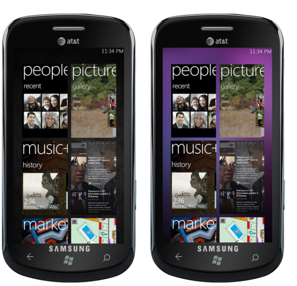
Jozef’s ideas look great to me. Such simple things like a background but partially transparent tiles make it more appealing (for me). But this might not please the Windows Phone Purists that believe in the CORE principles of the Metro UI (There’s a post I need to do which explains all the perceived oddities of the Metro UI). Nokia were apparently waiting for Mango before releasing their first Windows Phone. As you know they will also be able to customize it to levels that other WP manufacturers won’t. Not that Nokia would but the option is there.
AERO INTEGRATION:
The idea of Aero Integration to WP7 has been stuck in my head since May 2010. In June 2010 I created the first concept of WP7 showing the semi-transparent tiles with own background on the home screen. I liked it; I thought it looked much better than original WP7’s UI. In the last couple of months I have learned a lot. I realized that the WP7’s user interface does not need to have semi-transparent effects to be beautiful. However, the integration of the Aero could be one of the things that customers would appreciate. After publishing that concept I found out that people liked it. Many people want to have a chance to personalize their home screens.
Let’s look at the advantages of this concept.-Beautiful looking UI would become more beautiful by using the right combination of the backgrounds, system’s color and the transparency level.-Personalization on your own.-Good marketing trick.
Also, this concept has a couple of disadvantages.-The concept could ruin the idea of the Metro UI.-Beautiful looking UI would become intricate by using the wrong combination of the backgrounds, system’s color and the transparency level.
Thus, I think the Aero Integration should be a part of the next Windows Phone 7 update.
 CONTROL BAR:
In Windows Phone, pressing the volume buttons brings up a volume control bar that also gives you the option to change from loud/silent as well as control music buttons if you have music playing. That’s nice – it cuts the need for music player widgets and you can always access music buttons. Jozef goes a little further by adding further control buttons such as WiFi/Bluetooth/Brightness as well as quick notifications. This I think is available by swiping left to right.
I’m not sure about the activation method (would rather via volume button) and not double menu button press as the bottom is so far from the top bar.
I came up with the idea of having an all basic system setting right on the home screen with my first Windows Phone 7 Modification. Later, I realized that it was a copy of the Notification Area from Android OS. I tried to find a solution to add quick notifications, Zune’s control, and the basic system control to the one area. Widgets and Control Panel did not work. I have tried many different concepts. Firstly, I tried to add a 3rd additional screen to the left of the Home screen. Then I added control buttons and quick notifications right to the Tiles. They both interfere with the idea of the Metro UI. Finally, I came up with a smart solution. I call it Control Bar.The Control Bar brings quick notifications, Zune’s control, and the system control buttons to the top of your screen. To open the Control Bar simply press the Home button twice quickly. This opens the Control Bar, which primarily shows the system control buttons. Just slide to the left to launch Zune’s control buttons, or to the right to show latest system notifications. In the notifications area you can also scroll down to show more notifications.
Live Thumbnails
This is nice. I have a growing number of apps and tiles and I can see swiping getting tiring (though because it’s a very fast smooth swipe I only need 2 at best)
If you were able to categorize item, they might be able to appear in their own tiles. Much like folders. No not like iOS but Symbian folders though with nice preview thumbnails to show you what is inside.
Different platforms have a possibility to categorize items. WP7 does not even let us arrange items in the menu. I am coming up with an idea of Live Thumbnails. Imagine you can categorize items in the menu; even add a category to the Home Screen as a tile. The tile may show the thumbnails of items; the user gets a possibility to open an application/music file/contact right from the tile by pressing twice on the item. I think the best use of this would be in the Tablet OS (maybe WP8?).
Multitasking
Jozef presented this tiled multitaking before. Windows Phone Mango update is to come with Symbian^3 style linear multitasking. I’m a fan of the Maemo 5 contextual grid which was making its way to MeeGo. See point 5 of this post.
Jozef activated multitasking by pressing back twice or using zoom out pinch gesture. Like Maemo 5, the windows scroll vertically, and to close, like WebOS (or BB Playbook which stole from WebOS) swipe the card up like you’re throwing it away.
Am I the only one who didn’t like the pictures of the Multitasking that Microsoft presented at the MWC in February?  I decided to change it a little more. I think the cards with horizontal scrolling don’t fit the idea of Metro UI. So, I decided to remake it. The result was the cards with the vertical scrolling. To open Multitasking Menu just press the back button twice quickly, or use a zoom out pinch gesture. To close applications simply swipe the card up.
Background in the hubs
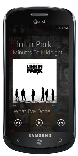
Windows Phone 7 does not let us to change background in the Hubs (except Picture Hub), so sometimes it may be hard to read some text. I am coming with the idea of using the transparent mask on the background to dim an image. I also want to show you the idea of using the album mosaic in Zune instead of a picture of an artist.AEROBASICvia jozefkocur
Category: Concept, Nokia, Windows Phone


Connect
Connect with us on the following social media platforms.