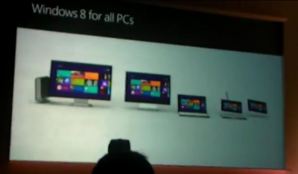
Video: Windows 8 Tablet demo! I want one of these now!
Advertisements
- Designed from the ground up to work with touch
- Has windows phone 7 feel (should be taken as a positive)
- AND works well with keyboard and mouse.
- Live tiles
- Apps are borderless. Every pixel is your app. No title bars, no system trays, no scroll windows.
- Application platform based on HTML 5, Javascript and CSS – “the most widely understood programming languages of all time.”
- Gestures – left to right swipe to bring up control bar.
- Right to left swipe for app switching
- Check it out when using two hands – perfect for tablet use? Made for tablet – not just a big iPod touch :p
- Swipe up from bottom to get to the controls. I know some will say it’s like BlackBerry’s playbook who some have said in turn is stolen from WebOS. N900 has also had some lovely side gestures (not requiring actual gesture hardware in bezel).
- Windows work on the side, apps top and bottom.
- Snap view – two apps side by side. (Well finally, this gives me good use of that screen real estate. My Windows desktop experience is full of side by side programmes). You can drag to determine how much space each uses.
- Internet explorer 10. Drag bar at top for tabs.
- Has FLASH. iPad say what?
- Standard QWERTY or ergonomic qwerty for thumbs.
- ZOMG You have standard PC explorer Win 7 like view :O (is this just for files? No. The software works just like old windows! :o)
Video cuts off abruptly. Here’s some other videos:
– You don’t have to give up the ability to have control (e.h. iPad/Windows Phone too)
I don’t know about you but that was a darn sight better than what Intel showed us with MeeGo (though mostly because it remains unfinished)
Via NetbookNews
Cheers Rick for the tip!
Very clean! Whilst you’re here, check out Jozeph’s concepts of Windows 8 tablet UI (this was before knowing about this demo)
Advertisements


Connect
Connect with us on the following social media platforms.