N9 Screenshots (part 1 of 2) #MeeGo #Harmattan
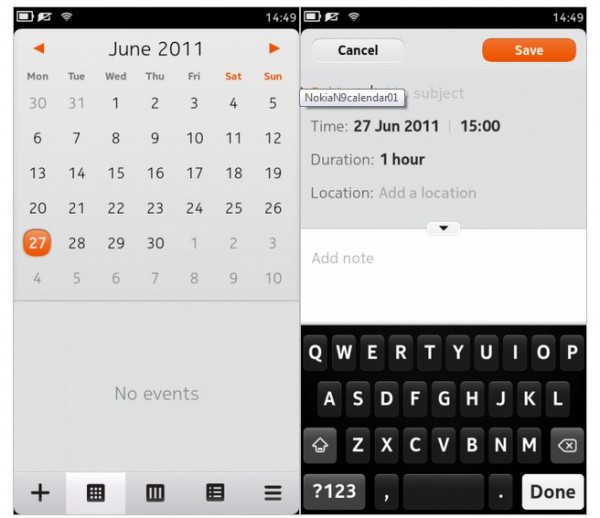
Yesterday, Nokia Conversations posted up part 1 of 2 of their MeeGo-Harmattan Screenshots posts, based on the response of what NokConv’s audience wants to see.
In part one, we can check out (if you haven’t seen in video already):
- Nokia Maps
- Calendar
- Contacts and Calling
- SMS
- Apps Menu
- ‘Other’ showing the feed view, facebook, twitter, accounts, multitasking and angry birds.
As I’ve mentioned before, I like the curved corners. It’s a small subtle change but makes a big difference in making it more up to date. The first time I saw this implementation was with Palm’s beautiful WebOS (Which is now headed by the ex Nokia MeeGo head, and of course Palm’s design guy is now at Nokia)
http://conversations.nokia.com/2011/06/30/nokia-n9-screenshot-gallery-12/
As usual the Nokia Conv comments about MeeGo have nothing to do with the screenshots.


Connect
Connect with us on the following social media platforms.