Symbian Belle drop down status bar – Belle looking MeeGo-Harmattan ‘swipe’ like.(Update)
Advertisements
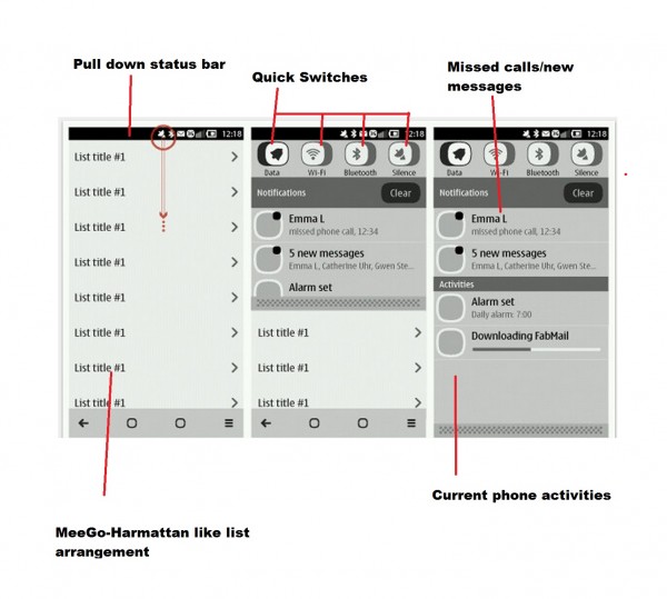
@Harkison tweeted us the image above (without the notes) he found from some Qt Quick guidelines. As you can see, this is for Symbian Belle (note the position of the icons on the top status bar as opposed to MeeGo-Harmattan – it’s split in the latter)
Here you can see, as noted by Jussi and other Nokia staff, essences of what we’ve seen in N9 MeeGo-Harmattan phone lives on in other future devices. Note, tThe newer, contextual ‘bottom bar’.
The list is already MeeGo like, with the > signifying further options available. What’s interesting here is the pull down status bar.
- Drag it down for quick settings. At the top are some quick switches to turn on/off data, bluetooth, wifi and I think profiles (though it looks like GPS sign, no?)
- Below you have missed calls and messages, possibly appearing on homescreen too like in N9/N950.
- Below that again are current ongoing activities. Here demoed is an upcoming alarm and some emails that are currently being download. I’d expect app download/bluetooth transfer to show itself here. A bit like how Maemo 5 handles drop down stuff.
It’s a good unified UI approach.
The Qt Quick guidelines may reveal more stuff about Belle. I can’t seem to find that document though.
Update, we got a further link containing images of further evidence suggesting that Symbian Belle will indeed be very similar to the swipe UI on the N9
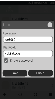
Log in screen
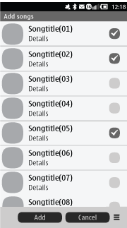
Multiple checklists
Interactive scrollbar
Magnifier
More can be found here I strongly suggest you read it
Thanks to Karol for the heads up
Advertisements


Connect
Connect with us on the following social media platforms.